Wednesday 28 December 2016

WAYFINDING - Location Research

Beeston Car Park - Middleton Grove LS11 5BX


Cross Flatts Park - Noster Terrace Road LS11 8QF


 Trig Point - Harthill Lane LS27 7BP


 Centre Car Park - 24 New York Street LS11 5BX


Saturday 10 December 2016

WAYFINDING - Initial Ideas and Idea Crit

Initial Ideas:
- Most beautiful places to drive/walk during the evening/night. Neon/glow in the dark sign system. Temporary for Leeds festival or etc.
- Urban Exploring. Street art/abandoned buildings.
- Best things to do for free in Leeds. Activities for families/couples/friends.
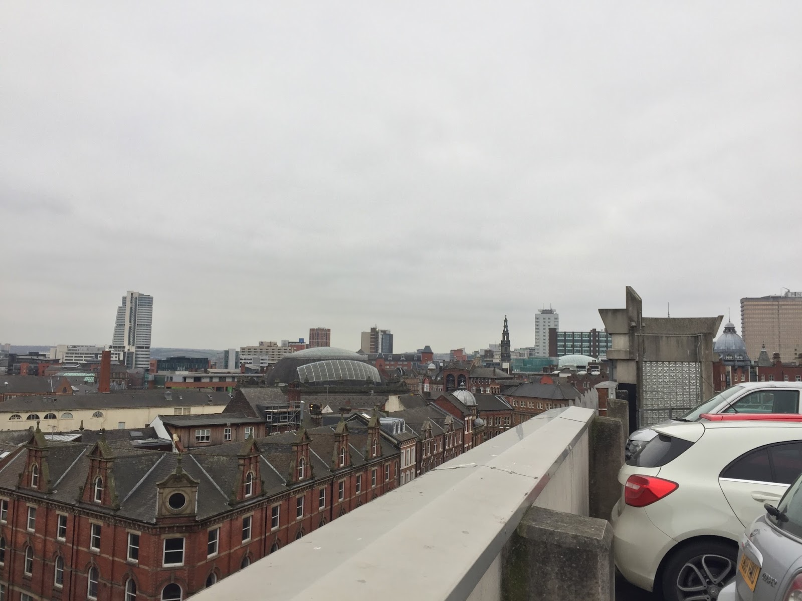
- Best vantage points of Leeds/highest points to view the city from.
- Leeds Light Night. System for the the yearly festival. Neon/glow in the dark/ moving light image light system.

Idea Group Crit:
From my initial ideas, the idea I was most confident in was the 'vantage points of Leeds'. When pitched to my group, they agreed that this idea was the most interesting. Feedback I received was:
- Create a trial from one point to another, so the audience experiences Leeds in between the locations as well as the locations themselves.
- Research The Situationists in Paris
- Get a map of Leeds and mark the points of interest.
- Look at the visual language of maps.
- Possibly look at London's M25 - main highway.


Monday 5 December 2016

Subjective Signs for Objective Things - Study Task 03


To create subjective signs for objective things, we explored blacklettering techniques and applied them to symbols of a hospital wayfinding system. The strokes were created using drawing and lino ink, applied with brushes, scalpels and pieces of card. I discovered that drawing ink has a much easier flow and a certain smoothness, in comparison to lino ink which was significantly thicker and clumpier. Drawing ink also allows fast brush strokes which gives intricate and interesting textures, whereas lino ink had a much messier and displeasing look.
The use of sharp, fast and straight strokes allowed to create the bases for most of the signs. An exaggerated sense of ornamental finials allowed to create interesting curved lines and patterns, which were also essentially applied to some symbols to aid the communication of the final signs. 
The use of blacklettering makes the sign system more contemporary, as it combines an analogue process with digital development to create unique and interesting elements within the sign. The extensive variety of strokes, with difference in materials, stroke weight and execution, as well as the varied combination of those, gives each symbol a unique and authentic look. This way a cliche is avoided, as there is still a uniformity across the whole system, but without all the symbols having the exact same qualities.


When using drawing ink, the start of the stroke was thick, bold and full of colour, due to the brush having a significant amount of ink on it. But as the stroke continued, and the brush lost ink, the result of the stroke becomes a lot more fragmented, and the texture of the brush begins to shape the design. During the digital development process (image trace), the authenticity of that texture is lost. Illustrator converts those intricate strokes into basic lines and shape. And even though up close (Fig.2), the digital development looks quite interesting and pleasing, from further away (Fig.1), those details are lost and the overall look of the symbols doesn't feel as authentic as the original brush work. However, with objectivity in mind, it's arguable that the process of converting the brush work into digital takes away the imperfections that the brush work might have had, and leaves a cleaner and more legible design. This would mean that when it comes to the idea of creating a usable signage system, that developing analogue into digital in fact is more appropriate and effective.