Friday, 28 October 2016

Malicious Definition, First Ideas And Class Crit

Malicious - characterised by malice; intending or intended to do harm.
synonyms: spiteful, malevolent, hostile, bitter, venomous, poisonous, evil, ill-natured, vindictive, vengeful, harmful, nasty, mischievous, cruel, destructive

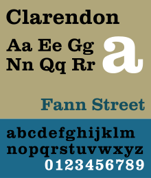
Idea 1: Clarendon is bold and has strong strokes and features. It’s been used in the past for ‘WANTED’ posters in the wild west so it connotes rule-breaking and crime, which links to my chosen word. It’s block-serifs create a harsh and stubborn appearance. By increasing/decreasing the serif sizes, or even creating more contrast between the strokes, I could potentially represent different levels of maliciousness.
Fig.1


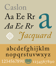
Idea 2: Caslon is a graceful and traditional font, it has gentle features. This makes it the complete opposite to my chosen word. By adding more aggressive and bold features, for example block serifs or stronger strokes, I could potentially create an interesting juxtaposition and communicate maliciousness in a more subtle manner. 
Fig.2


Class Crit Responses

Which font (Clarendon or Caslon) do you think would be more interesting/effective at communicating maliciousness? Why?

- Clarendon gives off a more bitter vibe suggesting cruelty thus is more effective. From your drawing of the 2nd Clarendon [fig. 1] I think this shows maliciousness the best due to the bold serifs. However, you have rounded the letter 'R' and I don't think this works with the rest of the letters, so maybe try making it more harsh or just not curving it at all.

- The second manipulation (Clarendon) [Fig.1] conveys maliciousness more due to the sharp serifs. Unlike the previous comment, I quite like the rounded ‘R’. It adds more personality. However, I do see what the previous comment means. On the other hand, I do think that the typo looks fast. This is due to how you have extended the serifs. Maybe consider making them smaller. Also, will the typeface be just as effective in lowercase? Because I only see this long serif style working in uppercase.

- Caslon  [Fig.2] I think will work best as the sharp serifs best represent maliciousness, almost looks like a weapon. It’s nice to have a challenge - changing a juxtaposing font. Maybe square off the ‘C’ shape so it no longer looks smooth. More sharp edges, manipulate the shape of the ‘C’. Inward sharp serifs - looks like teeth.

- I feel like out of the two Clarendon [Fig.1] is probably the most appropriate, as Caslon is too gentle & elegant to pull off a malicious vibe.  The second iteration of Clarendon with the exaggerated serifs works well in my opinion, and conveys the malicious feeling you’re going for. Definitely stick to uppercase as the lowercase just wouldn’t be impactful enough to pull it off. Cliche stuff to avoid would be really retro horror movie style poster typefaces i.e. dripping blood writing and stuff like that.


My Responses

- I start will start developing my ideas for the Clarendon typeface, however I will also explore some of Caslon to keep my options open to potential.

- I will work more closely with serifs, exploring ways to communicate 'maliciousness' more evidently.

- I will explore my design with uppercase and lowercase letters, to see whether my designs work on both or are only effective on either one.


Wednesday, 26 October 2016

Typeface Research


Image result for garamond

Garamond
Designed by french publisher and type-designer Claude Garamond, Garamond is a group of many old-style serif typefaces, and has been a basis for many modern Garamond versions. Garamond as a typeface offers elegance and readability, therefore it is suitable for a wide range of applications. The adjectives used to describe the typeface are 'fluidity', 'consistency' and 'downward sloping'.


Image result for caslon


Caslon
Designed by english gunsmith and typeface designer William Caslon I, Caslon is also a group of serif typefaces. Caslon is known as a good font for body text, and so is commonly used in magazines, journals, books or as a corporate typeface. The adjectives used to describe the typeface are 'authentic', 'grace', 'familiar' and 'traditional'.


Image result for bodoni


Bodoni
Designed by italian publisher and typographer Giambattista Bodoni, Bodoni is a series of serif typefaces. Bodoni has a unique style as it has very noticeable contrast between thin and thick strokes. This makes it most suitable for displays, posters, headlines and logos. The adjectives used to describe the typeface are 'balance', 'elegance', and 'delicate'.


Image result for baskerville


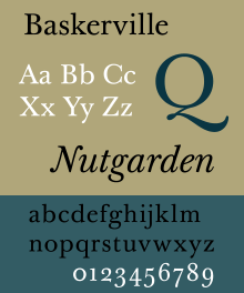
Baskerville
Designed by John Baskerville in 1757, Baskerville is a serif typeface. It is classified as a transitional typeface, intended as a refinement of old-style typefaces from the period. The typeface is often used in book design and body text, as well as in purely typographic compositions. The adjectives used to describe Baskerville are 'rationalism', 'simplicity', 'legibility' and 'beauty'.


Image result for clarendon


Clarendon
Designed by Robert Besleyin 1845, Clarendon is a slab-serif typeface. Clarendon is named after Oxford's Clarendon Press and is considered to be the first registered typeface. The typeface became popular all over the world as a display type, especially for posters printed with wood type. Therefore Clarendon is closely associated with "wanted" posters of the wild west. It is also popular within signage and logotypes. The adjectives used to describe Clarendon are 'bold', 'playful, and 'tough'.


Image result for akzidenz grotesk


Berthold
The H. Berthold type foundry, founded in 1858 by Hermann Berthold, is renowned for crafting high-quality typefaces. Arguably it's most famous typeface is Akzidenz-Grotesk. It is a sans-serif typeface, also described as 'grotesque', that was designed mainly for commercial use such as publicity materials, adverts, tickets and forms, as opposed to decorative or for book use. The adjectives used to describe Akzidenz-Grotesk are 'purposeful', 'balanced', attractive' and 'equal'.


Image result for times new roman

Times
Designed by Victor Lardent in collaboration with the company Monotype in 1931, Times New Roman is a serif typeface that was commissioned by the British newspaper 'The Times'. It is most commonly used for its excellent legibility in body text publications such as books and newspapers. It is not very suitable for on-screen usage. The adjectives used to describe Times New Roman are 'classic', 'practical', and 'common'.


Image result for helvetica

Helvetica
Designed by Swiss typeface designer Max Miedinger with input from Eduard Hoffman in 1957, Helevetica is a sans-serif typeface. "When in doubt, use Helevetica" used to be a common rule as the typeface is appropriate to a wide range of uses. It's been used for posters, logotypes, body text, headlines, logos and etc. The adjectives used to describe Helvetica are 'modern, 'progressive', 'universal' and 'ubiquitous'.


Image result for univers typeface

Univers
Designed by Adrian Frutiger in 1954, Univers is a sans-serif typeface that's classified as a neo-grotesque. Univers is a font family that contains a wide variety of weights and styles, which makes it appropriate for a many uses. The adjectives used to describe Univers are 'steadiness, 'homogeneity', and 'legibility'.

Monday, 24 October 2016

Final Crit and Evaluation


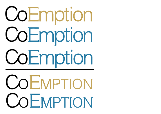
Above was my the final design I chose to present. I felt it communicated all the aims I had at the start of the project most successfully. It is also presented in a mock up of company related documents.

Final Crit Feedback

- The gold colour is a little bit 'money hungry'. The blue designs are more appropriate as they seem more trustworthy.
- Could have looked at silvers - because they're also quite 'expensive' but not as loud.
- Use of mini-serifs makes it look more professional.
- Capital 'E' as well as 'C' works well in giving more authority
- The design decisions overall are appropriate and well-considered.
- Use of helvetica was an interesting choice, and works well because it makes the design more friendly and definitely approachable .

Evaluation

During this brief believe I have created 5 logotype designs that communicate successfully what I had originally intended. The company I was designing a logotype for was a high-end investment bank who's public image would demonstrate professionalism as well as trustworthiness to the customers. The use of mini-serifs within my designs proved to be appropriate and effective, as my research had suggested, I know this because during my final critique the feedback I received was that it made my design look more "professional". The use of two capital letters within the logotype was also successful; the feedback confirmed that it added "authority" to my design. Helvetica was also a favoured design decision, it made my designs "friendly and definitely approachable", which in turn makes the design seem trustworthy. I believe using Helvetica Light had an impact on this, because it is thinner when it comes to type weight, meaning it is received as being softer and less threatening, and therefore friendlier and more reliable than other Helvetica weights. The final critique proved that my design decisions worked well, the personality I intended to communicate within my logotype and the opinions I wanted to evoke from my customers, were confirmed by the fact that the feedback I received matched my original intentions.

The only design decision that caused some ambiguity was my choice of colour. Some thought that the use of gold created a "money hungry" image. This was understandable as it was something I had already acknowledged and possibly even expected. The aim for the gold choice in colour was to be different and change the stereotypes; I thought that because of the friendliness and effectiveness of the form within my designs, that by using gold I could change the associations of the colour and make the customers view it in a more positive and advantageous light. It was apparent that I was unsuccessful in communicating this message. This may be because I underestimated the form of my designs, and that I didn't considered how strongly stereotypes effect meaning or even how difficult it is to change them. The use of gold now seems as if it has dominated the designs, and instead of highlighting the other design decisions and their positivity, it has changed the designs meaning as a whole and instead manifested greed and untrustworthiness. The use of blue in the other final designs were much more admired. The feedback received said they seemed more "trustworthy". Considering my gamble with the use of gold was unsuccessful, I would have to agree. Blue is typically connoted with reliability, wisdom and loyalty, so it expectantly very appropriate for a company that seeks to communicate these things. Although I still believe that the use of gold is a more interesting design decision that has potential to be more recognisable and intrigue the audience more significantly, the use of blue also works well. This is because it is supported by all the other design decisions I have made, which are arguably equally as interesting and intriguing as gold being the choice of colour.

Looking at one of my final design within a relevant mock up, set against a a white background, the logotype seems legible and modern. The design decisions I made are distinct and add personality to the logotype. Overall, I am very happy with the outcomes of this brief and believe that, although there are areas for improvement, my final five designs have been successful.

Sunday, 23 October 2016

Final 5 Designs

(Top to bottom, no. 1, 2, 3, 4, 5)


All 5 final designs feature four main design decisions that have been seemingly present throughout my development process. These are the connection of 'C' and 'O', the 'E' being a capital letter, mini-serifs and colour.

I made the connection between the 'Co' because it represents a 'cooperation' between the investment bank and the customer. It gives the designs more character and creates a more comfortable and reliable atmosphere for the customer.

I made the 'E' a capital letter, for two reasons. Capital letters are used for names, places, and titles, so by having two capital letter within the logotype, it demonstrates twice the sense of importance and authority of the company. The other reason was to emphasise the 'Co' even more, so it brings the customers' attention towards it and so the meaning behind the design decision is more evidently received.

The design decision of mini-serifs links to the traditional logotype qualities for investment banks and other companies of corporate professionalism. From my research, I found that the use of full serifs had lost it's previous value due to the financial crisis of 2007. The serifs, that were once seen as symbols of trustworthiness and prowess, had now become associated with the greed and deceit that the investment banks part of the crisis had shown. However, although this event altered the publics view on such type qualities, it didn't completely diminish them. That is why I used mini-serifs, not only do they provide a subtle link to the industry, but they also represent a certain degree of what they used to stand for. From my research, 'Credit Suisse' also use mini-serifs, and their logotype and brand have been successful and trusted for a long time, proving that mini-serifs are an appropriate design decision to make for what I aim to communicate. The mini-serifs I created are not too obvious or over-whelming, making the logotype seem more trustworthy and friendly, as well making a connection to the classic values of professionalism and expertise.

Colour is the last universal design decision I made. Wanting to create a company identity that would be approachable and friendly, I knew adding colour would help to accentuate the type qualities in place that were already doing so. It helps to emphasise the difference between 'Co' and 'Emption', drawing attention to the design decision for 'Co', as well as the capital 'E'. Colour also works in the general sense that it makes the logotype more eye-catching, and would make it more noticeable and recognisable by the public. Each design also is set against a white background, this is done not only for ease of legibility, but to also accentuate the design and it's qualities.

Final designs no.1 and no.4 both use gold as the colour choice. Gold is a representation of money and wealth. It would typically be inappropriate for a bank because it can create a sense of it being 'money hungry' and greedy. However, I believe that because of the softness of the mini-serifs and the use of neutral helvetica, it balances out this stereotype and instead places the gold colour in a positive and advantageous light from the customers point of view.

Final designs no.2, 3 and 5 use blue as the colour choice. Blue is commonly used as a corporate colour due to it's associations of calmness, loyalty, wisdom and trustworthiness. It has previously been seen used in investment banking and could arguably be considered unoriginal and therefore ineffective. However, I believe that because the rest of the design is quite modern and unexpected for investment banking, adding blue would becomes a quality of familiarity and makes the design as a whole more comfortable and approachable for the customers.

Final design no.3 uses underlining. Underlining is used to highlight something, to draw someone's attention and present something as more significant. Usually titles and subheadings would be underlined, they demonstrate a start of the next topic or a new chapter. By underlining my logotype I represent these qualities as a part of my company identity. The fact that the underline is in its basic black and white straigth form also helps to emphasis this. If it was stylised or manipulated it would be seen as more of a gimmick, and make the logotype seem less serious or professional.

Final designs no.4 and no.5 both use small capitals. This design decision came from my research into 'Credit Suisse', and their success as an investment bank throughout the years. They also use small capitals within their logotype. I think what makes them appropriate for their logotype as well as mine is that small capitals connote the same importance and authority that capital letters do, but without being as loud or aggressive. They are a more subtle way of making the logotypes stand out, as well as demonstrating those same positive qualities.

Thursday, 20 October 2016

Coemption Design Development


I started work on Illustrator. Based on previous exploration, I decided to work solely with Helvetica Light, as I feel it has good weight that allows clear legibility as well as has a gentle and friendly presentation. I first carried out my initial ideas of joining the 'C' and 'O' as well as making the letter 'E' a capital. I decided that joining both of these features into one would be more effective, as they represent different things and therefore create a balance within the logotype; the connected 'Co' represents a unity between the bank and the consumer, and the capital 'E' demonstrates authority, importance and professionalism. I looked briefly into rounding off all the letters, but thought this to look too childish and un-professional. I explored underlining, to emphasise even more so the power and importance. Also, I started looking at dividing 'Co' and 'Emption' using colour, to highlight the two different aspects of the company, the 'unity' with the consumer and the 'authority' of the bank.
_____________________________________________________________________________

Next up, I decided to explore mini-serifs. Although my research revealed that after the 2007 financial crisis serifs within investment banking and the industry weren't deemed as reliable anymore, the traditional values of the serifs were still unavoidably present. Serifs have always widely been deemed as something sophisticated and trustworthy, outside of the investment industry as within. Of course, the finical crisis did have that major affect nevertheless, and that is why I decided to create not full serifs but mini ones. This still adds a traditional atmosphere and a sense of professionalism and corporate identity, however it does it in a more subtle and modern way. This design decision is somewhat inspired by 'Credit Suisse', who also use mini-serifs. They are a very successful company who have been around since 1856. In 2007, they were one of the banks least affected by the financial crisis. This gave them a better public image. Their use of non-traditional logotype, including small capitals and mini-serifs, influenced the way the consumers started to view these features. They began to be seen as more trustworthy and reliable. They set the foundations for the use of these features in future designs. Therefore, by incorporating mini-serifs in my design I can be confident that they will be positively received by the public, and that they will communicate the same trustworthiness and reliability they have done in the past, and the type I am aiming for now.
_____________________________________________________________________________


Here I looked at some other ways I could emphasise the two different qualities I was aiming to communicate within my logotype. I thought working with negative space could give the logotype more personality and character, by making it seem more structured and strong. Also, adding colour to these features I thought would make the design seems more friendly and approachable. Overall, however, I didn't like these explorations because I felt that although the design decisions seemed appropriate, the result didn't communicate 'investment banking' but rather something more informal and playful. I wanted to make sure that the representation of professionalism and authority was an aspect that was kept clear in my logotype, and these designs didn't represent that. _____________________________________________________________________________


I made a slight detour to explore the logotype in just lowercase letters. I added the experimentations with the joining of 'co' and colour to see what affects they would have. I found that lowercase does a good job at communicating friendliness and approachability, however it doesn't communicate authority or professionalism, the other aspects I thought were necessary. These explorations seem more suitable for supermarket or information company logotypes, as they are smooth and extremely legible. However, for an investment bank, they just do not present enough professionalism or trustworthiness.
_____________________________________________________________________________


Looking back on the success of 'Credit Suisse' and their logotype, I decided to explore another design decision that has worked successfully for them, using small capitals. Alongside these I also added the previous design decisions I have firmly decided upon incorporating. I think these design work really well because they communicate formality and importance in a very obvious manner, especially the underlined designs. However, they do not seem as modern or friendly as the previous designs using regular capitals and lowercase. This might be because using both small caps, mini-serifs and underlying makes the logotype seem slightly overwhelming, as if it's "trying too hard", which decreases it's trustworthiness. The design with just small capitals and mini-serifs I feel is more appropriate as it is slightly more subtle, and that by maybe exploring with adding colour I could make it even more approachable and friendly.
_____________________________________________________________________________


I decided upon these two being my strongest designs. They both successfully, although in different ways, create an atmosphere of reliability as well as professionalism and authority in their form. However, I knew these qualities could be accentuated by use of colour. So I started looking at different colours and trying to identify which palette would be most appropriate for me to use. I decided upon the gold palette and the blue. Gold because it is associate with money, and although this  could potentially be viewed as "money hungry" and untrustworthy by the customer, I though that the gentleness and friendliness of the form of the design could overthrow that stereotype and show gold in a more positive and advantageous light. And blue because it is a calm and sensible colour, making it closely associated with trustworthiness, therefore reinforcing the features of logotype form and the qualities I want it to communicate.


_____________________________________________________________________________

Monday, 17 October 2016

Coemption Design Development and Class Crit

After deciding to use Helvetica instead of Bodoni, I then proceed to create some more initial designs on layout paper, but this time with the newly chosen typeface. I decided to re-apply some of the smaller design decisions I made within my exploration with Bodoni, as I felt that they were transferable and not qualities that were typeface specific. I looked again at making the 'E' in 'Coemption' a capital letter, and joining the letters 'C' and 'O' in 'Co'. Each initial Helvetica idea (Fig.1) was slightly different not only in the alterations made to the letterforms themselves, but also in the font weight that was used. My favourite weight was Helvetica Light (No.3 on Fig.1), as I felt that it didn't come across as loud as the other designs. This provided a friendlier atmosphere, which in turn made it seem more reliable and trustworthy, something I was aiming to communicate. Although Helvetica Neue Light Italic (No.5 on Fig.1) also had similar subtly as Helvetica Light, I didn't think it was as appropriate due to it being italic. In comparison to Helvetica Light, it didn't have the same assertiveness as the slants make it seem more passive, and this is something you would not want as part of your investment bank identity.
Fig.1

Class Crit Responses

 "Do you think the use of Helvetica demonstrates friendliness? How?"

- Yes, especially lowercase (with the uppercase C, which upholds formality) It looks modern, clean & reliable.
- Yes, it demonstrates openness and is easy to read.
- No, I think Helvetica in it's basic form is too passive and impersonal. Adding more character and/or rounded forms would make it friendlier.
- No, I don't think Helvetica is necessarily friendly as it's quite a neutral typeface.


"Which design is your favourite so far/ which do you think is most appropriate?"

- The joined letterforms [Co] illustrate the link between the investment bank and the consumer, this works effectively and is appropriate.
- I like the connection with the C and O, however I like it when you make 'Co' and 'Emption' disconnected.
- Helvetica. Med. (Last one) (No.6 on Fig.1)
- I think sans-serif is more appropriate. Also not italic, as it makes it look too tech-y.
- Lowercase is better as the uppercase looks a bit too loud - lowercase looks more professional for a bank.
- I really like the uppercase 'E' [as in 'CoEmption] as it gives it a bit more prestige as a professional bank.

My Responses:

- I will continue working on manipulating Helvetica to give it more character and move it away from it's 'neutral' state. The type of character I will aim for is a reliable, friendly, and professional representation.
- I will carry on exploring the ideas of linking the 'Co', as well as making the 'E' a capital letter.
- I will continue looking into both lowercase and uppercase variations, and see how these affect the communication of my company.

Group Crit and Additional Research

When I presented my company identity and chosen ideas, I received feedback that changed my approach towards the design decisions I was going to make.

Wanting to create an elite investment bank, my first idea was to go down the traditional path, and to attempt and re-create the same atmosphere that was communicated by other high-end 'Wall Street' investment banks.
The feedback I received was that "the bank should communicate something new, moving away from the traditions, and the atmosphere created by investment banks in the past". 

This feedback was directed towards the financial crisis of 2007. The precipitating factor of this crisis was a high default rate in the subprime home mortgage sector. In the late 1990s and early 2000s, there was an increase in the issuance of bonds backed by mortgages, also knows as mortgage-backed securities (MBSs). Investment banks were buying mortgages from mortgage issuers, repackaging them and selling off specific tranches of the debt to investors. As time went on, there were less and less new mortgages to pool the debt off and issue assets based off of, so the banks started repackaging  MBSs by collecting the unsellable tranches and selling them as new product - called collateralised debt obligations or CDOs. In theory, the pooling of these mortgages reduced risk and seemed as if the assets would be safe, when in reality the majority of these mortgages were of poor quality (subprime). The rating agencies who rated the quality of MBSs and CDOs did not fully appreciate these subprime mortgages, and as a result ended up rating them with the highest AAA rating. From the viewpoint of the investment banks, this was a goldmine. The AAA assets required little capital to borrow against and essentially provided them with a free return. The US and global banks went on a massive spending spree, borrowing vasts amount of money short term to fund their investments. Investment banks had leverage ratios of 30x or even higher. Some of the top investment banks such as Morgan Staley, Lehman Brothers, Merrill Lynch and Bear Stearns were almost entirely funded by short term borrowing. 

By the mid 2000s, there were hundreds of billions of dollars worth of mortgages given to individuals with poor credit rating on adjustable rates. These mortgages typically required a low interest payment for the first few years, but then increased for the years to follow. There was no possible way that subprime borrows could afford the higher repayment rates. And when house prices stopped rising and started to fall, homeowners could no longer refinance or remortgage their homes for cash. So the whole system started to default. Suddenly, tranches of CDOs and MBSs started getting wiped out, and investors started to lose confidence in the top AAA tranches and the banks which held large amounts of them. In June 2007, many banks started seeing huge loses due to exposure to subprime assets. Billions of dollars worth of client money was lost. It all kept going downhill from there, and even today there are traces left of the effect this global crisis had. 

In relation to my project, I realised that wanting to create a trustworthy high-end investment bank, focusing on the traditional appearance of typical investment banks would be inappropriate. People stopped trusting investment banks after the crash of 2007, and became more careful and judgemental. I needed to take a completely different approach to the design of my logotype. 

Another bit of feedback I received was that instead of Bodoni I should use "Helevtica [and] make it a new and fresh investment bank". I really liked this idea because I feel it is a challenge. Helvetica being a very neutral and uncharacterised typeface, I think it would be a quite an interesting design exploration and juxtaposition to try and give it some personality as well as making it seem sophisticated, trustworthy and "new". 

Saturday, 15 October 2016

Coemption - Meaning, Company Identity, Research and Initial Ideas

Coemption - The act of buying the whole quantity of any commodity

Who is the company? Finance and Investment Banking
What do they do? Raising Capital and Security Underwriting. Like most investment banks, Coemption would be the middleman between a company that wants to issue new securities and the public clientele. They will advise buyers and sellers on business valuations, negotiations, pricing, transactions and all other aspects of financial investments.
Who is the target audience? Companies/Businesses and the general public interested in investing in them. I want Coemption to be a professional and trustworthy high-end investment bank, the kind of 'Wall Street' level.
Where will the logo appear? Website, Buildings, Documents, Business Cards, ID Cards and other forms of corporate paperwork.

Some well know high-end investment banks are JP Morgan Chase & Co., Goldman Sachs, Morgan Stanley, The Blackstone Group, Evercore Partners, Center View Partners and etc.


What seems to be a recurring theme within these logo typefaces is serifs. Serifs provide a quite professional and sophisticated tone. In an attempt to create the same sort of 'Wall Street' intonation, I thought using a typeface with serifs would be most appropriate. I typed up my word in all 6 typefaces we were given to start with (See.Fig1.), and was most attracted to using Bodoni, because of it's quite gentle features. The contrast between the thick and thin strokes made the type seem reliable, whilst the serifs also maintained a professional and proficient feel.

Fig.1


I explored my word in the Bodoni font in a variation of upper and lowercase letters. I focused on kerning and tracking techniques. I worked some designs on layout paper and some digitally. My favourite variation so far was No.3 (Fig.2) done on layout paper, as I believe that by separating 'Coemption' into two words 'Co' and 'Emption' and therefore having two capital letters within the company name, gives it a bigger sense of importance and power. Another initial idea I had that I felt was effective was in no.6 (Fig.2), the joining of the 'C' and 'o' in 'Co' visually represents the meaning of the word. It demonstrates a unity between the company and the consumer, making it seem more reliable and trustworthy. Some of the initial digital designs I liked were no.2, 4 and 5 (Fig.3), as they worked with all uppercase letters, which also demonstrates a sense of power and therefore is appropriate in communicating an elite investments company.


Fig.2
Fig.3

Tuesday, 11 October 2016

Grids, Branding & Typeface Research


Grids came about during the Renaissance period - a lot of designers attempted rationalism design.
Rationalising design allows us to create tangible systems in which to ensure consistency and structure. It's argued that such approach to design inspires more confidence than design based on personal preferences/intuition.

Leonardo Da Vincis ‘The Vitruvian Man’ was one of the first such instances where a grid system was applied.
Architecture throughout history is also based on grids - e.g. the pyramids. 
Albrecht Durer attempted to define the perfect grid system for the construction of letters in 1525.
In 1660, Johann Neudorffer also used a geometric square grid system as the basis for the construction of his typefaces. Square is divided into 10 equal parts, with each part corresponding to the thickness of the stroke of the letterform.
In 1972, Olivetti developed an alphabet intended for 7x9 matrix printer, with a rectangular field of 35,49 or 63. A very simple typeface created with a simple grid system.
The Golden Ratio - divides a line into two parts relating to each other to approx. 1:1.618. When 360’o is divided by the golden ration, the golden angle is revealed as 137.5’o.
Wolff Olins - rebranded New Yorks Metropolitan Museum of Art. The previous logo was the ‘M’ from 'Pacioli’s De Devina Proportione' alphabet.


Re-Branding of British Steel 

A design week article stated:
"The main icon which is set in "molten orange" and combines the B and S letterforms also appears to look like three strips of steel. Core values of "pride, passion and performance" have been imbued into the icon, according to Ruddcoks, which has offset the orange against a cooler navy colour to show steel in its molten and hardened states but also to show how the company is vibrant and exciting (orange), and "cool, professional and committed" (blue/grey)."

I believe that the re-branding of 'British Steel' was unsuccessful. The idea behind the "three strips of steel" seems over-reaching to me, because it is not instantly obvious that that is what they're meant to represent. Even if subtly was the aim for this, I think it's a bad design decision as the companies product is more visually obscure, therefore it would need more evident representation, rather than abstract. What I mean by this, is that not everyone knows what large "strips of steel" would look like, and even if they did, I wouldn't imagine they would envision them as "molten orange"either. Because of this it is my opinion, that in comparison to the old logo, the new logo doesn't hold as much clarity. The old logo depicted two strips of metal bent to depict an 'S' for steel. As a consumer, we know this because not only is the logo blue, a colour which connotes 'coldness' and 'strength' so can easily be associated with metal, but also because the two strips forming the 'S' are visually reminiscent of steel and metal pipes that the general public would have seen in their homes and buildings. This makes the old logo seem more personal and trustworthy to the consumer, in comparison to the new logo whose abstract form and colour holds no such welcoming. Also, because of this, if the new British Steel logo was placed on it's own, without the type logo alongside it, the chances of the company being recognised are slim. Whereas the old logo was in circulation for 30 years, it had become iconic and respected; even if the re-brand of British Steel had been completely different, more well-considered and executed excellently, I don't think it would have had any chance of getting accepted anyway. With companies such as British Steel, that have been around so long, and have become part of the culture and society, re-branding it usually causes discomfort and upsets the balance of the consumer society. The re-brand of British Steel was arguably bound to fail, it is simply a shame, that it failed even more so than expected. New Logo and Identity for British Steel by Ruddocks

"A real corporate identity is based on an overall system approach, not just a logo. A logo gradually becomes part of our collective culture, in its modest way it becomes part of all of us. When a logo has been in our public domain more than fifty years it becomes a classic, a landmark, a respectable entity." 

Typefaces:

Garamond - original design produced by French Renaissance punch cutter Claude Garamond in 1530. Garamond is characterised by large counters in the a and e, and horizontal crossbars. Ascenders and defenders are long, and the f has a strong hook. Most top serifs are diagonal, slanting towards the left, here the influence of calligraphy is evident. Garamond is used in books, magazines etc.

Bodoni - designed by italian typedesigner Giambattisa Bodoni in 1790. Bodoni features extreme contrasts between thick and thin strokes. Original forms have subtly bracketed serifs, although most contemporary variations exclude the brackets. Mathematical precision of the letters provides vertical stress, and the ascenders and descenders appear long in relation to x height. The M and W are narrow, the R features a curved leg and the Q features a low tail that extends vertically. Bodoni's ornate appearance means that it is mostly recognised as a display typeface, used in posters, brochures, sign systems etc.

Century - developed by Lynn Boyd Benton in conjunction with renowned American printer Theodore De Vinne in 1896. Specifically designed to print ‘Century’ magazine beginning. Century was designed as an extremely readable typeface. Thick and thin stroke heights are somewhat heavier than most serif fonts, this is offset by generous white space between and within the letters. Unique characteristics of each letter are clear and slightly exaggerated. Century is used in body texts, books, magazines etc.

Futura - inspired by the Dutch De Sijil and Russian constructive movements, along with the Bauhaus and it's belief that 'form follows function'. Designed by german designer and educator Paul Renner, who applied elementary geometric form to typeface design as inspired by 1920s Europena designers. All strokes in each font are made of a single weight line, and the number of strokes to create each letterform are minimised. Futura is one of the most basic typefaces you can get. The O is a perfect circle, and A,B,D, P and Q were designed by adding a straight vertical line to the perfect circle.The T is composed of two straight lines, and the J has no curve. The G has no foot serif, and the Q is a perfect circle broken by a diagonal slash. Future is used in websites, posters, brochure, packaging etc.

Times Roman - designed by Stanley Morrison in 1932, who was commissioned by ‘The Times’ newspaper to redesign the newspapers text typeface. Morrison designed this typeface using Monotype Plantin 113 as the basis. The resulting text face is similar but features sharper serifs and a higher contrast within stroke weights.
Times Roman has short ascenders and descenders, sharp bracketed serifs, and an oblique stress. The counters are very open and comfortable, like the large bowl of the lowercase A, and the rounded uppercase letters such as C and G. The variety of weights, widths, italics and other font variations makes it a Times Roman highly desirable and practical typeface, it is used in websites, body text, books, posters, newspapers etc.

Helvetica - designed by Max Miedinger in collaboration with Edouard Hoffman in 1950s, in an effort to improve the Akzidenz Grotesk typeface. The result was Neue Haas Grotesk, in 1961 this was renamed to 'Helvetica'. Helvetica became the predominant typeface of many graphic designers of the International Typographic Style, also known as Swiss Style. This approach advocated clarity, precision and objectivity. In design, Helevetica echoes these qualities as it has possess no formal eccentricities, or distinguishing aspects of the design. The typeface is rounded sans-serif with large x height, counters within O, Q and C are oval, C has a narrow aperture and flat terminals, the R stands on a curved leg, and the A is double storied and features a tear-dropped shaped counter. Helvetica is used in websites, posters, brand names, album covers etc.

Tuesday, 4 October 2016

Punctuation, Ligatures & Emojis

We were tasked to design a new character for a typeface that should be a response to a pre-identified problem. Like most literature shortcuts, our aim was to make communicating easier and quicker. This is why we first started compiling a list of words that we use on a day to day basis, that would benefit us if they were to have simply one character. We came up with: 
hi, hey, bye, dear, to, from, also, or, the, of, brb, sos, i love you (ily), good morning/afternoon/evening, you, me, see you later

After exploring and trying to come up with a variation of characters for a few of these words (see below), we decided upon the words ‘hi’ and ‘to’ as the designs with most potential. These two words are very common and we felt like they could easily be incorporated into our everyday lives, if it were to become a real typeface character.


The idea behind our ‘hi’ design was fairly simple. As it is just a two letter word, you could argue that it does not need a ligature or a character design. However, because of how commonly used the word is, we felt that by simply joining the two characters together to form a solid ligature, we could create a very useful character. We also wanted to keep the character recognisable, so it’s meaning would be clear and universal. The end design worked very well and was adaptable to various fonts (See fig.1), however, during our crit the feedback we received was that the idea was “too simple”. Turns out our attempt at creating something straightforward backward to seem as fairly unoriginal and lazy. The feedback we were also given was to not be afraid of losing the letterforms. An example we were given was that we get rid of the ‘i’ in ‘hi’ and by just keeping the tittle, and placing it over the bowl of the ‘h’, we could shorten the efforts of writing but still keep the clarity of the message we were trying to communicate.

The design for ‘to’ was received much better. With this design we followed the same simplicity and clarity intentions we used for ‘hi’. The character utilises the letterforms of ’t’ and ‘o’, and follows the same basic principle of merging the two together. The end result was also adaptable in various fonts (See fig.2). I think this design seems more successful and was received more positively because we explored the possibilities of the letterforms more thoroughly, and shortened the word to it’s maximum extent whilst also keeping to our intentions. The character communicates the word legibly as well as being easy to reproduce. 
Fig. 1
Fig.2