Wednesday, 30 November 2016

Objective Symbols of Subjective Things - Study Task 02

Escape


Fig.1
Fig.2
Fig.3

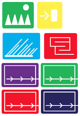
To visually communicate the word 'Escape', I have attempted to take the essence of the feeling of escape, and translate it into objective symbols. Fig.1 and Fig.2 are more conceptual and abstract representations of the word, created using the letters 'E', 'S' and 'C' of the alphabet. Fig.3 is inspired by Lance Wyman. 
Fig.1 symbols look quite pleasing aesthetically, they are detailed and intriguing. However, to be appropriate objective symbols they lack simplicity. Also, the confinements of the square they are placed in, which according to Fruitinger represent "boundaries...[and] the feeling of floors, ceiling, walls" does not communicate the word 'escape'. To make the symbols more successful I would have to break free the elements within the symbols, and let them flow over the lines. 
Fig.2 are collages using letterforms. They represent 'escape' more successfully as the elements within them extend beyond their square boundaries. They have a much more objective feel, as they are not too complicated and have potential to be easily recognisable. The choice of colour was not initially considered, so the designs are weakened because of that. However, if I were to improve them now I would re-design them on tones of green, as green is associated with 'Exit' signs, freedom and nature, all being associations of 'escape'. 
Fig.3 are designs influenced by Lance Wyman and his use negative space and colour, especially distinctive in his Mexico 68 Olympics pictogram designs. I thought this his style would be appropriate because it gives the idea of 'escape' a more positive feel. Whereas the other designs presented 'escape' as aggressive and forceful, these ones I believe show the more peaceful and organised side of it. The signs look objective because of their simplicity and frame. The square frame gives a feeling of certainty, with the rounded corners adding gentleness. The use of white negative space and soft rounded lines for the imagery inside gives the designs purity. These things successfully communicate the freedom and nature side of 'escape'. The choice of colour is not appropriate in all the designs. Whilst the soft green, bright yellow, and sky blue all are gentle and work well, the purple, red and navy seem harsher and too serious. If I were to re-design the symbols, I would only work with the first three colours. 

Sensuous

Fig.4
Fig.5
Fig.6

To visually communicate the word 'sensuous', I have attempted to transfer sensual properties into 2d formats and adapt them into objective symbols. Fig.4 are hand painted and then scanned. Fig.5 and Fig.6 are digitally developed, but based off of analogue designs.
Fig.4 designs are quite successful in the sense that it has a certain gentleness and intimacy to it, due to it being hand painted. The strokes are uneven and textured, giving the symbols a sense of a personality. In an attempt to make them more objective, I had developed them digitally, but then they lost their personality and failed to communicate 'sensuous' quite as effectively as the analogue originals. The choice of blue and green were effective because they are quite soft tones, however, the red seems slightly too harsh, so it would've been more successful if I had used a slightly lighter red tone or even pink. The frame being a square also isn't quite appropriate as the solid corners communicate seriousness rather than sensuality.
Fig.5 are designs influenced by Fig.4, but created entirely digitally. Unlike Fig.4, I had chosen the frame boundaries to be circles, as according to Fruitinger, "we appreciate rounded forms with the sense rather than the mind". I believe they are successful in looking objective, as they are quite simple in their use of line, and do not over-crowd the audience and their senses. The choice of colours, unlike Fig.4 were more considered, with a specific selection of softer tones, and colour combination that are not too contrasting, which aid the designs in communicating 'sensuous'.
Fig.6 are designs digitally developed from an analogue process. I had used a textured paper, and made imprints using paint. I then scanned and those and enlarged certain areas to create these symbols. The colours I had used are appropriate as they are soft pink, red and yellow, which are not too attention grabbing and complement each other well. The development from analogue to digital gives the symbols an interesting texture, and so an authenticity and uniqueness that could not have been achieved otherwise. This is quite evident in the symbols and so communicates interestingly to the senses, making these the most successful designs. The frame used is square, to show the idea of them being symbols more clearly, but the corners are rounded, so to remove there harshness of the right angles and communicate 'sensuous' even more effectively.

Ambivalent

Fig.7

Fig.8


To visually communicate the word 'ambivalent' I have attempted to created visually contrasting symbols based on basic shapes. Both Fig.7 and Fig.8 are digitally developed designs of hand drawings.
Fig.7 are designs created simply on doted paper. The use of basic shapes, straight lines and blocks of colour communicate 'ambivalent' well as it allows the designs to structurally and clearly represent a contrast. The choice of colour is appropriate as black and white are traditionally the two most opposing colours, black and white representing evil/good, lies/truth, darkness/light and etc. respectively. Although they communicate 'ambivalent' well, they do not however, look very objective due to their frame boundaries making them seem more like logos rather than symbols. To improve this I could place each of them in a new farm of their own, or possibly even just simply their current frame.
Fig.8 are designs are created using Otl Aicher's grid. This grid system also allowed the use of basic shapes and straight lines, allowing me to communicate contrasting elements evidently. Otl Aicher's pictogram designs are mainly black and white, as this gives them ease of interpretation and understanding, so my designs are also in black and white in an attempt to communicate the same clarity in the my intentions. These designs look significantly more objective than Fig.7, as they are placed within a more comprehendible frame boundary. The square gives the designs a sturdiness and a certain sense of confidence, according to Fruitinger, the square create "a symbolic object". The simplicity of the designs also is appropriate as objective symbols as they are not too over-whelming for the audience and would be easy to recognise on various scales. 

Thursday, 24 November 2016

Wayfinding Research in Leeds - Study Task 01

The task was a video research project, where we had to record how the public moved and interacted with the space around them. Three main aims were to: create a diversion, create a new connection, and make someone pause or stop. Our initial ideas were to use tape, and existing well-known recognisable signs.

Using the tape, we were able to create obstacles that the public did not expect. The reactions when faced with these obstacles were of some of acceptance and light-heartedness, whilst others of confusion and annoyance. For example, when we placed tape across the stretch of stairs, some people were surprised but not faltered by it and simply dove underneath the tape, whilst others decided that this route cannot be taken and changed course all together. In this manner we were able to create a diversion. 

For our existing sign idea, we chose the 'stop' sign, as we knew it to be visually very noticeable and recognisable. For this part we decided to become part of the diversion ourselves, by holding up the stop signs and facing the oncoming public. By being part of the obstacle, we allowed the creation of new connections. As people walked past, at times hesitant whether to truly stop or not, we received smiles and laughs, as well as small phrases of conversation. We got to interact with the public on a more personal level, as well as affect the way they moved through the space. 

We felt confident with using tape, as we felt it was easy and affective. So we applied it again to several other situations. In one of them we placed the tape in 'X' forms on the shopping centre floor. Although not many people noticed or reacted to the tape, we did receive a reaction from two little children, who stopped curiously to investigate what the tape was doing there, and found it some-what entertaining and amusing. This was quite interesting as it shows the difference between children and adults, and how they interpret the space around them; something that an adult does not even notice, is noticed and investigated by the child. 


Tuesday, 22 November 2016

Colour Meanings Research

Book by Patti Bellantoni 'If It's Purple, Someones Gonna Die' explores the power of colour in visual storytelling. Below I have extracted and focused in on the various meanings of colours and their effect on the audience.
RED – The Caffeinated Colour.
  • Bright red is like visual caffeine.
  • It can activate your libido, or make you aggressive, anxious, or compulsive.
  • Red is power, but it doesn’t come with a moral imperative. Red can give power to the good guy or the bad guy.
  • We tend to see it first, so it has the illusion of advancing towards us. It can manipulate our sense of space.
  • Red can make something appear to move faster.
  • Bright red can raise your heart rate and anxiety.
  • It is visually loud and can elicit anger.
  • Bright red tends to be cold, and heartless.
  • Warm reds tend to be sensual and lusty, or romantic.
  • Darker reds such as burgundy read as mature, regal and elegant.
YELLOW – The Contrary Colour
  • Yellow is visually aggressive. It appears to come towards you.
  • Associated with the sun, and the idea of powerful life energy and exuberance.
  • It is attention grabbing.
  • Yellow is the colour longest remembered and most despised.
  • Is also associated with happiness.
  • Yellow is the perfect symbol for obsession.
  • Large quantities can be hard on the eyes, and even induce anxiety.
  • When lightened, it becomes elegant and sophisticated.
  • Pale yellow can also be associated with innocence.
  • When more honey-like and golden, it becomes magical. The colour of memories, dreams and success.
BLUE – The Detached Colour
  • Blue is tranquility and sadness.
  • Can make people passive and introspective. A colour to think to, not to act.
  • Blue creates a sense of longing, of something left unfinished, of melancholy.
  • The colour for powerlessness.
  • We can depend on the sky being blue, so the colour is synonymous with loyalty and dependability.
  • Steel and indigo blue are associated with intellect.
  • Blue-green/turquoise colour inspires openness and interaction.
  • Can be used as dominant colour.
ORANGE – The Sweet and Sour Colour
  • Orange is generically a “nice” colour.
  • Opaque orange is the most upbeat and least dramatic.
  • The colour creates a warm and welcoming congeniality.
  • Light orange/sunset orange is romantic and emotional.
  • Can be used as association to poison and pollution.
  • Orange is the colour of the working class.
  • Versatile orange can also be read as exotic.
GREEN – The Split Personality Colour
  • Green is a dichotomous colour.
  • It symbolises nature, life and health.
  • Can also signal danger and decay.
  • When used for irony, it can stimulate emotional response.
  • Green liquid makes you feel uneasy, as it’s been made into a metaphor for poison.
  • The colour can represent corruptness and lies.
  • In association to the human body, green is often illness and evil.
PURPLE – The Beyond-the-Body Colour
  • Purple is the noncorporal, the mystical, and the paranormal.
  • Associated with sensuality within romantic tales and poetry.
  • The colour is a symbol for the royal and regal.
  • Can be used as a symbol for vigils, wakes and funerals.
  • Purple is stereotypically the colour for psychics, fortune tellers and witches.
  • It is a colour that inspires associations with the non-physical, transformations and transcendence.
  • Purple can foreshadow both metaphorical and literal death.
  • The colour can represent dreams and illusions.

Monday, 21 November 2016

Basic Signs Research

Pictograms 


They're used to warn, guide or protect the audience, so must be immediately decipherable. They must get right to the point and be clear in it's message in such a way that it cannot be misunderstood. Therefor
e, they must also be internationally recognisable and independent of culture.


Semiotics

Semantics - sign and meaning, dependant on: context, knowledge, society and culture
Syntactics - formal, unambiguous and succinct, dependant on: form, brightness, colour, movement, material, scale, position and shape.


Pragmatics
Indicative - informs the audience that they are allowed to do something, but do not necessarily have to. It is up to their own decision and choice.
Imperative - the intention of influencing the audience's behaviour. eg. prohibition signs, not allowing the audience to do something, even if they may want to.
Suggestive - informs the audience of an effect that their actions may have, with an intention of setting of a response/feeling from the audience. This information is regardless of time and space.

Basic Signs

The Square - "the primary characteristics of this sign: a symbolic object, boundaries property, also a dwelling place with the feeling of floor, ceiling, walls, protection"
- "With the square standing on it's corner we come into the field of oblique lines. The view of this sign is disquieting, and its position on its point indicates a certain intention, which is why this form is used as the ideal background for traffic signs, especially in the United States." (Fruitinger, 1989, p.43)

The Triangle - "If we place the triangle vertically on its apex, it obtains a direction giving character, with movement transferred from the vertical to the horizontal. The simple triangle is therefore used as a direction sign, which succeeds so long as the directions are horizontal, left or right."
- "Triangles with a horizontal side form ideal backgrounds for signals (road signs, etc.) because of their symmetry. The triangle with horizontal base conveys an impression of stability and permanence, like a pyramid. It is also the symbol for the expression "wait," rather like a mountain, whose only active function is to suffer erosion."
(Fruitiger, 1989, p.44)

The Circle - "Modern humans probably have a more spontaneous relationship with the straight line than with the curve. Daily encounters with level ground and with all kinds of constructions are primarily based on two principles of horizontal and vertical. We appreciate rounded forms with the senses rather than the mind." (Fruitinger, 1989, p.45)
- "The feelings are addressed more strongly by the circle than by any other sign. Depending on their character the viewers will place themselves either inside or outside the circle"
- "Enclosure becomes disquieting and is felt as claustrophobia."
(Fruitinger, 1989, p.46-47)


The Arrow - "When two oblique lines come together to form an angle, the expression of a movement or direction is produced in some form. Angles pointing to right or left have a stronger movement than those pointing up or down, for the obvious reason that human movement is normally on a level. (Only in elevators does the vertically places arrow obtain a clear expression of movement up and down.)" (Fruitinger, 1989, p.48)


Friday, 18 November 2016

Guest Speaker - Jo Blaker

Jo Blaker came in to speak to us about her work and her creative process. Some of the things she said that stuck out to me where:
"Don't worry about the labels"
"Looking, observing and noticing is how a creative process starts"
"You can naturally be very visual, or you can develop it by starting to look around you for things that interest you and collecting them"
"If you get bored, try a new material - it usually opens things up for me"
"Get away from the idea that you're sketchbook is for an audience - it's for you"


Her way of working is hugely based on collecting and documenting things she is intrigued about. She does this mainly through observation drawings and sketches.
Personally, I don't feel confident with realistic observation drawing, I find it slightly of a chore and never feel as if it has been successful. However, I am passionate about collage, scrapbooking and abstract drawing. I realise my sketchbook work does not have to be like Jo Blaker's, because there is no right or wrong way to collect and document information. That is why I can easily incorporate what I am passionate about and apply it to a sketchbook. For this module, I will be collecting information through the mediums of photographs, print outs, magazine/newspaper cuttings, and abstract drawings/paintings. I will explore my research by collaging, painting, scanning, cutting, folding, ripping and manipulating it in any and all ways I can think of.

Saturday, 12 November 2016

Module Evaluation

During this module, I have learnt a few new things that I believe have enhanced my skills as a designer. Even though I've worked with typography before, it has not been in such a evaluative and informative manner. This module challenged me to become a lot more analytical of all the design decisions I was making, and to consider what affect each of those will have not only on the way my design will look, but also how it will affect my audience. I thoroughly enjoyed this aspect of the module because I feel it has taught me how to focus myself more on why I was doing things, rather than on just getting them done. I know that this new skill will now stay with me throughout the rest of my studies and potentially throughout my future career. I feel confident in applying this mindset in all the modules to come. The simplicity of asking myself questions such as "Why?" and "How?" during my design process, has never been imbedded in me as significantly as it has been during this module.

More specifically about typography, I've also learnt valuable terminology that will surely aid me in my future design work. The ability to identify different features of a typeface or letterform now gives me an advantage when it comes to working with type in the future. Having such a skill and being able to apply it is not only advantageous in the sense that it allows easier communication when explaining design decisions and ideas, but it also allows me to create good impressions on others, as it demonstrates professionalism and knowledge. Not only that, but I've also started to appreciate typography more as whole. Never before have I paid as much attention towards the decision of what typeface is used within design as I do now. This will certainly make me pay more attention to my own typographic design decisions in the future, and now also having extended my knowledge about typography, use it more thoughtfully and hopefully effectively.

Another major skill I've learnt during this module was how to use Adobe Illustrator. It was a software I had never used before, and that being so had not known it's potential. Knowing now, even just the basics of the software, I already feel as if I am more open to broader possibilities of design. Illustrator allowed me throughout this module to turn my rough sketches and ideas into sleek finished designs. This has helped not only with clearer communication of each of my intentions for the briefs, but also has showed me that no idea I could have is too far reached, as long as I am motivated to learn the process of making it happen. Because Illustrator is such a universally useful tool for a range of design work, I know that I will definitely continue using Illustrator throughout my time on the course, as well as throughout my career.

Overall, I am very pleased with the progress I have made during this module and the new skills I have learnt. I will continue to apply these skills as well as be open to learning new ones, so I can constantly improve myself, as well as the professional practice and career I one day hope to maintain.

Friday, 11 November 2016

Final Digital Design, Final Crit & Evaluation


Here is the final typeface design in a digital format, and examples of it in use for a few different words. The research that has impacted my design was research into serifs, it gave me a better understanding of the relevance stroke weights have on a typeface and it's serifs. It also made me realise the potential that my design has when it comes to it's wider application and use on other typefaces. 

The purpose of my typeface is display. Because of the extended serifs, if the typeface was used as a body text, there would arise many complications concerning legibility and usability. The 'maliciousness' that the typeface communicated makes it more so appropriate for horror movies and posters. The typeface could be used for titles, credits, and other forms of text information that is conveyed within the projects. Nevertheless, the typeface could easily have other uses too. If you play around with colour and kerning, the typeface allows function within other genres as well as industries. The typeface could easily be used as logotype, online headings, book designs and etc. It is a characterful typeface that sets a malicious atmosphere, but has a range of applications. 


Final Crit Feedback

"Do you think my typeface communicated 'maliciousness'? How/Why? What quality do you think does this?"

- Yes, I think the extended serifs add meaning (maliciousness)
- The use of sharp lettering shows a sense of maliciousness, as it represents anger and is quite striking.
- Yes. The quality that does this is the sharp serifs that become more narrow as they extend outwards. They are reminiscent of thorns & other villainous things.
- With the very sharp serifs I feel you are communicating 'maliciousness' correctly with this design decision.
- It definitely communicates maliciousness. The contrast in stroke width works well to combine to this and the pointed serifs make the glyphs sharp, and malicious. 
- The sharp serifs and angled bars works well to convey an angry mood. Would like to see you put it in context or a type specimen.
- The sharp serifs represent the word so well!
- Sharp serifs add a feeling of aggression. 

"Any other comment/suggestions? Any other design you liked more/thought to be more appropriate?"

- I think the design you went with works best, although the designs where the spikes go inward maybe convey the word better, but would be more difficult to read.
- Maybe decrease the width of the letterforms. Thin and spiky might look more malicious instead of a wide letter. Wider letters typically are more friendly looking and approachable.
- The spikes work well and the subtle change really suits your word. Stick with this design.


Evaluation

During this brief I had created a type face that I believe successfully communicates the word 'malicious'. From my final critique, the feedback I received was that my design of sharp serifs was what demonstrated my intentions most clearly. The sharp serifs I designed extend a slightly different length with each stroke within each letter. This was done because I believe it helps to balance the typeface out as whole. If all the sharp serifs were the same length, the typeface would not only seem visually off-balance, but also quite dull and lacking personality. The difference in serif stroke length create a form of uncertainty and unawareness, which in my opinion successfully communicates the scheming quality of maliciousness.

The sharp serifs are also characterised by brackets. This was done so that the spike of the serif could flow smoothly from the letterform. I believe this aids in communicating the typeface as 'malicious' because such an evident connection between the letterform strokes and the serifs implies a unity; not only is the serif 'sharp', but the whole letter form is.

I had chosen Caslon because I knew it would be a very intriguing juxtaposition if I was to give such a graceful and traditional typeface a malicious personality. I liked the subtlety of the stroke weight of Caslon, and knew that I could use that to my advantage and create a malicious atmosphere that was more obscure but at the same time, because of the same reasons, more evident. This was confirmed during feedback as someone agreed that "the contrast in the stroke width works well to combine this and the pointed serifs", in order to communicate maliciousness.
Also, I believe that by adding sharper and more extended serifs, I was able to take an innocent typeface, and rebrand it as more threatening and untrustworthy. This is evident when we consider the functionality of my typeface. Because of the extended serifs, when wanting to write something, close attention would have to be made to the kerning between each letter. Each serif is a slightly different length, which makes this even harder. The whole process would feel dangerous and as if it could go wrong at any moment. This is especially effective because my typeface not only visually looks malicious, but it also stimulates maliciousness towards the user.

The design decision I seemed to have not considered was the width of the letterforms. During my final critique, someone suggested that I should "decrease the width" with reasoning that "thin and spiky might look more malicious" whereas "wider letters are typically more friendly looking and approachable". I agree with this to the extend that thinner letterforms may present a sharper look as a whole, however, due to my interpretation of the word 'malicious' I feel as if that would be too obvious and not be as effective as the typeface is currently. The aim for the design of this typeface was to communicate maliciousness in a very subtle manner, to make the typeface seem sneaky and for it to constantly keep you on your toes. Because of this, I believe having a wider letterform width gives the typeface stability. Where a thinner width may communicate fast actions and obvious malevolence, in my opinion the wider letters seem more self-assured and intimidating, as if they are in no hurry to do you harm because they are confident in that they surely will. Consequently, I believe this communicates my intentions far better, the communication of the word seems laid-back, which in turn could make it seem even scarier for the audience. Even though letterform width was something I had not though about, the message it communicates was something that I was already aiming for. Potentially the problem lies in that I had not communicated this aspect of the intentions quite as well as the others. Maybe I should have built up a focus on the weight of the main strokes of the letterforms, as well as the manipulation of serifs, and explored how changing both could affect the communication of the typeface.

Overall I believe that my typeface communicates what I had planned for it quite successfully. Although of course there are potential improvements to be made and design aspects to be considered, I believe that Caslon Malicious is a characterful typeface, that is visually striking and conveys all the qualities of maliciousness and more. 

Wednesday, 9 November 2016

Design Development - 'Sharp' Serif

From my previous development, class crit and research I have decided to continue working with the Caslon typefaces. I have chosen the develop further the 'sharp' serif idea as I believe it has the most potential in communicating 'maliciousness' as well as being applicable on a wider scale.

I started by looking at the Caslon typeface in Regular. I have chosen Regular because I believe that the weight of the strokes is most appropriate for what I was aiming to communicate. The weight is not too thin so that it becomes harder to read, meanwhile it is also not too thick so that it loses it's gracefulness and therefore doesn't interrupt the juxtaposition of my design.

Fig.1

The idea behind my design is fairly simple, I will be replacing the transitional serifs on Caslon into my new 'sharp' serifs. Meaning that most of the serifs already present within the letterforms will simply be manipulated to create new ones. The first thing I did before going digital with this was consider how I will approach some of the less obvious letterforms. I didn't want the communication of my typeface to simply rely on the new serif, so I looked at the letterforms with horizontal strokes and how I could manipulate those to also communicate 'maliciousness' as well as emphasis the 'sharp' serifs. 

I looked at the letters 'E' and 'F' and their arms (Fig.1), and first tried applying the spike-like design idea in line with the serifs. This, in my opinion, proved to look uncomfortable and off-balance. The letterforms seemed to lose their shape and in consequences lost the seriousness that aided in communicating the 'malicious' atmosphere. I then decided to stick with the original form of the arms, and simply sharpen the point where they meet the main stroke. This proved to be successful not only because it didn't throw the form of the letterforms off-balance, but also because it added a subtle increase in the aggressiveness of the design. By adding more sharp stroke ends, I have increased the communication of my chosen word even further so. 

I also looked at the letters 'A' and 'H'  (Fig. 1) and their crossbars. Because the crossbar extends connects one main stroke to another, I knew that re-creating the 'sharp' nature of the serifs within the letterform will not effect the balance of the letterform as a whole. I knew what I was aiming for visually so the only decision to make was what direction will the 'spike' threaten towards. It is evident that the 'spiked' crossbar extending from left to right is way more appropriate. This is not only because it is more aesthetically pleasing to look at, but also because that is the direction that the crossbar would be written in, making it feel more functional and coherent than the other design. 

The last letter I looked at was 'W' (Fig.1). This was because I felt that within the original Caslon typeface, the 'W' has an awkward joint between the thin and thick stroke on the top vertex, as well as too many serifs. I first looked at making the joint more aligned, and although that bettered the balance of the letter, it still seemed as if the use of serifs on the ends of the middle strokes was too overwhelming and unstable. I finally just got rid of the middle serifs all together, and were happy with the newly found stability and unpretentiousness of the letterform. 


I then went on to mapping out the whole alphabet onto layout paper by applying the 'sharp' serif design to all the letters, as well the the specific individual alterations made to the letters 'A', 'H', 'E', 'F' and 'W'. I believe this has been successful because as a whole this typeface appears to have a flow and conference within it, all the letterforms relate to each and communicate 'maliciousness' in the appropriate way I had first intended. 

Saturday, 5 November 2016

Serif Research & Response

As serif is a small stroke added to the ends of main strokes of letterforms. Serif typefaces are most often used for body copy in print, as well as body text and headlines online. The readability of serifs online is debatable, as the resolution of screen can make the typeface too complex and therefore harder to read. There is a wide range of serifs, but most fall in the groups of hairline, square (also known as slab), or wedge. They are also characterised by being either bracketed or un-bracketed.

- Hairline serifs are much thinner than the main strokes.
- Square serifs are identified as anything thicker than hairline.
- Wedge serifs are triangular in shape.

- Un-bracketed serifs attach directly to the stroke of the letter form, usually at a right angle.
- Bracketed serifs create a curved transition from the serif to the stroke of the letterform.

There are also a range of serif classifications. These are Old Style, Transitional, Modern and Slab.

Old Style serifs (also called Humanist) are the oldest typefaces dating back to the mid 1400s. They are characterised mainly by their diagonal stress, where the thinnest part of the letters appear on the angled strokes, rather than the vertical or horizontal ones. Some of the typefaces that demonstrate these serifs are Adobe Jenson, Centaur, and Goudy Old Style.

Transitional serifs date back to the mid 1700s. They are generally the most common serif typefaces. They are characterised by the fact that the differences between the thick and thin strokes are more pronounced that in the Old Style serifs, but less so than the modern serifs. Some of the typefaces that demonstrate these serifs are Times New Roman, Baskerville, Calson and Georgia. 

Modern serifs also date back to the 1700s. They are characterised by a significantly more pronounced contrast between the think and thick strokes, and have vertical stress, as well as minimal brackets. Some of the typefaces that demonstrate these serifs are Didot and Bodoni.

Slab serifs are characterised by having little to no contrast between the thin and thick strokes, and have thick, rectangular serifs. Sometimes they have fixed widths too. Also, the underlying letterforms sometimes resemble those of sans serif typefaces. Some of the typefaces that demonstrate slab serifs are Clarendon, Alexandria and Corona. 
_______________________________________________________________________________

Relating to my brief, I believe that creating a new 'sharp' serif is quite an interesting concept due to the fact that it has potential to become more universal. Within my work, I am only applying my design to the Caslon typeface, however, due to the simplicity behind my design, I believe that this 'new' serif could easily be transferable onto others. From my research I now know that the design of a serif closely relates to the contrast between the thin and thick strokes within each typeface. That is why, if my 'sharp' serif was to become applicable, it would only be within typefaces that have previously been identified as containing transitional serifs. This is because Caslon it self is identified as a traditional typeface, meaning that the design changes I make to Caslon could be applied to other typefaces of the same contrast between the thick and thin strokes, but not as easily so to other typefaces characterised by different serifs. 

Friday, 4 November 2016

Group Crit

Group Crit Responses

- Go with Caslon typeface as is it more interesting and works better with your chosen word
- The idea of making sharp serifs is the best one
- Research different types of serifs & possibly more research into Caslon
- Would work better as a display typeface, because the typeface could lose legibility in smaller sizes or in a body text.
- It has potential to be used within a wide range of applications, like posters, movies, titles etc.

My Responses 

- I will move away from Clarendon and focus on Caslon
- I will focus on the 'sharp serifs' idea, applying it to a whole alphabet and seeing if it works just as well throughout.
- I will research serifs and see how my 'sharp serif' design can create new meanings to communicate within typography.

Thursday, 3 November 2016

Design Development - Typeface Specific

Using my previous design experimentations and a range of type weights, I used layout paper to create some accurate typeface manipulations for Clarendon. I decided to focus on Clarendon because from the last class crit feedback, that was the typeface that was suggested to be most appropriate when communicating the word 'malicious'.


Here I've manipulated Clarendon Bold. I think these designs aren't very successful because although the bold is intimidating, it feels as if it is too obvious. I do The weight of the strokes is very strong which which makes the designs eye-catching, however when I think of maliciousness I imagine it to be more sneaky and subtle, which I think would be communicated better if a lighter weight was used. Nevertheless, I do like the design choices I've made on the second design, I think the pointed terminals work quite effectively as they give the letters a sense of mischief.


Here I've manipulated Clarendon Medium. Although it is a lighter weight than Clarendon Bold, I still feel like it is a bit too obvious and so doesn't communicate maliciousness in the more subtle manner. It does work well, however, in creating an almost threatening atmosphere. I think the second design does this especially well as all fully enclosed counters are coloured in black. This not only creates unease and discomfort for the viewer, but also gives the typeface a certain depth that makes it seem as  if it is scheming something dark or evil (associations of the colour black). This of course links well with the word 'malicious'.


Here I've manipulated Clarendon Light. Instantly I feel that this works better than Clarendon Bold or Regular, because the weight of the strokes is a lot thinner and so makes the designs much clearer and elusive. The type weight alongside the sharp serif features within the first and second designs work especially well, as they combine to create a rather suspicious atmosphere. The sharp serifs add aggressiveness and give the designs and unreliable and menacing tone. 


I also decided to quickly explore on Caslon Regular some of the manipulations I applied to the Clarendon designs. This is because although the feedback from the previous class crit heavily suggested I use Clarendon, I still felt that Caslon had potential. In my opinion, the qualities and manipulations that I experimented with that would communicate maliciousness, work much better on Caslon than Clarendon. I think this is because of the contrast between the original 'gracefulness' of Caslon, in comparison to the sharpness and aggressiveness of the qualities applied. I especially like the second design on the left, because I feel it perfectly demonstrates the subtly in it's belligerence I have been aiming for throughout my design development so far. 

Tuesday, 1 November 2016

Design Development

During one of our studio development sessions, we were set mini tasks to help us explore our chosen word and aid our idea development. I had to illustrate the word 'malicious' in a series of quick drawings. (Fig.1 and 2). Then I had to pass my word along and have someone else do the same thing (Fig.3). Finally, someone else again had to create quick designs of the letter 'A' that would communicate my word 'malicious' (Fig.4).
I found this exercise useful because it opened me up to different opinions of how my word is received and how someone else would chose to communicate it. This exercise also inspired me to create letters based off of illustrations (Fig. 5), which I then used, along with all the previous drawings, to create a series of more functional typeface designs (Fig.6).

Fig.1

Fig.2
Fig.3
Fig.4
Fig.5


Fig.6

The designs I like the best so far in Fig.6 are the use of sharp serifs in the first two designs, and the designs with blocks of letters blacked out. From the feedback I had received and the illustrative research I had, the sharp serif designs had been derived from the idea of 'teeth'. The sharpness of the serifs suggests threatening intentions, which works well when attempting to communicate 'malicious'. The designs with blocks of letters blacked out I think also work well, due to the mystery and suspicion they create, making the designs feel untrustworthy and intimidating. This also links well with the word 'malicious'.