Monday, 10 December 2018

Project Lazarus External Collaborative Brief

Brief

Turn an old-fashioned brand into something new, for a young audience.

3 people - 2 Graphic Designers and 1 Creative Advertising Student

Brands to choose from:
Brut - deodorant, after shave for men.
After Eight - biscuits, mints
Shake n' Vac - carpet powder to vacuum

Some ideas:
Brut - You can be manipulative without being a creep. some women/men find powerful men creative.
After Eight - They're not for grown ups. There is joy in the gamble.
Shake n' Vac - It's still a thing. It can still be useful to the right audience. 

Deliverables:
Produce a campaign that will be made up of 3 elements of choice. 

Chosen Brand: Shake n' Vac
Collaborators: Myself, Jessica Schofield and Laura Rose (Creative Advertising Student)


Research and Initial Ideas

The way the collaboration was structured was that Laura would go through the research and initial idea stage, and when she has come up with a solid idea, me and Jess would go ahead and execute the design of it. Me and Jess still aided her in the idea generation and idea development stages, however, she made the final decisions mostly herself with the help of her Creative Advertising knowledge and her tutor feedback.

Our (Me and Jess) 1st Meeting With Laura
She showed us her research and we discussed Initial Ideas:
- We should take the humorous approach, make it very easy and accessible for everyone.
- Should the target audience be students? This is a very easy product to use that could be useful to them. Before family/friends comes to visit? It is an easy and quick fix.
- 'Save the peg' an idea of instead of putting pegs on your nose because of the bad smell, you should use Shake n' Vac.
- 'It's easier than this' a humorous idea that instead of covering the floor with plastic to murder someone, you can just use Shake n' Vac after to hide the smell.
- 'Can't hide the body, but you can hide the smell'
- Flowers could grow out of the carpet after you've used Shake n' Vac.
- The audience is a young demographic.
- The deliverables could be an ad shell (bus stop poster), an A4 poster.

Our 2nd Meeting With Laura
She decided upon a concept and we discussed visuals/the design of it:
- The concept is taking a humorous approach and marketing Shake n' Vac as useful when committing a murder/trying to hide the fact you committed a murder.
- The slogans are 'We can't hide the body, but we can hide the smell' and 'We can't hide the evidence, but we can discard of the smell'. One more to be figured out later.
- We should associate objects with each slogan, something to symbolise the 'murder' but without it being too literal or inappropriate.
- The objects could be: bloody shirt, rope, tape, cellophane, spilt food, knife, broken lights/furniture, lost wallet/phone/keys, open apartment door, something else that's bloody.
- We could have different scenarios where a person is murdered a different way each time, and Shake n' Vac is used in those scenarios to hide the fact a murder was committed.
- We could have a store conveyer belt and market Shake n' Vac as an 'essential' when planning for murder, by placing it next to the other common products such as rope, tape, bleach, cellophane, black bags and etc.
- If we go for the object idea, it would make sense to place the objects on carpets, and then have the carpet gleaming and smelling nice underneath the object.
- We could place bloody finger prints onto the Shake n' Vac bottle, as if it's just been used.
- Target Audience: 2- to 35 year olds.
- The deliverables will be: Ad Shell, Bus T-side and A0 Sheet.


Saturday, 27 October 2018

Initial Statement of Intent

Themes, subject matter, lines of enquiry: 
Branding, Publications, Traditional Print, Illustration

Research Methodologies:
Books, Internet, Verbal

Practical Development (media, methods, production skills):
Physical and digital outcomes (where appropriate), Book binding, lino or screen print, digital print, illustration, composition/layout

Contextual and Theoretical references:
Where appropriate to each project. Unsure as of yet.

Approaches to Documentation/Recording:
Blogger, Screenshots of progress, Images of production process (where applicable), possibly Video (where applicable), Feedback and my responses to it.

Reflection and Evaluation:
Relevant reflection during each blog post, weekly reflection on progress and time management, evaluation at the end of each project

Project Management:
2 projects before Christmas (if not completed at least developed far enough so they can be completed over Christmas break)
1 competition brief (possibly the Penguin Book Design) and 1 smaller brief (possibly branding or competition also)

Time Plan:
Mondays - 601 Session COP
Tuesdays - Part Time Work or 601 COP
Wednesdays - Part Time Work or 601 COP
Thursdays - 603 Session Extended Practice
Fridays - 602 Session PPP
Saturdays - Part Time Work or 603 Extended Practice
Sundays - Break or 601/602/603 whichever I feel I may be falling behind on

Wednesday, 10 October 2018

'Tell a Lie' Internal Collaborative Brief

Ideas:
- Social pranks, pretending to be a celebrity, creating flashmobs etc.
- Fooling tinder users, setting up dates and not turning up/ someone else shows up.
- Fooling freshers/new students into going to a non-existing exhibition.
- Making fake sale signs/vouchers for shops.
- Creating a fake magazine to leave in the uni cafeteria.
- Setting up a non-existent professional speaker.

Chosen Idea: Make fake vouchers for free McDonalds food, and give them out to students/young  people in the streets.


Content: FREE TOASTY TREATS
"We know these winter months can make you reminisce about those days by the pool, but don't let this get you down! Have some toasty treats on us!

How to make this believable:
- Make sure the design follows McDonalds brand guidelines, and mimics existing vouchers.
- Pay attention to the details such as barcode, terms and conditions, quality of images etc.
- Think about the production of the vouchers, what stock would be most appropriate and relevant.
- How do we make ourselves seem believable as we hand out the vouchers.

Existing Vouchers:


Initial Designs:


Existing Badges:
We decided to create badges to clip on as we hand out the leaflets, so it seems more convicning that we are representing McDonalds, and therefore more believable. 


Production:
A6 size leaflets, in a shiny/ take-away menu style stock. We thought this would be most appropriate as it is the type of stock that vouchers/leaflets typically are printed on, and so would be most believable to the audience.


Monday, 23 April 2018

505 Module Evaluation

This module I have found extremely enjoyable and satisfying. This was because I chose topics that I have a personal interest in, and was able to create work that I am proud of happy with.
Studio Brief 1 was about micro-genres, and by picking Lithuanian Rap, I was able for the first time to bring my nationality into my design work. I treated the brief with a sense of patriotisms, and allowed myself to really immerse in the imagery and culture of Lithuania. I feel that I may have gone slightly too far, as almost all reasons for design decisions were surrounding Lithuania. However, I feel like this is acceptable and okay, as it only shows how proud I am to be Lithuanian and excited to promote it to others. I especially enjoyed creating illustrations, as it meant I was able to get away from the computer and do some hands-on drawing, something which I find myself doing less and less now a days. The outcome for the brief is a 3D graffiti spray can. A 3D outcome personally is atypical for me, which is another thing that I really enjoyed creating. Making mock-ups and working the design to fit the spray can was quite relaxing and enjoyable as it also meant I got to step away from the computer. Also, having a 3D outcome makes the experience of seeing the design much different. Seeing it in real life, in context, and being able to touch it gives it a whole new meaning and impression. This I believe is very effective for the exhibition, and what makes the outcome successful.
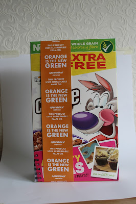
Studio Brief 2 was about tackling an issue, and I was very enthusiastic about my chosen issue of endangered animals and the threat of extinction. It was fulfilling to design something that could have real-world applications and have the potential to make a change to the better, especially since the issue I worked with is quite emotional and important to me. The outcome I created for this brief I believe are quite innovative and interesting. It's an unconventional means of certifying products, and I believe it would be far more effective than existing methods due to it's unavoidability and boldness. The execution of the concept/ideas, however, I believe was a little rushed and could have been more developed. Although I am happy with the outcomes and believe they communicate the brief and my intentions adequately, with further development I feel like the project could have been even more effective and successful. I especially liked the colour scheme of my designs, a bright orange and 'greenpeace' green work well together and make each other stand out. The 'orange strips' on products I believe worked very well in context and looked fairly professional. The amount of outcomes I produced for the campaign, could have been more. I could have expanded the campaign into social media and more digital platforms, rather than just focusing on print materials and the website. Overall, I am very happy with the outcomes I produced, and feel proud in coming up with a concept that had the potential to be a real solution to my issues. If it was applied in real life, I believe I could really help reduce deforestation due to the demand of palm oil, and in turn help endangered species and the threat of extinction by preventing the poor animals' habit from being destroyed for our human greed.