I have found this module to be very interesting, but at the same time challenging.
Studio Brief 1 was especially difficult for me, as we had to let go of our content and work on the design of someone else's. This would not usually be the issue, if the content I had received was equally as engaging and interesting to me. Unfortunately, the content of the publication I had to design was very unappealing and uninspiring to me. This affected my enthusiasm and commitment to design, and as a consequently made my final outcome not as successful and effective as it could have been. I realise that as a designer in the real world, you almost always have to design with other people's content, however even knowing this I struggled to dedicate myself to the work. On the other hand, I was quite happy with the way I interpreted the brief to work alongside my dislike of the content. I was able to create a concept of humorous and satirical design that I quite enjoyed executing. The final outcome for Studio Brief 1, although not some of my best work, still turned out to be have better quality, execution and concept than I expected.
Studio Brief 2 I found a lot more interesting and engaging. Design for screen is something I am more comfortable with as I had explored it in my first year. The content for the design was something that we got to choose, which I felt a lot happier and more excited about. My chosen media to design for was a car console interface. I choose this because it was something that from experience I knew would benefit from a re-design, and it would also be a challenge for me as the media is quite alien and unexpected. The concept and aims I created for the design I believe were really strong and appropriate. The final outcome, therefore, I was very happy with as I believe the design decisions I made helped to communicate my aims clearly. Of course, the final designs were not perfect, as there were some elements such as colour and button sizes that could have been considered more. However, overall I am very proud of what I achieved for Studio Brief 2, and am confident in exploring design for screen further.
Overall, it is noticeable that the design for screen brief I enjoyed and succeeded in far more than in the design for print brief. This may be due to the fact that I am more used to designing for screen, and less comfortable at designing for print. However, I still enjoyed both briefs and their production, and although I am not completely happy with my final outcomes, I am happy with the work I produced and confident in my abilities and potential to do better.
Monday, 20 November 2017
Friday, 17 November 2017
Smart Car Console - Final Design Feedback
- It is clear and well layed out.
- I do not like the purple, it is a bit dull.
- Maybe do mock ups of playlist/song covers.
- Keyboard seems too small, I have a touchscreen in my car and it is very fiddly and it has bigger letters than this.
- I think you should re-think the colours.
- All functions included are perfect, they're simple and you wouldn't want more as that may confuse.
- For the keyboard maybe have a voice search, it's really long and hard to type whilst driving.
- Good that it's simple and not distracting, as you need to focus in the car whilst driving.
- Good consistent design throughout.
- Simple, and easy to navigate.
- Nice consistent pictograms.
- Maybe have a siri mode.
- Colours look a bit similar to windows.
- Interface fits a car, as it's easy to use
- Maybe refine the colours
- I like the simplicity of the design and function.
- Colour scheme could be thought about more in relation to the audience.
- Really like the designs, they're simple and obvious, as well as easy to use.
- Size of the keyboard may be too small to type as driving, could be dangerous.
- I like they idea of separate colours and how they're connected to certain areas of interface.
- Colours may be slightly childish.
Wednesday, 15 November 2017
Smart Car Console - Final Designs
After establishing the typeface, colour scheme, and some initial layout and design elements, I continued to design the whole of my interface with the purpose and aim of the interface in mind.
The aim was for the interface to be as simple and stripped back as possible, so that any function of the interface could be reached within 3 steps. The purpose for the interface was for it to be quick and easy to use.
Home Screen
'Music' Category
'GPS' Category
'Phone' Category


The aim was for the interface to be as simple and stripped back as possible, so that any function of the interface could be reached within 3 steps. The purpose for the interface was for it to be quick and easy to use.
Home Screen
 |
| The home screen has 4 categories with each having a designated colour. |
 |
| Within the music category, there are a further 4 categories: Radio, Playlist, Spotify and Settings. The 4 sub-categories are distinguished with a different shade of purple. This was done so that the user is able to identify that they have navigated into the main 'Music' category, and different shades of purple were used to further allow the user a distinction of which sub-category they will be navigating/have navigated to. |
 |
When navigating into the 'Radio' sub-category, the user is able to see their pre-set favourite 8 stations.
At the top left of the screen, as well as on most screens within the interface, it is communicated where within the interface the user is currently at. This is communicated through both symbols associated with that part of the interface, and the one word explanation.
|
 |
After selecting one of the pre-set stations, they user is taken to a screen confirming their selection.
At the bottom left of the screen, as well as most screens within the interface, a back button is placed. This is so the user is able to go back to the previous page at any time throughout the interface.
|
 |
| Using the touchscreen, the user is able to swipe both ways and navigate between their pre-set 8 favourite stations. |
 |
| When navigating into the 'Playlist' sub-category, the user is shown the playlists from their connected device. The user is able to swipe between the sets of playlists if there are more than 8. |
 |
After selecting one of the playlists, the user is taken to a screen confirming their selection, at the same time as the playlist starts to play. The user is able to swipe both ways and navigate through the songs within that playlist.
At the bottom right of the screen, as well as in some of the screens within the interface, a speedometer symbol is shown. This is the only 'new' symbol that the user will have to learn the function for, as all of the other symbols used within this interface play on familiarity and function, as the user will most likely have seen and used that symbol before. This new speedometer symbol is the connection between the second part of this interface design, the design of the speedometer behind the wheel. The idea of this interface design is that it is linked with the speedometer behind the wheel which would also be a digital screen. By pressing the speedometer symbol on the main interface/console, the user is able to transfer the information from this screen onto the speedometer, to allow the information to be even more accessible and quick for the user.
|
 |
| When tapped on the search icon on the top right of the screen, a search bar and keyboard appear. The user is able to type the name of the song they wish to search for. As they type most relevant suggestions appear below the keyboard. |
 |
| If the initial suggestion is not the song the user was looking for, more relevant suggestions will continue to come up as the user continues typing. |
 |
| When navigating into the 'Spotify' sub-category, the user is shown their saved playlists from their connected Spotify account. They are able to swipe through the sets of playlist if there are more than 8. |
 |
| After selecting one of the playlists, the user is taken to a screen confirming their selection, at the same time as the playlist starts to play. The user is able to swipe both ways and navigate through the songs within that playlist. |
 |
| When navigating to the 'Settings' sub-category, the user is shown 8 Music setting functions they are able to control. By tapping one of the functions they would be taken to another screen showing them their options. |
 |
| Within the 'GPS' category, the user has the option of seeing their location, searching for a location, or selecting one of the 4 pre-set sub-categories for locations they may need to travel. Within 'Starred' and 'Recent' journeys there would be a list of locations. If the user was to tap 'Home' or 'Work', the GPS will automatically start the journey to that pre-set location. |
 |
| If the user taps on the search bar, the map and sub-categories will disappear allowing room for the keyboard to pop up. |
 |
| As the user types in the search bar, suggestions will appear underneath with the most likely locations the user is looking for. The user is able to scroll through the suggestions if needed. |
 |
| If the user taps to view their 'Recent' journeys, the journeys will appear in the style of the search bar. The journeys will have the 'Recent' symbol next to them to show the user what it is they are looking at. If the user was looked at 'Starred' journeys, a start would appear instead. |
 |
When the user chooses a location/journey, the map will flood the screen to allow the most clarity of information. The GPS system is in a similar style to Google Maps, as it is the most familiar and easy to use. The top part of the map shows the directions the user is to take, the bottom part shows the journey statistics, as well as the speed limit which updates as the user drives down different roads.
|
 |
| Within the 'Phone' category, the user has the option of quick calling one of the pre-set 3 main contacts, or looking at the sub-categories of 'Starred', 'Recent', 'All' and 'Missed [Calls]'. The contacts and their pre-sets are controlled through the connected device/mobile. |
 |
| If the user navigates to the 'Starred' sub-category, the screen will display the 6 pre-set 'Starred' contacts. The top right of the screen gives the symbol and option to search 'All' contacts within any sub-category, and the bottom right of the screen gives the symbol and option to create a group call. |
 |
| When the user choses a contact to call, the user is taken to a screen confirming their selection. For the duration of the call, the phone icon will be green to show to the user that the call is connected. This will also be confirmed by the timer below the contact name. The user at this stage also has the option of adding a contact to create a 'Group Call'. |
 |
| When the user or the person they are speaking to ends the call, the phone icon will turn red to show to the user that the call is disconnected, and shortly after, the screen will fade away back into the part of the system that the user made the call from. |
 |
| If the user decides to create a 'Group Call', they will be given the option of selecting the contacts from the sub-category within which they pressed the option. So, if the chose 'Group Call' within the 'Starred' sub-category, the user can only select any of the 'Starred' contacts for the group call. |
 |
| If the user creates a 'Group Call', he will see all of the contacts involved in the group call on the screen. The green phone icon within each individual circle will confirm the connection of the call. |
'Car' Category
 |
| Within the 'Car' category, there are 4 sub-categories: Service, Driving, Bluetooth and Display. The 4 sub-categories are distinguished with different shades of blue. |
 |
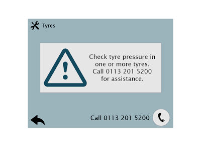
| Within the 'Service' sub-category, there are 8 service topics. If there is something that requires the users attention, the icon will change to an exclamation mark within a triangle, and the colours will be inverted to draw the users attention. |
 |
| When the user selects the service needing their attention, the user will be taken to a screen confirming their selection and the need for attention. Some form of information regarding the service will be given, and an assistance number provided if needed. The bottom right of the page also has a short-cut to call the assistance number straight away if the user wanted to. |
 |
| If the user selected a service without their being any attention or warning symbols on it, the user will be taken to the general service information screen. This will provide a rough idea of how the service is performing and roughly how long until the service will need to be addressed again. |
 |
| Within the 'Driving' sub-category, the user is provided with 8 driving function he is able to control. |
 |
| When selecting one of the functions, the user is given the details of what he is able to control, and the choice to do so. In this case, the driver can chose to turn off and on 'Side collision warning' and 'Lane departure warning'. |
 |
| To show which option the user has chosen, it will be highlighted in blue with white text. The option that was not chosen will be in white with blue text. |
 |
| Within the 'Bluetooth' sub-category, the user is shown which device the interface/console is connected to. He is also provided with 4 options to make changes to the connected device: 'Disconnect', '[View] Paired Devices', 'Connect New Device' and 'Delete Devices'. |
 |
| Within the 'Display' sub-category, the user is able to chose from 8 different function he can control. These functions allow the user to personalise and customise their experience with the user interface, as well as make some technical/functional changes to the interface. |
As the console/interface design is for a car, something that had to be considered is the night mode. For the console/interface to be safe, it has to have a night mode that can be manually or automatically activated for when it gets dark. If this was not an option, the console/interface would glow in the drivers face and not only distract them, but also obscure their vision. For this reason, I also created a 'Night Mode' version of the interface above, which utilised the same designs and colours, but with a more muted and appropriate atmosphere for driving in the night.


Subscribe to:
Comments (Atom)