- Make it a temporary way finding system, as part of something like a festival happening in Leeds.
- Look into the ordinance survey, and other maps. Look at the line qualities they use to represent different paths and locations.
- Think about adding distance markers, so the audience know how far away each location is.
- Don't have one line, cut it into fragments.
- Don't make the pattern designs too complex, keep the building and land qualities of the skylines.
- Think about using just one colour throughout the whole system, and focus your design on the line patterns.
- Maybe look into the colours used for paths within maps/the ordinance survey.
The Ordinance Survey/Map Research:
 |
| Fig.1 |
 |
| Fig.2 |
 |
| Fig.3 |
 |
| Fig.4 |
In response to my crit feedback, I researched into the ordinance survey and design ideas behind maps. Looking at the ordinance survey key (Fig.1), I saw a variety of line patterns and qualities that I could incorporate into my design development. The 'public rights of way' section (Fig.2) was especially interesting as it contains a series of line styles that are all evidently different, but at the same time still look as part of the same system. The fact that they are 'public' rights of way also makes an appropriate connection between the research and my project, as the way finding system I am creating will also be available to the public.
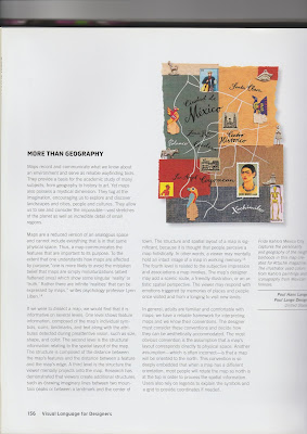
Within the book 'Visual Language for Designers' by Connie Malamed, I read up the section titled 'More than Geography' (Fig.3 and 4). There it speaks of the idea that a map 'communicates the features that are important to its purpose', as well as that 'there are infinite 'realities' that can be expressed by maps'. This creates a debate between objectivity vs. subjectivity, whether a map is a map only when it communicates exactly what is needed, or whether the idea of a map can be interpreted by each individual designer. This made me re-consider the rationale I had set myself for this project. I aimed for my way finding system to be objective, for the design process to not be influenced by my personal opinions or judgements. However, throughout the project I had noticed that my personal opinions had in fact effected design development; there had been design ideas which could have been more appropriate for the audience, that I rejected. An example of this is the differentiate of the different skylines/routes using colour (Fig.5). I have rejected this idea due to my personal opinion that the use of colour is boring and too obvious. From the audiences' perspective, differentiating my way finding system using colour may be a lot easier for them to understand. The audience would not be looking at my way finding system as a designer, so they would not see anything 'boring' or 'too obvious' about the use of colour. Although I had aimed for my way finding system to be objective, there is nothing wrong with it being subjective. The needs and requirements that my audience have are still being met, but just more subtly than they would expect. Like 'there are infinite 'realities' that can be expressed by maps' so there are infinite ways to express the idea of maps.
 |
| Fig.5 |
No comments:
Post a Comment