Design Development:
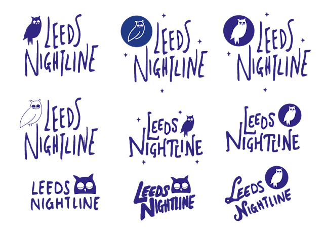
After my initial idea sketches, I took the design of the logo into digital development. I first looked at the owl element of the design, and tried some vector drawings/shapes that could represent the animal in an easy and not overly complicated way. I used my research and focused on the owl's eyes, beak and body shape to create the designs.
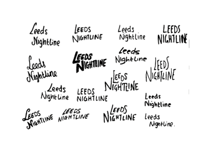
Drawing from my initial idea sketches, I then combined the handwritten type with my vector drawings. Some quick initial feedback had revealed that the handwritten type that I have used in the first line of the above image was the most interesting and appropriate for the brief. This was because the handwritten type looks quite delicate and soft, due to its elongated letterforms and the way the letterforms are composed in relation to one another. The vector illustrations of the owl proved to fit quite nicely within the logotype designs, and created an atmosphere for the branding that I think is quite appropriate. The illustrations paired with the handwritten type makes the designs feel soft and welcoming. The colour of navy blue that I have chosen to work with not only meets the brief requirement, as they had asked for the colour blue, but also connotes 'nightime'. This is appropriate because the service is open and used during the night, and so fits in with the darker atmosphere and calm feel of the night.
Feedback:
During the feedback session, I had shown the design work I had done up to date, and asked for feedback relating to how appropriate it was for the target audience, as well as any other comments and criticism my peers/tutors had.
- The owl illustration doesn't quite match the handwritten type, maybe it could also be drawn.
- I don't agree [with the above feedback], I feel like there is a nice balance between the handwritten and the clean illustration. If it was all done by hand it might be too shabby/rough.
- Maybe try working with just the owl's face and the type.
- I think it works for the target audience, because the vibe is friendly and 'nice'. It feels safe.
- Don't have the owl as sleeping, it doesn't make sense as the service is 'awake' at night.
- Maybe play around with the composition a bit more.
- The handwritten type is effective, I say carry on with that.
- I like the little stars, it adds a calming and trusting vibe to it.
- Text may be a little illegible, although it is the most interesting/appropriate out of all of them.
- The choice of colour I think is appropriate, as it makes it more serious and professional in a way, but also trustworthy/reliable.
Design Development:
One of the points at feedback was that the type/text may be a little illegible, but that the style of it was the most appropriate. Therefore, I decided to go back and try to create some more handwritten type examples in the same style as the favoured one, but give the letterforms more clarity. This proved quite difficult, as re-creating the style again was challenging due to the natural way letterforms become skewered through writing. Although some of the handwritten designs were not as good, I still managed to work with them.
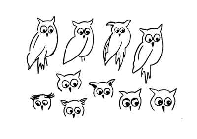
Another piece of feedback suggested that I try and create the owl imagery/illustration in the same hand-made style as the lettering. Taking that into consideration, I attempted to drawn some owl imagery by hand. This was quite challenging, as to get the owl drawings in the same style as the lettering, it had to be not too complicated and quite quickly drawn, to get sharp and confident lines. However, this in turn made the drawings visually poor. Nonetheless, I decided to see how they would work with the text.
Another piece of feedback I heavily took on board was that I should not make the owl sleep, as the nightline service is 'awake' at night. This was something that had skipped my mind and would have made the designs of the logo look quite silly if it had not been pointed out. Because of this, when doing the owl drawings by hand, and further digital developments of the illustrations, I made sure to have the owls' eyes open.
Experimenting with putting the hand drawn owl illustrations with the text proved to be unsuccessful. The consistency of the line widths, and the overall style of the logo designs looked inconsistent. The drawing, themselves quite poor, made the quality and professionalism of the overall design weaken, therefore I decided to go back to my digital owl illustrations and work with them.
Trying out different handwritten type earlier within the same style of lettering, again proved to not be as successful as the previous design. It made the logotype design feel unbalanced and gave the design a sketch-like overall look and feel. I decided that the previous handwritten lettering was far more effective and appropriate for the logo, and that any issues about legibility could be dealt with by scaling the logo and by placing it on the right coloured backgrounds.


No comments:
Post a Comment