
Final Outcome
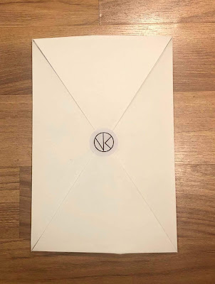
The outcome for this brief is branding for photography student Victoria Kathryn. The branding includes a logo design, business card designs and a promotional mail pack design. The concept for branding was inspired by Victoria's use of colour and shapes, and her focus on sustainability. The logo design is made up of an icon and text. The icon is a play on the shapes used within Victoria's photographs to create her initials 'V' and 'K', and within a circle to subtly represent a camera lens. The text within the logo uses the typeface 'Interstate' in Regular and Light weights. This sans serif typeface was chosen due to its minimalism, and the way it visually complements the icon design. The business card designs utilise the clients' Victoria's photography on the back, and presents the logo design and her contact information on the front. The photography used for the business cards were derived from Victoria's series about sustainability, and includes 4 photographs, 2 of still life objects and 2 of living plants. These 4 photographs were chosen to allow Victoria the choice of tailoring which business card to hand out to who. The front of the each business card reflects and hints at the photograph on the back, by extracting one shape and colour. This was done to create a connection between the front and back design of the business cards. The logo design on the business card is large to draw the audience's attention, and inform them Victoria's name and the service she provides. The contact information also uses the typeface 'Interstate' in a Light weight, to uphold cohesion across all branding materials. The promotional mail pack design includes 5 of Victoria's photographs and one business card, inside a envelope-style folder. The photographs are also taken from the clients' Victoria's series about sustainability, and are printed on 'Museum Heritage' paper stock to give them a rough texture and enable vibrant colours. Each photograph print includes a white boarder to frame the photographs in a professional manner, as well as Victoria's logo design and contact information. This was done to enable each photograph to act as a promotion for Victoria, even if separated from the original mail pack. The business card is inserted into the mail pack via a small see-through tracing paper pocket. This was done so the business card is neatly presented, and also available for the audience to view even whilst still inserted in the mail pack. The envelope-style folder is a net design printed on A2 in 'Digi Wallpaper' paper stock, to make it sturdy but also easy to fold. The net was designed in a way that gives the folder height, allowing the photograph prints to fit snuggly in the mail pack. The design is mostly colourless, to reduce the use of ink and make it more sustainable. A design inspired by the colours and shapes within the clients' Victoria's photography is printed as a background for the photograph prints. This was done to give the mail pack an unexpected pop of colour, as well as to reinforce the branding and make the mail pack unique to the client. The promotional mail pack is closed shut with a sticker of the logo icon. The materials used for the production of the initial mail pack are not sustainable, but ideally for future reproductions recycled paper would be used. To reduce initial printing costs for the client Victoria, a universal front cover design for the business cards was also created, so that it could be used together with all 4 back cover photographs. This universal business card was printed on paper stock made from recycled cotton t-shirts.
Evaluation
The brief was to create branding materials for photography student Victoria Kathryn, which reflected her practice and showcased the focus on sustainability that is present within her photography. I believe the final outcomes have been successful at meeting the aims of the brief, because the concept for all branding materials has been inspired by Victoria's photography, and the designs considered the use of ink and recycled materials. The concept for branding was inspired by Victoria's use of colour and shapes within her sustainability projects. All three branding outcomes, the logo, business cards and promotional mail pack, utilised colours and shapes in a way that created a branding identity, and makes all outcomes cohesive and representative of Victoria's practice. The design of all outcomes also considered reducing the use of ink to showcase Victoria's focus on sustainability. The logo design is minimal utilising simple lines and thin typography line weights. The business card designs also use thin typography line weights, as well as reduced opacity of colours. The promotional mail pack is mostly colourless, with only branding identity and net guidelines present. To improve the outcome for this project, I believe I should have found and printed the promotional mail pack with the appropriate recycled paper stocks and even inks. The final outcome pictured is only a mock-up version created using non-sustainable paper stock. Although my client was happy with the structure and texture of this outcome, when created using recycled materials the outcome may be very different, which may affect how the mail pack is presented and how my client responds to it. Also, I believe I could have developed the design of the promotional mail pack folder further. Although it succeeds at using less ink, it only does so because it is quite a simple and plain design, which also makes it slightly boring. To improve, I could have explored more sustainable design and production techniques that would have allowed me to make the mail pack design more visually engaging. Nonetheless, I believe the final outcomes for this brief have been successful because not only did they communicate clearly who my client Victoria is as a photographer, and her focus on sustainability, but they also made her very happy and created a photographers branding identity that is unordinary and meaningful.


No comments:
Post a Comment