Monday 27 February 2017

Studio Brief 1: Initial Book Cover Design Ideas


From my initial idea sketches above, I selected what I believed to be the strongest concepts and expanded my ideas on a larger and more in-depth scale.

Fig.1
Fig.1 shows my first idea. I wanted the cover to be fairly typographical, focusing on the title of the book and subtle illustrations within the letterforms. The letter 'I' within 'Kill' would extend down as an arrow and pierce the letter 'O' within 'Mockingbird'. The 'O' would be a small illustration of the bird itself. The typeface I wanted to be quite neutral, to allow the focus on the subtle illustrations, so a possible choice of Helvetica, Futura or some other sans serif font would be made. Although the concept is fairly obvious and taking the title of the book literally, I thought that the outcome could potentially be very visually pleasing and something that, even though it is expected, hasn't been done before.

Fig.2
Fig.2 shows my second idea. I wanted this to also be typographical, focusing once again on the title of the book and manipulating the letters forms. This time I only wanted to work with the word 'KILL' and to create it out of feathers. The feathers would act as a reference to the mockingbird. I could possibly use photography of real feathers or abstract drawings/silhouettes. I wanted the design to be minimal and to work with just black and white, and possibly some red accents to add some intriguing details and drama. The typeface I also wanted to keep minimal, so a neutral Helvetica, Gill Sans or similar sans serif typeface would be used. The concept, although quite minimal, had the potential to be strong and impactful if all the design details were closely taken into consideration and well executed.

Fig.3
Fig.3 shows my third idea. For this cover design I wanted to focus around the imagery. The front and back would have a grid-like layout of various different objects that are mentioned throughout the story, and that hold strong meanings. The objects would be strategically scaled and placed vector drawings. For the choice of colour I planned to reference the deep south that the story is set in, possibly working with neutral earthy and orange tones, however, I was not set on this and was open to other colour considerations. The choice of typeface I planned on would be Futura, because it is not only neutral, but is also modern and has a distinct personality. I felt that overall the concept had a potential to be interesting and striking, if the execution of it was well done and polished.

Fig.4
Fig.4 shows my fourth idea. Once again I wanted to work with typography and focus on subtle illustrations to convey the meaning of the title and the book. The letters 'I' in 'Kill', 'Mocking' and 'Bird' would extend and fall downwards as arrows. Small feather illustrations would appear as floating around the cover. The colours I had considered were brighter tones of orange, red or yellow, to make the cover more visually striking and attention grabbing. The typeface I wanted to work with would be a neutral sans serif like Helevetica or Gins Sans, and a 'Light' weight to create a relationship between the letterforms and the arrows. The concept, although quite simple, I felt had the potential to be very visually stimulating and eye-catching on a bookstore shelf. The only concern was whether this would be enough design to fill the space on the front cover effectively, and throughout the whole spread (front, spine and back) too.


Fig.5
Fig.6

Fig.7
Fig.8

Fig.9
Fig.5 to Fig.8 are quick initial digital mock-ups of each idea.

Having digitalised my first idea (Fig.1) in Fig.5 I found that the idea was much harder than I had anticipated, to execute it in a slick and smooth manner. The word 'Mockingbird' was a scanned and digitalised version of my hand-written and drawn letterforms, and this really shows in the design, with a noticable difference in stroke weights and angles. The letter 'r' also seems to look more like an 'e'. The concept had potential, however, from my initial mock-up I was quite disappointed and didn't see myself continuing with this idea, especially also because I felt I had stronger concepts within my other initial ideas.

Fig.6 is a digitalised mock up of my second idea (Fig.2). This was looking a lot more like my initial envision than the previous idea. The use of the feathers to create 'Kill' was very abstract and interesting looking but still legible. The contrast between the boldness of the 'Kill' and the delicate nature of the rest of the type created a strong impact. The small accents of red I felt also added the drama I was aiming for, and made the overall design of the title more intriguing. As just a front cover, I was happy with the design, however I was worried how this concept would translate across the wholes spread (front, spine and back).

Fig.7 & Fig.8 is the drawings and the digitalised mock up of my third idea (Fig.3). These are the vector drawing for the objects on the front cover, and I was very happy with them. They all look cohesive and have a certain style softness to them. The grid idea seemed to work, and the placement of the objects were complimentary of each other and allows all objects to be seen as individual but also as part of a whole. I was very proud of the drawings, but definitely wanted to develop the idea further to see how they would translate on the cover alongside the text and throughout the whole spread.

Fig.9 is a digitalised mock up of my fourth idea (Fig.4). The arrows and the 'floating' feathers seemed to work well with filling the space of the front cover, something that was a concern of mine at first. The relationship between the typeface weight and the arrows I was unhappy with at this point, because it made the placement of the arrows seem forced. The typeface of Gill Sans, however, I though was appropriate because of it's softness and didn't want to change that, so I knew that simply some design work was needed to create the relationship I was aiming for. I also needed to explore how the design and concept would work across the whole spread, and whether there was enough elements of design for that.

Feedback:

During our interim feedback, the most liked idea was the fourth idea (Fig.8 and 4) as my peers said it has the "most potential" and "looks very interesting, especially the arrows for the 'I's".
The other idea they also liked was the third idea (Fig.7 & 3), because they said that the it was "very meaningful and appropriate" and the illustration themselves "very clean and simple, but not boring".
Because of this, I decided to focus mainly on those two ideas when it came to my design development.

Friday 24 February 2017

Studio Brief 1: Study Task 02 - Book Cover Analysis

Designed by Sarah Jane Coleman

"...the most poignant moments [in the book] are those when the feared Boo Radley leaves his little gifts for Scout and Jem hidden in the tree, especially the tiny figurines of the children. That needed to be central to the image and in the end, it literally does form 'the spine' of the book. The other elements were Scout's tomboy clothing and the trees (forming play areas and hiding places)"

The intended message, as stated by Sarah Jane Coleman, was to communicated what to her were the most "poignant moments" in the book. I believe she wanted to show the innocence of the children by placing them in a setting of "play areas and hiding places". By making the "tomboy" aspect of Scout's clothing evident in the silhouette, I believe she also sends a message about the rule breaking of social norms that are present throughout the book; Scout choses to dress boyish in a society where she is expected to dress girly. The semiotic of the tree, and the hole in the middle which is composed on the spine, represents the narrative of Boo Radley within the book, and how he left them presents in the tree. This semiotic is effective because the tree in the story represents one of the main themes. To the children the idea of Boo Radley, at first, is that he is scary and supernatural, but when he begins to leave them presents in the tree, they begin to slowly view him as more real and human. This represents the children's maturity and the development of their understanding of the world, which makes the tree an important symbol for their growth.
I believe the cover overall is very successful, the layout and composition of it, with the tree spanning over both the front and back and using the spine as support, is very clever and effective. The use of silhouettes allows the messages to be communicated very clearly, and also adds a sense of mystery to the narrative, making it intriguing for the viewer. The colours used are earthly and neutral, but also quite gloomy and with a sense of drama, this represents the small-town concept of the setting of the story, and also the intensity of the events that happen within that small town.


Designed by Ally Simmons

"I wanted to recreate the feeling I got when I read the book for the first time. I made the cover with all the wonders Boo Radley put in the tree in my mind. I used sepia colors to evoke that feeling of timelessness."

The intended message of Ally Simmons' design was to create a sense of 'wonder', using the imagery of the tree and the objects that Boo Radley places inside. The character of Boo Radley, to Scout and Jem, is full of wonder and mystery, and communicates one of the main themes of maturity in the book, as the children grow to see Boo Radley as more and more human. The presents left in the tree are catalysts for this growth and so are appropriate visual representations for the story overall. However, I believe that this approach to communicating the book has been over-used and is an obvious visual approach. Although the illustrations are soft and childlike, making them effective in reflecting the main characters, and the colours effective in reflective of the time the story was set in, the concept overall feels expected and slightly boring. The contrast between the fullness of colour on the front cover and the opacity on the spine and back seems slightly pointless, and the illustration of the mockingbird on the back once again too obvious and out of context with the rest of the concept.
Concept aside, the execution of the book design is quite successful and the illustrations and composition of them is very effective and appropriate. The centre-focused front cover is appealing visually and would potentially stand out on in the book shop, even if the concept has been seen before.


Designed by William Heinemann

The intended message by William Heineman I believe was to communicate the drama and juxtapositions that occur throughout the book. The semiotics used are the flowers and the mockingbird. Flowers as a symbol appear multiple times throughout the book, as a symbol of innocent for Mayella Ewell, or a symbol of breaking stereotypes for Miss Maudie. Within this cover, I believe the flowers are used as a symbol of innocence, communicating that the mockingbird pictured also is the innocent. The use of the mockingbird is expected, however, because of the 50th anniversary edition I believe it is forgiving to use obvious imagery because the intent is not to completely re-design the representation of the book but to celebrate it. The mockingbird is also illustrated some what upside down, as if he is dead, that is also very literal and expected, but still forgiving due to the aesthetic of the cover as a whole. The use of colours is very contrasting and bold, the black and the red create very strong visuals of evil, death and blood, but also drama. The blunt grey as the background sets quite a sad mood, but also I believe was used for it's neutrality to allow the black and red to really stand out. The contrast of the innocence of flowers and the dead mockingbird, paired with the contrast of the black and red really compliments the imagery.
Overall, I believe this book cover design is successful because of it's attention to detail and appropriate use of colour. For the 50th anniversary release, especially, I believe it is appropriate because it takes the concepts and themes most commonly associated with the book and communicates them in a more modern, interesting and aesthetically pleasing way.

Wednesday 15 February 2017

Studio Brief 1: Study Task 01 - Book Analysis

To Kill a Mockingbird by Harper Lee


‘Shoot all the bluejays you want, if you can hit ’em, but remember it’s a sin to kill a mockingbird.’
A lawyer’s advice to his children as he defends the real mockingbird of Harper Lee’s classic novel – a black man charged with the rape of a white girl. Through the young eyes of Scout and Jem Finch, Harper Lee explores with exuberant humour the irrationality of adult attitudes to race and class in the Deep South of the 1930s. The conscience of a town steeped in prejudice, violence and hypocrisy is pricked by the stamina of one man’s struggle for justice. But the weight of history will only tolerate so much.


Author: Nelle Harper Lee (April 18, 1926 - February 19, 2016)
- 'To Kill a Mockingbird' was published in 1960.
- It is deemed as a 'classic of modern American literature'.
- The plot and characters are loosely based on Lee's observations of her family and neighbours, as well as the event that occurred near her hometown in 1936, when she was 10 years old.
- The novel was inspired by racist attitudes in her hometown of Monroeville, Alabama.
- Her father, a former newspaper editor and proprietor, practiced law and served in the Alabama State Legislature from 1926 to 1938. He once defended two black men accused of murdering a white storekeeper. Both clients, a father and son, were hanged. 
- The 1931 landmark Scottsboro Boys interracial rape case may also have helped to shape Lee's social conscience.
- In the book, Scout's friend Dill, is inspired by Lee's childhood friend and neighbour Truman Capote.
- Truman Capote, on the character of Boo Radley, mentions that "He was a real man, and lived just down the road from us. We used to go and get those things out of the trees. Everything she wrote about is absolutely true."
- Her other book 'Go Set a Watchman' was originally the first draft of 'To Kill a Mockingbird', but was later re-drafted into a sequel of the book. 
- The book was adapted into an Oscar winning film in 1962 by director Robert Mulligan, with a screenplay by Horton Foote.


Plot Summary:
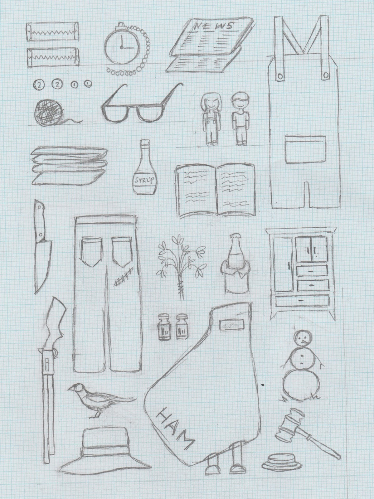
The story takes place during three years (1933–35) of the Great Depression in the fictional "tired old town" of Maycomb, Alabama, the seat of Maycomb County. It focuses on six-year-old Jean Louise Finch (Scout), who lives with her older brother, Jem, and their widowed father, Atticus, a middle-aged lawyer. Jem and Scout befriend a boy named Dill, who visits Maycomb to stay with his aunt each summer. The three children are terrified of, and fascinated by, their neighbor, the reclusive Arthur "Boo" Radley. The adults of Maycomb are hesitant to talk about Boo, and few of them have seen him for many years. The children feed one another's imagination with rumors about his appearance and reasons for remaining hidden, and they fantasize about how to get him out of his house. After two summers of friendship with Dill, Scout and Jem find that someone leaves them small gifts in a tree outside the Radley place. Several times the mysterious Boo makes gestures of affection to the children, but, to their disappointment, he never appears in person.
Judge Taylor appoints Atticus to defend Tom Robinson, a black man who has been accused of raping a young white woman, Mayella Ewell. Although many of Maycomb's citizens disapprove, Atticus agrees to defend Tom to the best of his ability. Other children taunt Jem and Scout for Atticus's actions, calling him a "nigger-lover". Scout is tempted to stand up for her father's honor by fighting, even though he has told her not to. Atticus faces a group of men intent on lynching Tom. This danger is averted when Scout, Jem, and Dill shame the mob into dispersing by forcing them to view the situation from Atticus' and Tom's perspective.

Atticus does not want Jem and Scout to be present at Tom Robinson's trial. No seat is available on the main floor, so by invitation of the Rev. Sykes, Jem, Scout, and Dill watch from the colored balcony. Atticus establishes that the accusers—Mayella and her father, Bob Ewell, the town drunk—are lying. It also becomes clear that the friendless Mayella made sexual advances toward Tom, and that her father caught her and beat her. Despite significant evidence of Tom's innocence, the jury convicts him. Jem's faith in justice becomes badly shaken, as is Atticus', when the hapless Tom is shot and killed while trying to escape from prison.
Despite Tom's conviction, Bob Ewell is humiliated by the events of the trial, Atticus explaining that he "destroyed [Ewell's] last shred of credibility at that trial." Ewell vows revenge, spitting in Atticus' face, trying to break into the judge's house, and menacing Tom Robinson's widow. Finally, he attacks the defenseless Jem and Scout while they walk home on a dark night after the school Halloween pageant. Jem suffers a broken arm in the struggle, but amid the confusion someone comes to the children's rescue. The mysterious man carries Jem home, where Scout realizes that he is Boo Radley.
Sheriff Tate arrives and discovers that Bob Ewell has died during the fight. The sheriff argues with Atticus about the prudence and ethics of charging Jem (whom Atticus believes to be responsible) or Boo (whom Tate believes to be responsible). Atticus eventually accepts the sheriff's story that Ewell simply fell on his own knife. Boo asks Scout to walk him home, and after she says goodbye to him at his front door he disappears again. While standing on the Radley porch, Scout imagines life from Boo's perspective, and regrets that they had never repaid him for the gifts he had given them.

Genre: A Southern Gothic and a Coming-of-age.
The grotesque and near-supernatural qualities of Boo Radley and his house, and the element of racial injustice involving tom Robinson contribute to the aura of the Gothic in the novel. Lee used the term 'gothic' to describe the architecture of Maycomb's courthouse and in regard to Dill's exaggerated morbid performance as Boo Radley. Outsiders are also an important element of Southern Gothic texts.

As a coming-of-age, Scout and Jem face hard realities and learn from them. Jem says to neighbour Miss Maudie the day after the trial, "It's like vein' a caterpillar wrapped in a cocoon ... I always though Maycomb folks were the best folks in the world, least that's what they seemed like". This lease him to struggle with understanding the separations of race and class, and therefore grow.

Motif: Gothic details and Small town life
Lee adds drama to the story by including a number of Gothic details in the setting and plot. The gothic elements within the book are the unnatural snowfall, the fire that destroys Miss Maudie's house, the children's superstitions about Boo Radley, the mad dog that Atticys shoots, and the ominous night of the Halloween party on which Bob Ewell attacks the children.

Contrasting the Gothic motif of the story is the motif of old-fashioned, small-town values, which manifest throughout the novel. Lee emphasises the slow-paced, good-natured feel of life in Maycomb. She often deliberately juxtaposes small-town with Gothic; the horror of the fire is mitigated by the comforting scene of the people of Maycomb banding together to save Miss Maudie's possessions.

Symbols: Mockingbird and Boo Radley
The 'mockingbird' represents the idea of innocence. Thus, to kill a mockingbird is to destroy innocence. A number of characters (Jem, Tom Robinson, Dill, Boo Radley, Mr.Raymond) can be identified as mockingbirds; innocents who have been injured or destroyed through contact with evil.
At the end of the book Scout thinks that hurting Boo Radley would be like "shooting' a mockingbird." After Tom Robinson is shot, Mr.Underwood compares his death to "senseless slaughter of songbirds".

Throughout the novel, Boo Radley is an important measurement of the children's development from innocence to grown-up moral perspective. At the beginning, Boo is merely a source of superstition. As he begins to leave presents for them, he becomes increasingly intriguingly and real to them. At the end of the novel, he becomes fully human to Scout. Boo is a mockingbird, and an important symbol of the good that exists within people.


Themes:

Morality
The book dramatises Scout and Jem's transition from a perspective of childhood innocence, in which they assume that people are good because they've never seen evil, to a more adult perspective, in which they have confronted evil and must now incorporate it into their understanding of the world. A subtheme is the threat that hatred, prejudice and ignorance pose to the innocent; Tom Robinson and Bood Radley are not prepared for the evil that they encounter, and as a result, they are destroyed.
The moral voice of the book is embody by Atticus Finch, who is unique in that he has experienced evil without losing his faith in the human capacity for goodness. He tries to teach this lesson to Jem and Scout to show them that it is possible to live with conscience without losing hope or becoming cynical. Scout is shown to gradually develop throughout the novel towards understanding Atticu's lessons, culminating when, in the final chapters, she at last sees Boo Radley as a human being.

Education
When Scout starts school, she is ahead of her classmates because Atticus has taught her how to read and write. However, once her teacher discovers this, she punishes Scout and tells her to not learn anything else at home, because her father does not know how to teach properly. This is the first clear conflict between institutional education and education at home. When Scout comes to Atticus with concerns about her education, he tells her that she must continue going to school, even if she finds it frustrating, but he will continue to teach her at home. Clearly, Atticus understands the faults of the educational system, but also knows it is necessary for his children to pass through this system to be a part of society. At the end of the novel, Scout notes that she has learned probably all there is to learn, except maybe algebra. She understands that life experiences are the true teachers, and that Atticus has taught her more than school ever will.

Social Inequality
Scout and Jem spend a great deal of time trying to understand what defines and creates the social strata. Scout tends to believe that "folks are just folks", while Jem is convinced that social standing is related to how long people's relatives and ancestors have been able to write. Scout and the other children have a very clear understanding of the social inequalities in their town, but see these inequalities as natural and permanent. The finch family falls rather high up in the social hierarchy, while the Ewell family falls at the bottom. Maycomb's black population fall beneath all white families, including the Eweels, whom Atticus labels as "trash". Scout understands the social structure, but doesn't understand why it is so; she believes that everyone should be treated the same, no matter what family they are from.

Racism
During the Depression era, blacks were still highly subjugated members of society. Blacks were not permitted to commingle with whites in public settings, as exemplified in the courthouse physical separation of races and in the clearly distinct black and white areas of town. Things like intermarriage were almost unheard of, and sorely looked down upon. Mr. Raymond, a white man who married a black woman and has mixed children, reveals that he pretends to be an alcoholic by carrying around a paper bag with a bottle of Coca-Cola inside in order to let the town excuse his choice of marriage. Tom Robinson is convicted purely because he is a black man and his accuser is white. The evidence is so powerful in his favor, that race is clearly the single defining factor in the jury's decision. When Atticus loses the trial, he tries to make his children understand that although he lost, he did help move along the cause of ending racism as evidenced by the jury's lengthy deliberation period. Usually, such a trial would be decided immediately.

Adjectives to describe the book:
Injustice, Innocence, Morality, Compassion, Courage, Prejudice, Cultivation, Southern, Gothic, Growth


Friday 10 February 2017

Module Evaluation

During this module, I had found myself facing problems and challenges I had never encountered before. The wayfinding project was very open-ended, and at first I struggled with choosing a concept knowing that I will have to carry out all the design stages for it myself. The project, in a way, was to create something from nothing, a design approach I've almost always avoided. The idea I choose was something that I myself found interesting, which I realised helped me to feel more comfortable as well as helped to generate ideas. What I found most challenging, however, was the knowledge that the ideas I had been developing were still out of my reach as a designer. To come up with the final outcomes I had to hop between softwares and the tools/techniques I was familiar with, and was continuously still unhappy with the results. Even now, I am not a hundred percent happy with the work I had produced, because I know that I could have done better if I had motivated myself more. However, even though I struggled with visually producing work in the way I imagined it, I still found myself developing my software skills and learning little new things.

Personally, what is most disappointing to me are my wayfinding 'on site' mock-ups. I had never attempted to create perspective mock-ups before and significantly struggled with it, which I'm sure is evident in the mock-ups themselves. What I should have done was taken a different approach into presenting my final outcomes, an approach I was more comfortable with, such as the analogue. Hand collages or even real-life applications of my wayfinding system would have been a lot more appropriate and effective than the poor digital attempts.

Within the second Studio Brief, I had done the opposite and worked by hand, making my battery packaging into 3D and photographing it. I believe the difference between my skill in digital and analogue is clear across my design boards. What to take away from this module is that I shouldn't attempt or expect brilliant results from techniques I am not familiar or comfortable with, but rather stick to what I know until I can gain enough practice to do the other stuff successfully. 

In comparison to the last module, however, I have hugely developed. My understanding of layout designs, colour, and presentation has noticeably advanced. I feel a lot more comfortable with the idea of starting design work on a blank piece of paper, and have a much better understanding of the building blocks of the design process. I feel as if I am gaining a more professional understanding of design and can critique others' work a lot more constructively. I am also starting to enjoy more and more the process of creating work, and starting to feel more proud of it. Overall, this module. although at times frustrating, has helped me to develop as a designer, and the conclusion of it makes me feel excited for new things to come.

Tuesday 7 February 2017

OBJECT - Evaluation

I believe that the final outcome for this brief has been succesful it it’s communication of my intentions. The packaging reflects all the charactersitsics I aimed for in my rationale.The only set back I think is that, although the final outcome is clean and aesthtically pleasing it it’s design, it only weakly communicates the research I had done at the start of the brief. I could have refered to my research throughout my design process, and that possibly could have influenced even more ineteresting results.

The design decisons I’ve made throughout the project I feel were appropriate. The thoughtful and researched use of colour, in relation to the emotions, has especially aided my design process and gave me more confidence in the idea, as well as the production process. The design of the box packaging, I believe could have benefited with some more attention. The battery packaging design is a variation of the individual colours, along with white and black text, whereas the battery packaging is grey with only white text. I feel as if this slightly flaws the consistency of design, and is definitely an area for improvement. 

The idea behind the cut out slit to see inside the box packaging also could have been more considered. Because the project was focused mainly around colour, showing only a small slit of it within the design of the packaging feels lacking. During peer feedback, it was suggested that I had made the box packaging from acetate. I agree with this because that way, the battery packaging would be the centre of attention and the box packaging just another tool to showcase the uniqueness of the product. 

As well as recieving feedback, giving it has helped me to develop my own decision making process. It helped me to look at my work from a different perspective and to ask myself what I would suggest if this was someone else’s work. This mind set influenced only a few of the minor design decisons, however, I feel they were equally as important to the overall success of the final outcomes. 


Overall, I am happy with the outcome of this brief, and although there are areas for improvements and things I could have done differently, the end product still meets my initial intentions and makes for an interesting concept of design.

Friday 3 February 2017

OBJECT - Final Outcome and Final Crit


Final Crit Feedback:
- Well thought out and appropriate colour choices.
- The concept/packaging has an 'IKEA' style.
- Maybe try white packaging instead of grey- it would link your battery packaging with the box packaging more.
- Clear acetate packaging could show off the battery packaging even more.
- Consider whether each box should have a variety of battery designs, or the same battery designs.
- The cut in the box is effective as it shows off the colours of the designs well.