From my initial idea sketches above, I selected what I believed to be the strongest concepts and expanded my ideas on a larger and more in-depth scale.
 |
| Fig.1 |
Fig.1 shows my first idea. I wanted the cover to be fairly typographical, focusing on the title of the book and subtle illustrations within the letterforms. The letter 'I' within 'Kill' would extend down as an arrow and pierce the letter 'O' within 'Mockingbird'. The 'O' would be a small illustration of the bird itself. The typeface I wanted to be quite neutral, to allow the focus on the subtle illustrations, so a possible choice of Helvetica, Futura or some other sans serif font would be made. Although the concept is fairly obvious and taking the title of the book literally, I thought that the outcome could potentially be very visually pleasing and something that, even though it is expected, hasn't been done before.
 |
| Fig.2 |
Fig.2 shows my second idea. I wanted this to also be typographical, focusing once again on the title of the book and manipulating the letters forms. This time I only wanted to work with the word 'KILL' and to create it out of feathers. The feathers would act as a reference to the mockingbird. I could possibly use photography of real feathers or abstract drawings/silhouettes. I wanted the design to be minimal and to work with just black and white, and possibly some red accents to add some intriguing details and drama. The typeface I also wanted to keep minimal, so a neutral Helvetica, Gill Sans or similar sans serif typeface would be used. The concept, although quite minimal, had the potential to be strong and impactful if all the design details were closely taken into consideration and well executed.
 |
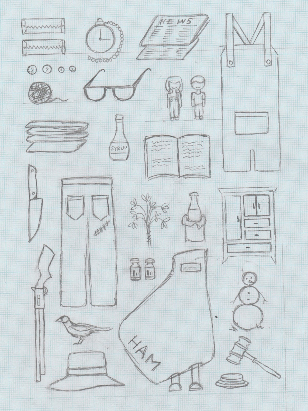
| Fig.3 |
Fig.3 shows my third idea. For this cover design I wanted to focus around the imagery. The front and back would have a grid-like layout of various different objects that are mentioned throughout the story, and that hold strong meanings. The objects would be strategically scaled and placed vector drawings. For the choice of colour I planned to reference the deep south that the story is set in, possibly working with neutral earthy and orange tones, however, I was not set on this and was open to other colour considerations. The choice of typeface I planned on would be Futura, because it is not only neutral, but is also modern and has a distinct personality. I felt that overall the concept had a potential to be interesting and striking, if the execution of it was well done and polished.
 |
| Fig.4 |
Fig.4 shows my fourth idea. Once again I wanted to work with typography and focus on subtle illustrations to convey the meaning of the title and the book. The letters 'I' in 'Kill', 'Mocking' and 'Bird' would extend and fall downwards as arrows. Small feather illustrations would appear as floating around the cover. The colours I had considered were brighter tones of orange, red or yellow, to make the cover more visually striking and attention grabbing. The typeface I wanted to work with would be a neutral sans serif like Helevetica or Gins Sans, and a 'Light' weight to create a relationship between the letterforms and the arrows. The concept, although quite simple, I felt had the potential to be very visually stimulating and eye-catching on a bookstore shelf. The only concern was whether this would be enough design to fill the space on the front cover effectively, and throughout the whole spread (front, spine and back) too.
 |
| Fig.5 |
 |
| Fig.6 |
 |
| Fig.7 |
 |
| Fig.8 |
 |
| Fig.9 |
Fig.5 to Fig.8 are quick initial digital mock-ups of each idea.
Having digitalised my first idea (Fig.1) in Fig.5 I found that the idea was much harder than I had anticipated, to execute it in a slick and smooth manner. The word 'Mockingbird' was a scanned and digitalised version of my hand-written and drawn letterforms, and this really shows in the design, with a noticable difference in stroke weights and angles. The letter 'r' also seems to look more like an 'e'. The concept had potential, however, from my initial mock-up I was quite disappointed and didn't see myself continuing with this idea, especially also because I felt I had stronger concepts within my other initial ideas.
Fig.6 is a digitalised mock up of my second idea (Fig.2). This was looking a lot more like my initial envision than the previous idea. The use of the feathers to create 'Kill' was very abstract and interesting looking but still legible. The contrast between the boldness of the 'Kill' and the delicate nature of the rest of the type created a strong impact. The small accents of red I felt also added the drama I was aiming for, and made the overall design of the title more intriguing. As just a front cover, I was happy with the design, however I was worried how this concept would translate across the wholes spread (front, spine and back).
Fig.7 & Fig.8 is the drawings and the digitalised mock up of my third idea (Fig.3). These are the vector drawing for the objects on the front cover, and I was very happy with them. They all look cohesive and have a certain style softness to them. The grid idea seemed to work, and the placement of the objects were complimentary of each other and allows all objects to be seen as individual but also as part of a whole. I was very proud of the drawings, but definitely wanted to develop the idea further to see how they would translate on the cover alongside the text and throughout the whole spread.
Fig.9 is a digitalised mock up of my fourth idea (Fig.4). The arrows and the 'floating' feathers seemed to work well with filling the space of the front cover, something that was a concern of mine at first. The relationship between the typeface weight and the arrows I was unhappy with at this point, because it made the placement of the arrows seem forced. The typeface of Gill Sans, however, I though was appropriate because of it's softness and didn't want to change that, so I knew that simply some design work was needed to create the relationship I was aiming for. I also needed to explore how the design and concept would work across the whole spread, and whether there was enough elements of design for that.
Feedback:
During our interim feedback, the most liked idea was the fourth idea (Fig.8 and 4) as my peers said it has the "most potential" and "looks very interesting, especially the arrows for the 'I's".
The other idea they also liked was the third idea (Fig.7 & 3), because they said that the it was "very meaningful and appropriate" and the illustration themselves "very clean and simple, but not boring".
Because of this, I decided to focus mainly on those two ideas when it came to my design development.


No comments:
Post a Comment