 |
| Designed by Sarah Jane Coleman |
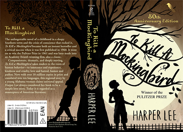
"...the most poignant moments [in the book] are those when the feared Boo Radley leaves his little gifts for Scout and Jem hidden in the tree, especially the tiny figurines of the children. That needed to be central to the image and in the end, it literally does form 'the spine' of the book. The other elements were Scout's tomboy clothing and the trees (forming play areas and hiding places)"
The intended message, as stated by Sarah Jane Coleman, was to communicated what to her were the most "poignant moments" in the book. I believe she wanted to show the innocence of the children by placing them in a setting of "play areas and hiding places". By making the "tomboy" aspect of Scout's clothing evident in the silhouette, I believe she also sends a message about the rule breaking of social norms that are present throughout the book; Scout choses to dress boyish in a society where she is expected to dress girly. The semiotic of the tree, and the hole in the middle which is composed on the spine, represents the narrative of Boo Radley within the book, and how he left them presents in the tree. This semiotic is effective because the tree in the story represents one of the main themes. To the children the idea of Boo Radley, at first, is that he is scary and supernatural, but when he begins to leave them presents in the tree, they begin to slowly view him as more real and human. This represents the children's maturity and the development of their understanding of the world, which makes the tree an important symbol for their growth.
I believe the cover overall is very successful, the layout and composition of it, with the tree spanning over both the front and back and using the spine as support, is very clever and effective. The use of silhouettes allows the messages to be communicated very clearly, and also adds a sense of mystery to the narrative, making it intriguing for the viewer. The colours used are earthly and neutral, but also quite gloomy and with a sense of drama, this represents the small-town concept of the setting of the story, and also the intensity of the events that happen within that small town.
 |
| Designed by Ally Simmons |
"I wanted to recreate the feeling I got when I read the book for the first time. I made the cover with all the wonders Boo Radley put in the tree in my mind. I used sepia colors to evoke that feeling of timelessness."
The intended message of Ally Simmons' design was to create a sense of 'wonder', using the imagery of the tree and the objects that Boo Radley places inside. The character of Boo Radley, to Scout and Jem, is full of wonder and mystery, and communicates one of the main themes of maturity in the book, as the children grow to see Boo Radley as more and more human. The presents left in the tree are catalysts for this growth and so are appropriate visual representations for the story overall. However, I believe that this approach to communicating the book has been over-used and is an obvious visual approach. Although the illustrations are soft and childlike, making them effective in reflecting the main characters, and the colours effective in reflective of the time the story was set in, the concept overall feels expected and slightly boring. The contrast between the fullness of colour on the front cover and the opacity on the spine and back seems slightly pointless, and the illustration of the mockingbird on the back once again too obvious and out of context with the rest of the concept.
Concept aside, the execution of the book design is quite successful and the illustrations and composition of them is very effective and appropriate. The centre-focused front cover is appealing visually and would potentially stand out on in the book shop, even if the concept has been seen before.
 |
| Designed by William Heinemann |
Overall, I believe this book cover design is successful because of it's attention to detail and appropriate use of colour. For the 50th anniversary release, especially, I believe it is appropriate because it takes the concepts and themes most commonly associated with the book and communicates them in a more modern, interesting and aesthetically pleasing way.
No comments:
Post a Comment