This module had been for me had been quite challenging, but also enjoyable.
The individual briefs I worked on were the RSA Moving Pictures, the penguin 'A Brief History of Time' book cover and the Leeds nightline logo.
The RSA Moving Pictures brief was the most challenging for me, as I needed to learn a new software, After Effects. I wanted to do this brief because I felt very strongly about the content of the audio clip, and what Tiffany Dufu was trying to communicate. The animation I did was based on the manipulation of typography. Even though I found the use of a new software challenging, it was also very enjoyable. I liked how I was able to apply the Adobe software skills and knowledge I already have, to create an interesting outcome. As this was the first time using this software, some lack in knowledge is I believe noticeable in the outcome, and the technical skills is something I can improve and work on for the future. Overall, I do feel that even with the basic skills that I learnt and used, I was able to portray my concept successfully, and created an outcome of a quality and standard that I wanted it to be.
The Penguin book cover design for ' A Brief History of Time' by Stephen Hawing was very interesting for me, as I enjoy looking into space and astronomy as a hobby. This brief allowed me to apply the knowledge I already had about the subject, and to give the design of the book cover my own approach. I mostly enjoyed working with the idea of making the cover unexpected, and unlike something that had been done before. I think this is what made the book cover successful.
The Leeds Nightline logo brief was a quick brief, on which I spent only a limited number of days. I found doing this quite challenging, as it didn't leave room for my ideas to sit with me and be considered more in depth. However, this process also taught me that the initial quick ideas can sometimes be the strongest, after they have had the right amount of development applied to them. Although the logo outcome has been effective for the brief, I do think that if I were to do the brief again, I would have a different final outcome.
The collaborative briefs I worked on were the D&AD Adidas and the collaboration with students from Nanyang University.
The Adidas brief I found to be challenging as it was lightly out of my comfort zone. I am not used to creating commercial designs, and was at first unconfident in my ideas. However, I approached the design for this brief with my own perspective, and found that I can use my skills that I feel are the strongest, and apply them to the brief, this way leaving a sort of signature on the designs. After getting into it, I found designing for this brief quite enjoyable, and learnt that brief outcomes do not have to follow strict rules, and cane be adapted to your style of design and your perspective. Working in collaboration, I found for this brief to also be slightly challenging. This was due to some instances of mis-communication, and not agreeing on a consistent and cohesive visual language to follow. Although this made creating designs for the brief harder, in the end I believe the brief came together, and even with issues with communication, the outcomes were successful.
The Ocean Heroes brief I found to be very enjoyable, as we were given the opportunity to work with students from Nanyang University in Singapore, as well as given free reign on how to respond to the brief. Working with the other students opened up our groups skill set, and allowed us to be more ambitious in our concepts and designs. The outcome we produced for this brief I believe were very successful because we paid a lot of attention to the target audience, and had fun whilst designing.
Overall, I believe this module for me has been a learning curve. I worked in collaboration with different students, learnt new software, and was able to create designs that I myself liked and enjoyed. The biggest problem I faced during this module was time management, I found myself rushing to complete work and blog posts and because of this I feel like some of the quality of my work may have suffered. However, in the end I am still very happy with the work I have produced, and am confident in continuing to develop and utilise all the things I learnt.
Showing posts with label OUGD503. Show all posts
Showing posts with label OUGD503. Show all posts
Wednesday, 21 March 2018
Wednesday, 14 March 2018
503 Adidas Brief - Final Designs (Website and App Mock Ups) & Feedback
Website:
 The website mock up of the logotype/banner and the drill cards is successful as both elements are consistent and cohesive. The colour story compliments each other and makes all the elements/illustrations/icons stand out. The balance of information on the page mimics the Adidas page, and communicates the Adidas brand well.

The player card is also successful as it fits neatly within the website player drill layout. The player card fits in well with the rest of the content/branding, even though it contains photography unlike the rest of the designs. The player card makes the page instantly more exciting and adds some personality.
App:

The player card within the app is not as successful as on the website, because it feels slightly too wide for the screen size and therefore to small on the phone screen. The player card for the app could have been better if it was altered for app/mobile screen use, or if the layout design of the app was composed in a way that could accommodate the player card for neatly. Nonetheless, the player card looks striking against the app layout design, and brings some colours, fun and personality to the screen.

The player cards within the drill also face a similar and more drastic problem than the pervious player cards. The app design allows only a small rectangular strip to accommodate for the player card imagery, therefore cutting a large part of the design off. However, the player names, colours and some icons/illustrations are still visible, making it easy to distinguish between the different players. Again, the colours and design of the player cards bring some colour and fun to the app design.

The drill cards within the app layout work successfully as they are the same format/size as they are on the website, therefore they do not need any editing. Each drill has been given enough space so that the viewer could distinguish between them easily. The vertical layout of them mimics the vertical stripes within the graphics which creates a nice balance within the app, and makes it visually appealing for the viewer/audience. The colours from the graphics liven up the page, and make it more encouraging to interact with. The humour element within the graphics is clear and easy to understand and engage with.
Feedback:
- I like the 'cut and paste' feel, as well as the illustrations.
- The colours and illustrations work very well.
- The graphics need to be more consistent. So in the video the line thickness and colours should be more like the illustrations and etc.
- 'Bossman' implies a 'man', so there's the possibility this would deter women/girls from choosing this drill. Could that be a problem?
- I concept/idea is very strong, however the execution and designs do not feel like they support the concept quite as well as they could.
- The humour elements work very well, it's funny and friendly at the same time.
- There's some inconsistency between layout design and the imagery design, they don't feel as if they belong together.


Monday, 12 March 2018
503 Adidas Brief - Design Development
Logo Design:

Following my initial sketches for the logo design, I went on to re-create some of my ideas digitally. I focused more on the idea of creating the letter 'A' for 'Adidas Ability' from the different Adidas-like shapes. I though these logos are all quite successful, as they are simple and easy to distinguish, but at the same time quite intriguing and purposeful. In the end, however, none of these logos were used, as when it came to the app and website layout design, my team member Serge did not incorporate neither mine nor his logo designs within the layout.
However, a form of a logotype was used instead. For the 'Adidas Ability' campaign, I created a sort of banner that could be used on the web/app platforms. This in a way turned into the campaigns logo, as it would sit on top of some navigational pages.

I decided to incorporate into the logotype the illustrations/icons I had created for the visual language of the campaign. I did this to give the logotype more personality, and to showcase to the target audience what kind of branding to expect. This logotype sets the tone for all the rest of the graphics/imagery content to come.
 We wanted a 'main' colour for the brand, and although yellow was quite striking, it felt too typical and expected, so I explored various different colours that could become the brands 'main colour'. I found that very bright colours made the type and illustrations disappear, and that the softer colours made them stand out more.
 The colour I choose in the end was a baby/light blue. This was because I believe that the colour is quite unexpected for a sports branding, and is also quite visually pleasing. The colour is calm and friendly, which makes it appropriate for our target audience of 17-25 year olds. I also looked at the positioning of the three signature Adidas stripes. I included the stripes in the first place so that there could be consistency between the main Adidas and the Adidas Ability brand. For the placement of the stripes, I wanted them to not overpower, but to enhance the logotype. That is why the simple yet effective three stripes rising up vertically was chosen. This symbolises how 'Adidas Ability' cane make you 'rise up' and 'become more' in a way, it symbolises positivity and growth.
 Looking back on the logotype design, I wanted to quickly explore how the icons/illustrations would look it they were not neatly collated above the name. Doing this revealed that if they were to be placed randomly over the page, the whole logotype/banner design losses balance and feels to unconsidered and unprofessional. Having the icons line up neatly on top of the world looks more serious and professional, as well as aesthetically pleasing.

The final logotype/banner design above is a slightly edited down version of the ones previously, there are less icons. I removed some of the icons because I felt that there were too many and they were making the logotype/banner seem too heavy and busy. By having less icons the logotype/banner feels more casual, friendly and approachable.
Drill Card Design:


After some feedback about my initial design, that they were a little bit "too much" and "over the top", I decided to try and make the drill cards less complex and overcrowded by utilising the illustrations within them. I also created additional illustrations of the items that I had already included within the initial design, but now they were less attention grabbing and more in cohesion with the rest of the branding.
Still, this illustration style felt a little bit too over the top, and so I wanted to simplify the composition and layout of the icons/illustrations. Also, to get rid of the fire element.
 After removing and changing some elements within the collage/composition, I was much happier with the look of the drill card. The layout/composition is now much cleaner and easier to understand. All the elements within the composition feel balanced, and the overall feel and atmosphere of the drill card is cohesive with the rest of the visual language/branding of the campaign.

 As I was happy with the expert 'Bossman' drill card, I then went on to create the medium skill 'bang average', and the beginner 'baby steps' custom illustrations and drill cards.


The colours I used for the skill levels are representative of the level, with baby steps being yellow, bang average orange and bossman red. The colour gradient helps to distinguish easily between the skill levels for the viewer and target audience, and can easily be adapted into various other drill exercises that could be added in the future.
Player Cards Design:
Having designed the icons/illustrations for the visual language of the branding, as well as the drill cards, I had a very strong visual identity that I could apply to the player cards. From my initial designs, I had kept only the imagery of the footballers in motion. This was because I felt that the motion pictures added a form of excitement to the designs. I also changed the name 'Adidas Ability' to the players actual names, to aid the users in distinguishing and recognising the players. I used the icons/illustrations within each player card to keep a cohesive and consistent design. Only the composition and the colour changes with each player. The different colours were assigned so that it could be easier for the viewer/audience to distinguish between the player drills, and also the colours can be used in the future to categories different drills and aid app/website navigation.


Drill Card Adaptation to Wesbsite/App:
Due to some communication issues between the team, the drills cards I had previously designed were the wrong format/size for the layout of the website and app. For this reason, I then had to go back to my design and edit them down to fit the layout format/size.
I wanted to try and keep the same humorous feel to the drill cards as I had previously, but just edit it down so I only needed a few elements to communicate the same message. Because of this, I choose to pick just one common group of illustration within each drill, and that was clothing. I realised that I can still easily and with humour communicate each category with just the top half of clothing. I used the same typeface and the signature three stripes within these re-designs, to keep the cohesiveness between the new drill cards and the rest of the content.


 I played around with the placement of the stripes, and decided upon mimicking the logotype/banner design I had previously done and having them rise upwards. This fits in well with the composition as it allows all elements of the design to stand out and be clear. It also symbolises positivity and growth towards success.

Following my initial sketches for the logo design, I went on to re-create some of my ideas digitally. I focused more on the idea of creating the letter 'A' for 'Adidas Ability' from the different Adidas-like shapes. I though these logos are all quite successful, as they are simple and easy to distinguish, but at the same time quite intriguing and purposeful. In the end, however, none of these logos were used, as when it came to the app and website layout design, my team member Serge did not incorporate neither mine nor his logo designs within the layout.
However, a form of a logotype was used instead. For the 'Adidas Ability' campaign, I created a sort of banner that could be used on the web/app platforms. This in a way turned into the campaigns logo, as it would sit on top of some navigational pages.

I decided to incorporate into the logotype the illustrations/icons I had created for the visual language of the campaign. I did this to give the logotype more personality, and to showcase to the target audience what kind of branding to expect. This logotype sets the tone for all the rest of the graphics/imagery content to come.


The final logotype/banner design above is a slightly edited down version of the ones previously, there are less icons. I removed some of the icons because I felt that there were too many and they were making the logotype/banner seem too heavy and busy. By having less icons the logotype/banner feels more casual, friendly and approachable.
Drill Card Design:


After some feedback about my initial design, that they were a little bit "too much" and "over the top", I decided to try and make the drill cards less complex and overcrowded by utilising the illustrations within them. I also created additional illustrations of the items that I had already included within the initial design, but now they were less attention grabbing and more in cohesion with the rest of the branding.
Still, this illustration style felt a little bit too over the top, and so I wanted to simplify the composition and layout of the icons/illustrations. Also, to get rid of the fire element.


The colours I used for the skill levels are representative of the level, with baby steps being yellow, bang average orange and bossman red. The colour gradient helps to distinguish easily between the skill levels for the viewer and target audience, and can easily be adapted into various other drill exercises that could be added in the future.
Player Cards Design:
Having designed the icons/illustrations for the visual language of the branding, as well as the drill cards, I had a very strong visual identity that I could apply to the player cards. From my initial designs, I had kept only the imagery of the footballers in motion. This was because I felt that the motion pictures added a form of excitement to the designs. I also changed the name 'Adidas Ability' to the players actual names, to aid the users in distinguishing and recognising the players. I used the icons/illustrations within each player card to keep a cohesive and consistent design. Only the composition and the colour changes with each player. The different colours were assigned so that it could be easier for the viewer/audience to distinguish between the player drills, and also the colours can be used in the future to categories different drills and aid app/website navigation.


Drill Card Adaptation to Wesbsite/App:
Due to some communication issues between the team, the drills cards I had previously designed were the wrong format/size for the layout of the website and app. For this reason, I then had to go back to my design and edit them down to fit the layout format/size.
I wanted to try and keep the same humorous feel to the drill cards as I had previously, but just edit it down so I only needed a few elements to communicate the same message. Because of this, I choose to pick just one common group of illustration within each drill, and that was clothing. I realised that I can still easily and with humour communicate each category with just the top half of clothing. I used the same typeface and the signature three stripes within these re-designs, to keep the cohesiveness between the new drill cards and the rest of the content.


Friday, 9 March 2018
503 Adidas Brief - Initials Ideas
Following the research, and several group discussions with my team, I knew what graphic content I needed to create to go towards the website and app. The name for the app/campaign we chose is 'Adidas Ability'. This is because the word 'ability' is positive and suggest that the app/campaign can allow the target audience to increase their ability in football.
The graphic content I needed to create was: Logo, Drill Cards, and Player Cards.
Logo Initial Ideas:

For the logo design, I first started with some sketches. I focused around making the logo an extension of the Adidas logo, this was because we wanted the app to be an extension of the Adidas brand, so having the logo play a tribute to their official logo feels appropriate and suitable. I looked into playing around with the mountain shapes, as well as the signature Adidas stripes. I explored creating a letter 'A' from those shapes, to reflect the name 'Adidas Ability'.
'Adidas Ability' Illustrations/Visual Language:
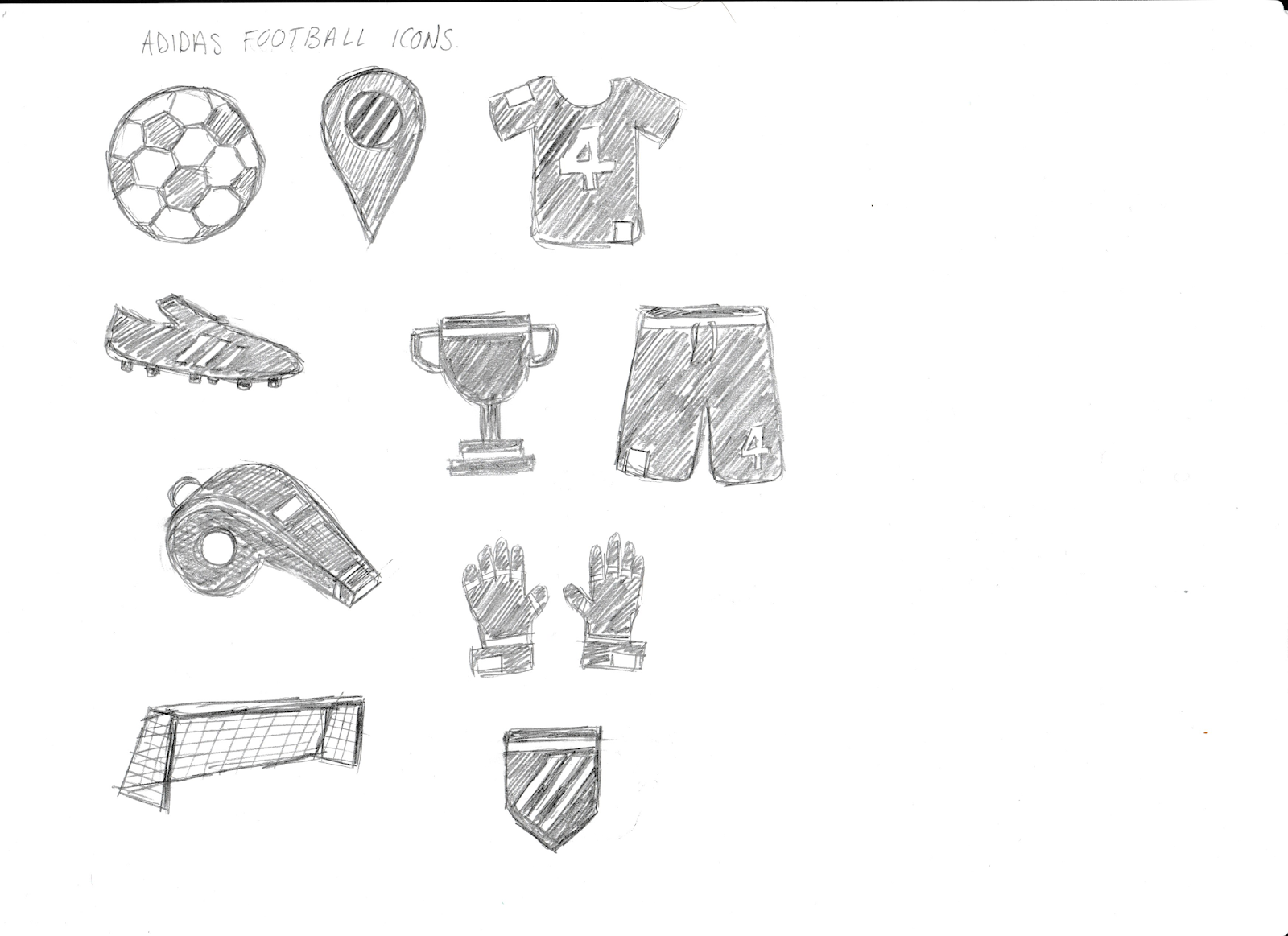
For the drill cards and player cards, I wanted to create a range of illustrations that could be used across the graphics/imagery. I wanted to do this so that I could create a visual language across all the material that would allow some cohesion to be formed. The illustrations I wanted to keep quite simple, and went for the obvious items associated with football. I though this would be appropriate as having something more abstract or obscure would not be understood by everyone and would exclude some members of the target audience. Also, the style of illustration could easily be applied for future projects and apps for different sport areas, clearly identifying both the difference in the sports, as well as the obvious relation to this initial campaign/Adidas app.

 After considering the icons and drawing the initial sketches, I went ahead to create them digitally as vectors. I choose a fairly thick line width so that the illustrations could be bold and could be applied against various backgrounds, making them versatile in their usage. I also kept them quite simple, so that they didn't feel too heavy on the viewers eyes and were easily identifiable.
Drill Card Initial Ideas:


As we wanted the app and the imagery within it to have a 'tongue and cheek' atmosphere, and play on humour, I came up with interesting and funny names and imagery that can be used for the drill cards. There are three initial drill routines, beginner, medium, and expert. The names gives to the drills are correspondingly baby steps, bang average and bossman. As the city we are focusing our app on is London, we wanted some of the language used to be relatable to Londoners, and so we utilised their slang to distinguish between the different skill levels.
For the imagery, here I started experimenting with the expert skill drill named 'Bossman'. The imagery I wanted for it to have was humours. For this reason I included within the collage a gold chain, black sunglasses and explosions; things stereotypically associated with 'cool' and 'boss'. I also included within the collage the illustrations/icons I had designed. This was so that I could start implementing the visual language across the design material.
The collage also includes product promotion for Adidas boots. I did this because it fits quite comfortably inside the collage, and makes for subtle product promotion for the Adidas brand.
Player Card Initial Ideas:

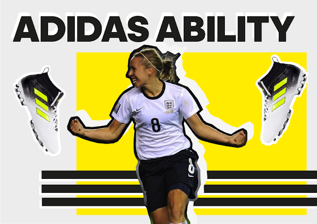


For the player cards, we decided that the football athletes that should be featured need to be Londoners. As the location for the app is London, it would inspire the users/target audience and make them more motivated to use the app if they saw the athletes that came from the same place as they did. Having Londoners as the sponsored players makes the app more relatable not only for the target audience but also to city of London itself.
For the design of the player cards, I wanted to include the players in motion and in quite striking/interesting stances. This was so that the player cards could draw the viewers attention and make them interested in the player, as well as possibly make them want to aspire to be them.
I used an 'Adidas' typeface for the text, to keep in line with the Adidas branding and association to the brand. For this reason I also included the signature Adidas stripes.
Product placement was again used within these player card collages so that the main Adidas brand could get something out of this, as well as to make the viewers aware of the products.
Each player was assigned a different colour. This was done to create visual interest and to distinguish between the players. This also in the future would allow ease of navigation as different player drills could be colour coded so the audience know which players drill they are looking at.
The graphic content I needed to create was: Logo, Drill Cards, and Player Cards.
Logo Initial Ideas:

For the logo design, I first started with some sketches. I focused around making the logo an extension of the Adidas logo, this was because we wanted the app to be an extension of the Adidas brand, so having the logo play a tribute to their official logo feels appropriate and suitable. I looked into playing around with the mountain shapes, as well as the signature Adidas stripes. I explored creating a letter 'A' from those shapes, to reflect the name 'Adidas Ability'.
'Adidas Ability' Illustrations/Visual Language:
For the drill cards and player cards, I wanted to create a range of illustrations that could be used across the graphics/imagery. I wanted to do this so that I could create a visual language across all the material that would allow some cohesion to be formed. The illustrations I wanted to keep quite simple, and went for the obvious items associated with football. I though this would be appropriate as having something more abstract or obscure would not be understood by everyone and would exclude some members of the target audience. Also, the style of illustration could easily be applied for future projects and apps for different sport areas, clearly identifying both the difference in the sports, as well as the obvious relation to this initial campaign/Adidas app.

Drill Card Initial Ideas:


As we wanted the app and the imagery within it to have a 'tongue and cheek' atmosphere, and play on humour, I came up with interesting and funny names and imagery that can be used for the drill cards. There are three initial drill routines, beginner, medium, and expert. The names gives to the drills are correspondingly baby steps, bang average and bossman. As the city we are focusing our app on is London, we wanted some of the language used to be relatable to Londoners, and so we utilised their slang to distinguish between the different skill levels.
For the imagery, here I started experimenting with the expert skill drill named 'Bossman'. The imagery I wanted for it to have was humours. For this reason I included within the collage a gold chain, black sunglasses and explosions; things stereotypically associated with 'cool' and 'boss'. I also included within the collage the illustrations/icons I had designed. This was so that I could start implementing the visual language across the design material.
The collage also includes product promotion for Adidas boots. I did this because it fits quite comfortably inside the collage, and makes for subtle product promotion for the Adidas brand.
Player Card Initial Ideas:


For the player cards, we decided that the football athletes that should be featured need to be Londoners. As the location for the app is London, it would inspire the users/target audience and make them more motivated to use the app if they saw the athletes that came from the same place as they did. Having Londoners as the sponsored players makes the app more relatable not only for the target audience but also to city of London itself.
For the design of the player cards, I wanted to include the players in motion and in quite striking/interesting stances. This was so that the player cards could draw the viewers attention and make them interested in the player, as well as possibly make them want to aspire to be them.
I used an 'Adidas' typeface for the text, to keep in line with the Adidas branding and association to the brand. For this reason I also included the signature Adidas stripes.
Product placement was again used within these player card collages so that the main Adidas brand could get something out of this, as well as to make the viewers aware of the products.
Each player was assigned a different colour. This was done to create visual interest and to distinguish between the players. This also in the future would allow ease of navigation as different player drills could be colour coded so the audience know which players drill they are looking at.
Subscribe to:
Posts (Atom)