The graphic content I needed to create was: Logo, Drill Cards, and Player Cards.
Logo Initial Ideas:

For the logo design, I first started with some sketches. I focused around making the logo an extension of the Adidas logo, this was because we wanted the app to be an extension of the Adidas brand, so having the logo play a tribute to their official logo feels appropriate and suitable. I looked into playing around with the mountain shapes, as well as the signature Adidas stripes. I explored creating a letter 'A' from those shapes, to reflect the name 'Adidas Ability'.
'Adidas Ability' Illustrations/Visual Language:
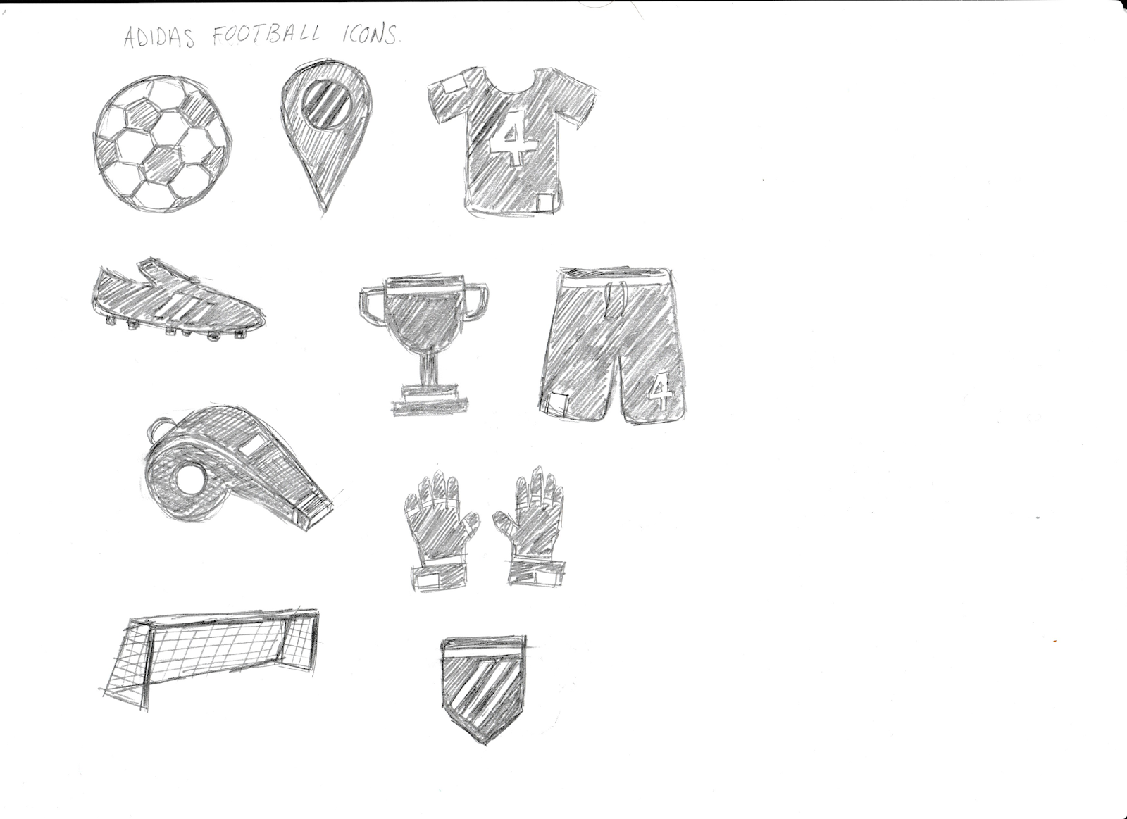
For the drill cards and player cards, I wanted to create a range of illustrations that could be used across the graphics/imagery. I wanted to do this so that I could create a visual language across all the material that would allow some cohesion to be formed. The illustrations I wanted to keep quite simple, and went for the obvious items associated with football. I though this would be appropriate as having something more abstract or obscure would not be understood by everyone and would exclude some members of the target audience. Also, the style of illustration could easily be applied for future projects and apps for different sport areas, clearly identifying both the difference in the sports, as well as the obvious relation to this initial campaign/Adidas app.

Drill Card Initial Ideas:


As we wanted the app and the imagery within it to have a 'tongue and cheek' atmosphere, and play on humour, I came up with interesting and funny names and imagery that can be used for the drill cards. There are three initial drill routines, beginner, medium, and expert. The names gives to the drills are correspondingly baby steps, bang average and bossman. As the city we are focusing our app on is London, we wanted some of the language used to be relatable to Londoners, and so we utilised their slang to distinguish between the different skill levels.
For the imagery, here I started experimenting with the expert skill drill named 'Bossman'. The imagery I wanted for it to have was humours. For this reason I included within the collage a gold chain, black sunglasses and explosions; things stereotypically associated with 'cool' and 'boss'. I also included within the collage the illustrations/icons I had designed. This was so that I could start implementing the visual language across the design material.
The collage also includes product promotion for Adidas boots. I did this because it fits quite comfortably inside the collage, and makes for subtle product promotion for the Adidas brand.
Player Card Initial Ideas:


For the player cards, we decided that the football athletes that should be featured need to be Londoners. As the location for the app is London, it would inspire the users/target audience and make them more motivated to use the app if they saw the athletes that came from the same place as they did. Having Londoners as the sponsored players makes the app more relatable not only for the target audience but also to city of London itself.
For the design of the player cards, I wanted to include the players in motion and in quite striking/interesting stances. This was so that the player cards could draw the viewers attention and make them interested in the player, as well as possibly make them want to aspire to be them.
I used an 'Adidas' typeface for the text, to keep in line with the Adidas branding and association to the brand. For this reason I also included the signature Adidas stripes.
Product placement was again used within these player card collages so that the main Adidas brand could get something out of this, as well as to make the viewers aware of the products.
Each player was assigned a different colour. This was done to create visual interest and to distinguish between the players. This also in the future would allow ease of navigation as different player drills could be colour coded so the audience know which players drill they are looking at.
No comments:
Post a Comment