Working with the previously design logo and slogan 'orange is the new green', I decided to experiment with some poster designs for the campaign.
I looked at different typefaces, ones that would stand out and be bold, but also ones that were sustainable and would be good for the environment (use less ink).


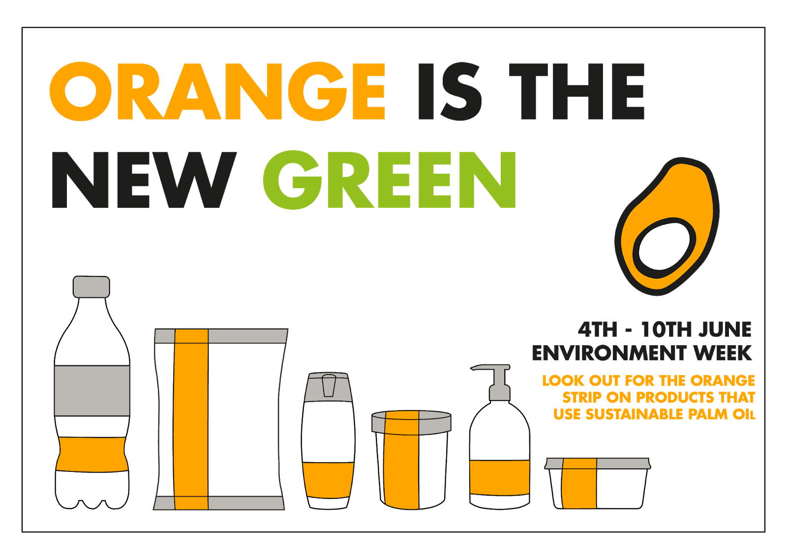
I wanted to really exaggerate the orange and make it noticeable, however, I found that the posters with an orange background were slightly bland and unexciting. Therefore I experimented with having the background white and implementing orange in other elements. I really liked the visualisation of the slogan 'orange is the new green' with corresponding colours, I believe it really highlights the slogan and the message, making it memorable.


I looked at visualising the idea of the 'orange strip, onto the posters, but found that it was too abstract and did not communicate the idea that well. I was still struggling with finding a clear and effective visual language for the campaign.
An idea came to mind, that instead of attempting to visualise the 'orange strip' in an abstract way, I should do it in a more obvious and easy to understand. For this reason, I decided to create illustrations of the different types of products that the strip would be placed on.


Although I briefly looked at another typeface, I found 'Futura' fit the best with the illustrations and the message of the campaign. 'Futura' made the slogan and the information bold and clear, eye-catching and legible, therefore it was perfectly fit for the campaign.
I continued with the colour story from previous experimentation, and fell in rhythm with having the visualisation of the slogan 'orange is the new green', as well as other information and elements on the page be either bright orange or 'greenpeace' green.


I considered re-designing the mark, however I then thought that there may be no reason for it anyway. By working alongside Greenpeace, and having their logo on the posters/branding, I already had a reliable and professional logo that made the campaign more trustworthy for the audience, and so I did not need to create a logo. I also thought that the slogan 'Orange is the new green', felt less like a slogan, and more like a campaign name. For these reason, I decided to drop the certification mark design and to continue designing the 'Orange is the new Green' campaign instead.
I began thinking about other branding material, and knew that a billboard design was necessary, as billboards can reach a very wide audience, especially if they are distributed nationwide, and as Greenpeace is not only a nationwide but and international organisation, that would certainly be the case.
I continued the visual language that I had previously established into the poster exploration. The illustrations, typeface 'Futura' and colour scheme of bright orange and 'greenpeace' green were used throughout. The compositions for both the poster and billboard designs that I was favouring were the central/middle aligned ones, as I believe they have the best hierarchy of text and are easily read by the audience.


Another promotional/informative element for the campaign I wanted to design was an alternative to the 'Greenpeace' website. As the campaign asked companies to alter their packaging appearance for a week, I thought it would be appropriate if the 'Greenpeace' website did the same, to support and promote the case even further.
First I designed simply a banner for the website that promoted and informed about the event coming up, and that followed the already established visual language.
 Next I thought about how the website would change during the week-long campaign. For this, I thought it would be appropriate if there were some features that were permanent on the website as the audience navigated around it. The illustrations from the visual language I thought were one of the appropriate elements, however, they would not have worked in their current horizontal form. Therefore, I quickly realigned them, as well as adding a few extra product illustrations, into a vertical column that would be appropriate for a website.
Next, I simply played around with transforming the Greenpeace website with the visual language of the campaign. I changed their well-known green into the bright orange of the campaign, and played around with implementing the campaign information as permanent features as the audience navigates.
 |
| I found that the illustrations were too big, and would become annoying and distracting for the audience. The placement of the campaign slogan within the banner is not effective, as the banners change, so the audience may not be able to always be aware or notice the first banner, making them confused about why the whole page has suddenly changed. |
 |
| Here the website is much clearer. I have decided to not alter the way the content or the navigational system was displayed. This was because I was not re-designing the Greenpeace website, but simply adapting it to the campaign. This website transformation would last only the one week in line with the campaign. Having the illustrations smaller and on only one side makes them less annoying and disrupting. Having the slogan and information of the event on the other sides, makes sure that the audience always has excess to that information as they navigate the website, as well as making it more obvious as to why the website has changed. It also makes it clear that the change is only permanent, by having the timeframe of the campaign, and therefore the website transformation of the screen. |

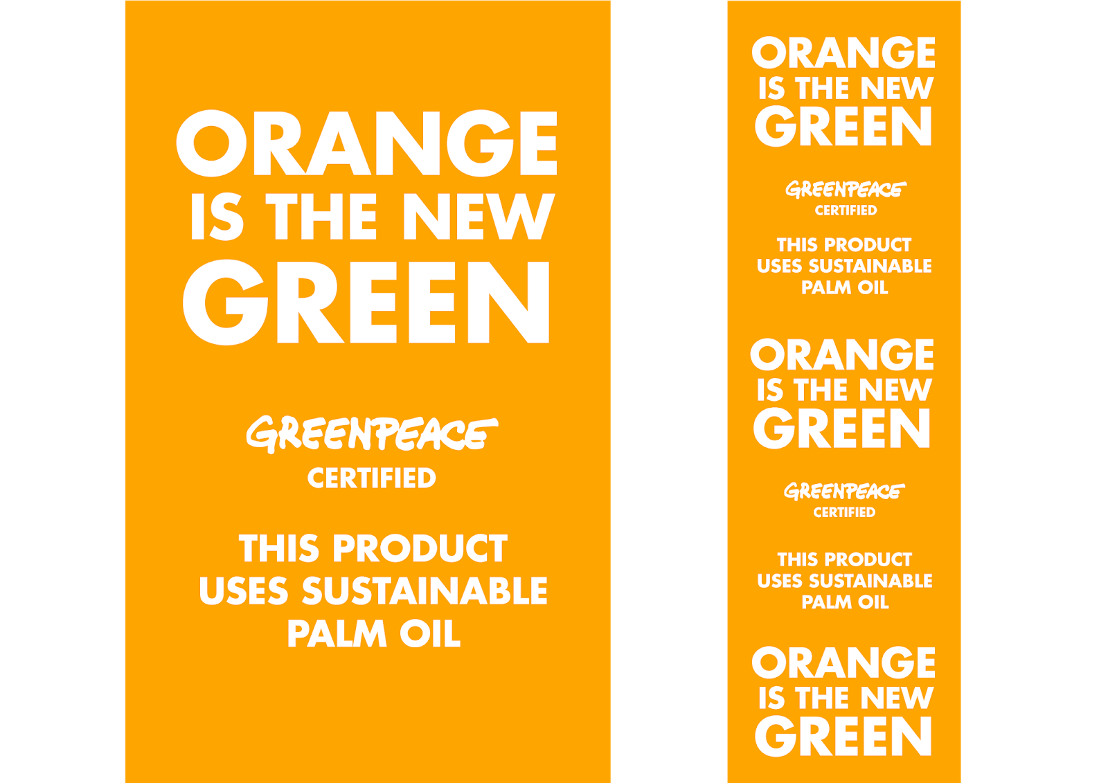
I considered the different shapes of products, as previous feedback had suggested, and made the strips communicate the messages both vertically and horizontally, so that the strip could be applied appropriately depending on the shape form of each product. The information on the strips is fairly minimal, having only the slogan, 'Greenpeace' logo and text 'This product uses sustainable palm oil'. I thought that thus information was enough to go on the orange strips, this is because up to this point where the strips would already be on the products and in store, the audience would have seen the advertisements and be aware of the event happening. The slogan makes sure that the audience is aware that this is the same event/campaign as had been advertised, the 'Greenpeace' mark reassures the certification of the orange strip and makes it more trustworthy for the audience, and the small line of text sums up/informs the audience what this orange strip means and what it represents.
No comments:
Post a Comment