Research:
Existing nightline service branding:


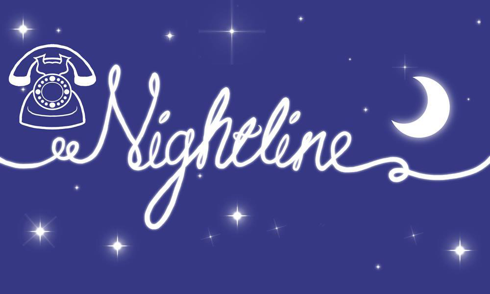

For inspiration, I first looked at the existing branding of other nightline services. There are many similarities that occur across the branding, the colour blue and the imagery of night being the main ones. As one of the brief requirements is for the branding to include the colour blue, that cannot be avoided, however, I knew that I could still steer away from 'night' imagery. A lot of the existing branding is also quite delicate and pleasing to the eye, this is understandable and appropriate due to the nature of the services they provide. This 'sensitivity' and 'calmness' is also something I knew I wanted to include in my branding design, as I believe it is one of the most important factors in making the branding approachable and appropriate for the target audience of students; those seeking to use the nightline services.
Owls (for imagery referencing):


One of the brief requirements was for the logo design to feature owl imagery. For this reason, I also researched/looked into owls and their different features that I could utilise. I found that the owl's eyes, beak, ears and body shape were the most distinctive, and so that inspired my idea generation and initial designs.
Initial Ideas:


Next, I focused on exploring just the type/logotype. I had chosen the type/font of the logo to be handwritten, as it makes the logo design feel more personal and in turn trustworthy. Having handwritten type I believe would make the logo and branding of the service more approachable and relatable to the audience. It would also add some sensitivity and friendliness to the design.
No comments:
Post a Comment