
Next I started to create some of favourite initial sketches digitally, and started adding some colours. The colours I began experimenting with were quite soft/light/pastel. This was because from my research I had discovered that those colours represent Victoria well as a photographer, as well as are very personal/a favourite of hers. I wanted her branding to represent not only her photography, but also her as a person/her personality.


I also started to apply some of the logo ideas on top of one of her photographs. I did this so that I could see if those logo ideas could work in this context, and if so which one seemed to do so best. I discovered that none of the logos seemed to be working as I had imagined they would, and realised that it was not the fault of the logo designs, but rather that the photograph was quite busy/had a lot going on, so then all the logo designs are being lost within the photograph.


I decided to scrap the photograph background for now, and try using only colour. I also introduced Victoria name and the word 'photography' into the logo experiments. I did this because I decided that none of the logos I have been experimenting with were making it clear that the branding is for a photographer. This was not my fault, I believe that the logos were quite strong and communicated the letters 'V' and 'K' well, however, the simple nature of the branding and the style that Victoria's practice is, simply does not communicate the typical photographer. I did not want her branding to be stereotypical by making it an icon of a photography camera, that is why I decided to add context to the logos I were designing by adding her name and service. By adding that context, the logos were transformed and began to communicate a photography brand much more clearly.
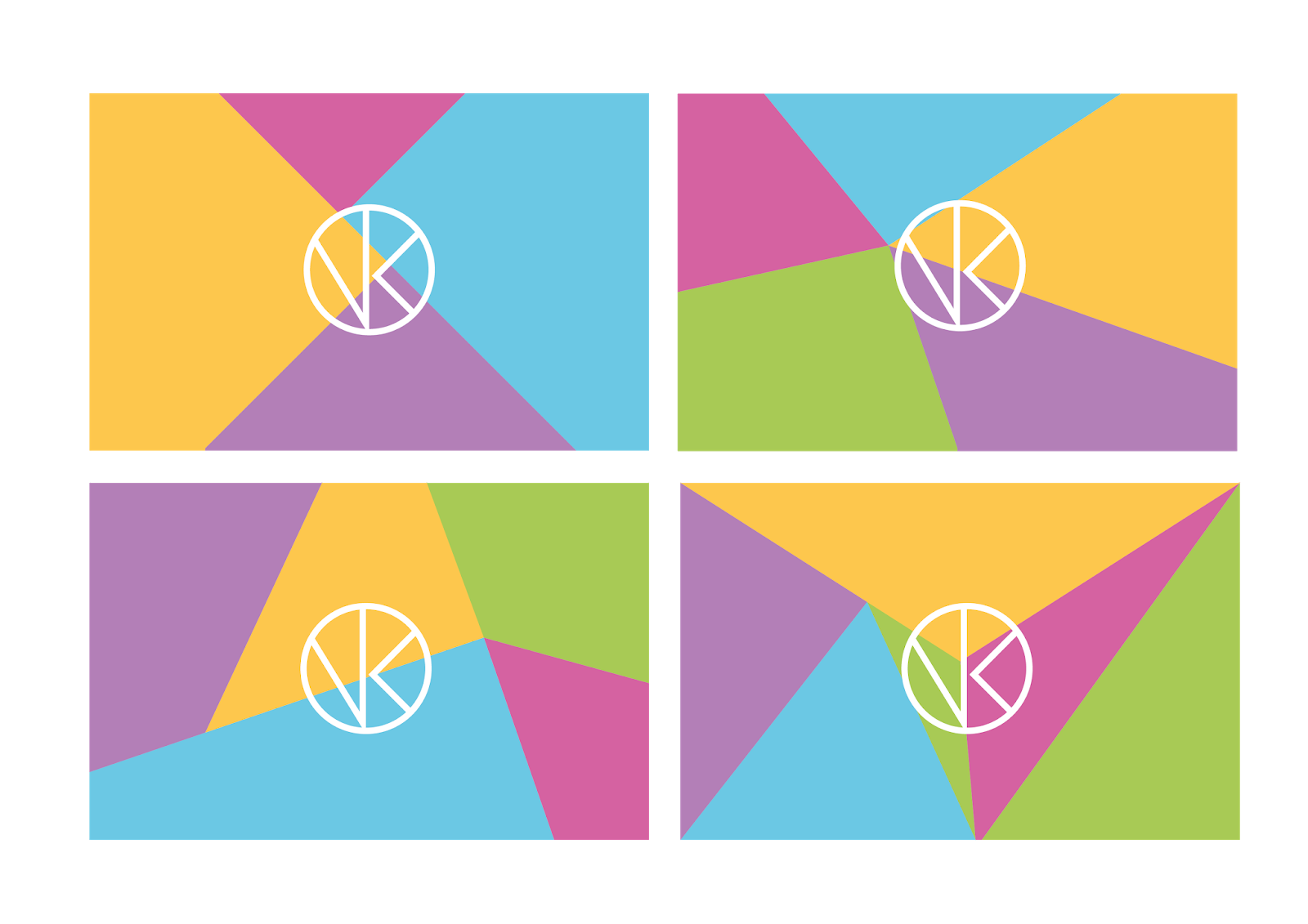
The colours I began looking at were derived from her photography, and the colours she uses in her photography work. These also happened to be the colours/colour schemes that she personally really liked. I also started to explore a 'mosaic' style background. During my research I found that not only does she really like this style, but her photography also references it. She uses coloured paper to create different coloured shapes as the background of her still life photography. I thought this could be a subtle but effective reference to that.


Her response was:

After her feedback, I was happy she choose the top left logo because that one was my favourite as well. I was able to now move on with developing the other details of her branding, The mosaic style backgrounds I agreed with her were not really working as they felt a little chaotic and the text/logo were getting lost within them similarly to how the logos were not working on top of the photography.
To confirm the choice for myself and to focus more on my designer instincts and not just the thoughts of the client, I quickly mocked up some of the logo designs into her website to see which one seemed to fit in with her website and her work the best. In doing this I confirmed to myself that indeed the logo that both me and my client favoured was the most effective, because it instantly seemed at home on her website and looked as if it belonged there. Whereas the other logos felt a little awkward and did not match the personality/style of the work on the website as well as the chosen logo.


Having chosen the logo design, I did give the mosaics another chance by seeing how much the logo by itself would work, and to see if it was the extra text/copy underneath it was causing the problem. Unfortunately it turned out that it was simply the nature of the mosaic effect, and how overpowering and attention grabbing it was that made the logo or anything on top of it seem awkward and swallowed by the mosaic. I decided to scrap the mosaic idea all together and try and pull back the use of colour all together.


I knew I wanted to include the name 'Victoria Kathryn' and service 'Photography' within the logo design. The icon I knew could stand alone as part of Victoria's branding, however without the text it would not make sense. I needed to include the text/copy to clarify the context that the icon design is representing.
I looked at a whole variety of different typefaces and tried to find the one that matched the logo design the best visually. My client had mentioned earlier in her feedback that the typeface I used in the earlier examples of the icon design, a sans serif, was similar to something she would use, and therefore represents her well. Therefore all the typefaces I looked at were sans serif.

From the whole range of typefaces, I narrowed down the typefaces into three favourites. I did this so that I could separate the typefaces from the chaos of looking at that many in one place, and so that I could get a feel for them and their relationship with the icon design a bit better. From those three I narrowed it down to only two. At this point I turned to peer feedback and presented to them the two logos, and asked them which they thought looked the most balanced and cohesive. The responses I got were in favour of the logo/typeface on the left. I agreed with my peers. I thought that the typeface on the left has a better relationship with the icon design because the thickness of the typefaces matched the weight of the lines in the icon really well visually. The logo looks balanced and professional. To make sure the balance was not an optical illusion due to the use of black and white, I also applied the logo to a coloured background, and found that the effect and success of the logo remained the same.

I had now finished the design of the logo for Victoria. The circle contains subtly the letters 'V' and 'K' which represent the name 'Victoria Kathryn'. The circle hints at a camera lens, representing the service provided - photography. The use of simple lines and minimal overall tone of the icon/logo represents Victoria's personality and her style of photography. The chosen sans serif typeface also represents Victoria's personality, as well as creates balance and gives context to the overall logo design.
No comments:
Post a Comment