Looking back upon my design development up to this point, I knew that my direction had to slightly change as it was not communicating my concept as well as I had hoped. Looking back at the designs I had done, what caught my attention was the list of 'Wonder' title explorations I had created. At first I only saw the list as individual options for the front cover, however, with fresh eyes I saw that as a whole the group of words really looked visually stimulating and eye-catching. The use of different art and classroom materials to create the various styles of letters represents well the children characters within the story, and I believe would also feel very welcoming and relatable for the target audience of the story as well. Against the white background, the titles look very bright, bold and eye-catching.
 |
| I kept the scratched wood style text/type to hold on to the classroom desk concept. Also, the simple scratched text style balances well with the more chaotic and busy title. This direction within my design process I was a lot happier with as I felt it was a lot stronger both visually and conceptually. The more subtle and abstract approach to the classroom desk concept was feeling a little more mature and stripped back, the elements within the front cover design were stripped back to make the communication of the message clearer, and the design of the cover overall more appealing. I knew that now I could start working on the back cover of the book design, and develop the front and back cover together to enrich the classroom desk concept and make sure all elements are working cohesively together towards it. |
 |
| To implement the book slogan onto the front cover, I attempted to place within the existing design so not to compromise the bold and eye-catching effect of the large-size 'Wonder' title. I thought this was quite effective as the slogan did not distract from the rest of the design, but was still fairly easy to read. Only the spacing between the slogan words felt a little too distant, so maybe the slogan is not as easy to read at first glance. |
 |
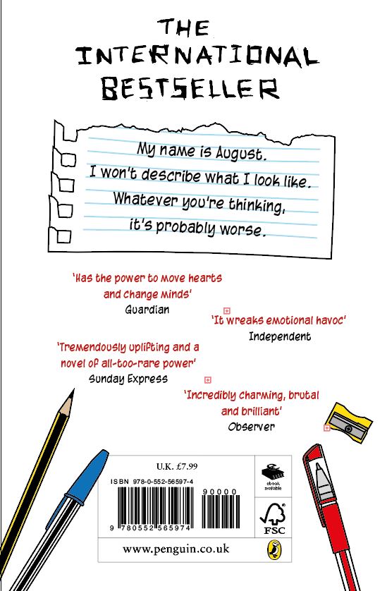
| For the back cover, I decided to utilise some more of the scratched text/type I had created earlier, to create some connection and cohesion between the front and back cover. The rest of the copy however I wanted to make more legible, so I used a sans serif typeface that was somewhat rounded and felt similar to what a child handwriting may be like. I used some but not all of the classroom object illustrations I had created earlier in the design process, this was so that I could reference back to the classroom concept for my cover design, as well as to create some unexpected and visually engaging features for the back cover. I did not use all of the illustrations as I did not want to overwhelm or make the back cover too busy, which is an issue I feel I had in my earlier designs. |
FEEDBACK
Feedback confirmed to me that this design direction was working much better than previously, and that I should continue with it. Overall feedback stated that this was close to completion, and that it only needed some small features to be developed further to really bring the design together. One of the suggestions within my feedback was to work on the slogan on the front cover design, as the sans serif typeface I had used up to this point felt a out of place, and that maybe I should try writing the slogan in the same scratched wood style as the author 'RJ Palacio' is written. I took this feedback on board, and hand-written the slogan as I had done previously with all the other scratched wood style text, scanned it in and vectorised it.

Next I started to experiment with the layout/placement of the slogan on the front cover, with the newly hand-written scratched wood style text.
 |
| The slogan in the scratched wood style text instantly made the front cover design feel more balanced, and also added towards the classroom desk design concept. The layout of the slogan words in this example feels a little disjointed and random, although this is okay and fits within the theme, I still wanted the slogan to be more clear and easy to read. |
 |
| In this slogan layout exploration, the slogan is slightly easier to read as all the words follow a similar grid/layout. However, all the words within the slogan still feel too distant from one another, which does not make it clear that the slogan is a flowing sentence. |
 |
| This slogan layout seems to be going in the right direction, as the words all follow the natural left to right reading format. Also the words take up less lines, only 4 whereas before the words took up 5 or 6 lines, this makes the slogan now easier to read. By keeping the slogan on only 4 lines, and also within the spaces in-between the 'Wonder' title words, the slogan feels more like it belongs within that space, and does not distract too much from the other elements on the front cover. |
 |
| A slight difference from the previous slogan layout exploration, but a large improvement in the readability, legibility and balance of the slogan and the rest of the front cover. Bringing all the words of the slogan closer together avoids the issue of the words being too distant, and allows for the audience to read the slogan clearly in one flowing sentence. The slogan now fits snuggly in between the 'Wonder' title, and therefore makes the overall front cover feel cohesive and visually balanced. |
As suggested by feedback, I also wanted to improve the typeface/text/copy on the back cover, as well as its layout on the page. I tried out a variety of different typefaces that resembled the style of a child's handwriting. I wanted a typeface like this so that the copy on the background could feel somewhat familiar and relatable to the target audience of the book. I did not want to write the copy in the scratched wood style as I had done for some copy elements as those would not be legible in a smaller size, and because I knew that the blurb of the book needed to be legible so that the young target audience could read it easily.
 |
| This typeface was appropriate as it is rounded and therefore looks like a child may have written this, however the typeface seemed a little too wide and comic-like. Because of this the typeface did not seem balanced against the rest of the design and did not fit into the theme of classroom/school. |
 |
| This typeface was also appropriate as it was quite rounded and looked like a child could have written the copy. But again, the typeface felt a little out of place within the rest of the design. The typeface was also a little dense, which meant that it maybe quite hard to read for the younger audience. |
 |
| With the same typeface, I started to play around with the layout of the book reviews. Previously when they were listed vertically it felt a little too typical and boring, and as this book has a younger/children target audience, I knew that even the small details such as the layout of the reviews should be more playful and visually interesting. |
 |
| This was another typeface I quickly tried out, although quite playful and visually interesting, this typeface did not resemble the hand-writing of a child and also was quite illegible. |
 |
| This typeface I felt was working the best so far. This was because it resembles children hand-writing, but not in the stereotypical sense. The typeface/hand-writing is quite messy and not prefect, which makes it seem more natural. The typeface/hand-writing is also not too child-like which fits the theme of school/classroom well, and is also legible and easy to read. Within the design of the back cover, and with the rest of the text/type styles, this typeface sits well and compliments the rest of the design elements. |
 |
| Sticking with the typeface from the previous design, I wanted to try out the more playful and fun layout of the review copy that I had tried within earlier designs. This proved to work quite well, as the typeface was not as large or wide as the previous ones, and so made the reviews fit and sit in a balanced way within the page. |
The design of my 'Wonder' book cover I felt was coming together really well. I had taken on board the feedback I received earlier on board, which I believe made the progress of my design more successful and the final outcome overall more appropriate and appealing for the target audience.


No comments:
Post a Comment