 |
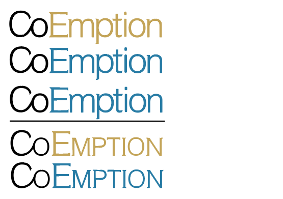
| (Top to bottom, no. 1, 2, 3, 4, 5) |
I made the connection between the 'Co' because it represents a 'cooperation' between the investment bank and the customer. It gives the designs more character and creates a more comfortable and reliable atmosphere for the customer.
I made the 'E' a capital letter, for two reasons. Capital letters are used for names, places, and titles, so by having two capital letter within the logotype, it demonstrates twice the sense of importance and authority of the company. The other reason was to emphasise the 'Co' even more, so it brings the customers' attention towards it and so the meaning behind the design decision is more evidently received.
The design decision of mini-serifs links to the traditional logotype qualities for investment banks and other companies of corporate professionalism. From my research, I found that the use of full serifs had lost it's previous value due to the financial crisis of 2007. The serifs, that were once seen as symbols of trustworthiness and prowess, had now become associated with the greed and deceit that the investment banks part of the crisis had shown. However, although this event altered the publics view on such type qualities, it didn't completely diminish them. That is why I used mini-serifs, not only do they provide a subtle link to the industry, but they also represent a certain degree of what they used to stand for. From my research, 'Credit Suisse' also use mini-serifs, and their logotype and brand have been successful and trusted for a long time, proving that mini-serifs are an appropriate design decision to make for what I aim to communicate. The mini-serifs I created are not too obvious or over-whelming, making the logotype seem more trustworthy and friendly, as well making a connection to the classic values of professionalism and expertise.
Colour is the last universal design decision I made. Wanting to create a company identity that would be approachable and friendly, I knew adding colour would help to accentuate the type qualities in place that were already doing so. It helps to emphasise the difference between 'Co' and 'Emption', drawing attention to the design decision for 'Co', as well as the capital 'E'. Colour also works in the general sense that it makes the logotype more eye-catching, and would make it more noticeable and recognisable by the public. Each design also is set against a white background, this is done not only for ease of legibility, but to also accentuate the design and it's qualities.
Final designs no.1 and no.4 both use gold as the colour choice. Gold is a representation of money and wealth. It would typically be inappropriate for a bank because it can create a sense of it being 'money hungry' and greedy. However, I believe that because of the softness of the mini-serifs and the use of neutral helvetica, it balances out this stereotype and instead places the gold colour in a positive and advantageous light from the customers point of view.
Final designs no.2, 3 and 5 use blue as the colour choice. Blue is commonly used as a corporate colour due to it's associations of calmness, loyalty, wisdom and trustworthiness. It has previously been seen used in investment banking and could arguably be considered unoriginal and therefore ineffective. However, I believe that because the rest of the design is quite modern and unexpected for investment banking, adding blue would becomes a quality of familiarity and makes the design as a whole more comfortable and approachable for the customers.
Final design no.3 uses underlining. Underlining is used to highlight something, to draw someone's attention and present something as more significant. Usually titles and subheadings would be underlined, they demonstrate a start of the next topic or a new chapter. By underlining my logotype I represent these qualities as a part of my company identity. The fact that the underline is in its basic black and white straigth form also helps to emphasis this. If it was stylised or manipulated it would be seen as more of a gimmick, and make the logotype seem less serious or professional.
Final designs no.4 and no.5 both use small capitals. This design decision came from my research into 'Credit Suisse', and their success as an investment bank throughout the years. They also use small capitals within their logotype. I think what makes them appropriate for their logotype as well as mine is that small capitals connote the same importance and authority that capital letters do, but without being as loud or aggressive. They are a more subtle way of making the logotypes stand out, as well as demonstrating those same positive qualities.
No comments:
Post a Comment