
Garamond
Designed by french publisher and type-designer Claude Garamond, Garamond is a group of many old-style serif typefaces, and has been a basis for many modern Garamond versions. Garamond as a typeface offers elegance and readability, therefore it is suitable for a wide range of applications. The adjectives used to describe the typeface are 'fluidity', 'consistency' and 'downward sloping'.
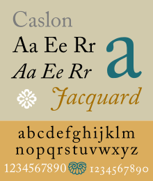
Caslon
Designed by english gunsmith and typeface designer William Caslon I, Caslon is also a group of serif typefaces. Caslon is known as a good font for body text, and so is commonly used in magazines, journals, books or as a corporate typeface. The adjectives used to describe the typeface are 'authentic', 'grace', 'familiar' and 'traditional'.

Bodoni
Designed by italian publisher and typographer Giambattista Bodoni, Bodoni is a series of serif typefaces. Bodoni has a unique style as it has very noticeable contrast between thin and thick strokes. This makes it most suitable for displays, posters, headlines and logos. The adjectives used to describe the typeface are 'balance', 'elegance', and 'delicate'.

Baskerville
Designed by John Baskerville in 1757, Baskerville is a serif typeface. It is classified as a transitional typeface, intended as a refinement of old-style typefaces from the period. The typeface is often used in book design and body text, as well as in purely typographic compositions. The adjectives used to describe Baskerville are 'rationalism', 'simplicity', 'legibility' and 'beauty'.
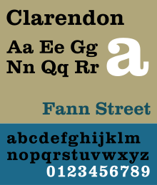
Clarendon
Designed by Robert Besleyin 1845, Clarendon is a slab-serif typeface. Clarendon is named after Oxford's Clarendon Press and is considered to be the first registered typeface. The typeface became popular all over the world as a display type, especially for posters printed with wood type. Therefore Clarendon is closely associated with "wanted" posters of the wild west. It is also popular within signage and logotypes. The adjectives used to describe Clarendon are 'bold', 'playful, and 'tough'.

Berthold
The H. Berthold type foundry, founded in 1858 by Hermann Berthold, is renowned for crafting high-quality typefaces. Arguably it's most famous typeface is Akzidenz-Grotesk. It is a sans-serif typeface, also described as 'grotesque', that was designed mainly for commercial use such as publicity materials, adverts, tickets and forms, as opposed to decorative or for book use. The adjectives used to describe Akzidenz-Grotesk are 'purposeful', 'balanced', attractive' and 'equal'.

Times
Designed by Victor Lardent in collaboration with the company Monotype in 1931, Times New Roman is a serif typeface that was commissioned by the British newspaper 'The Times'. It is most commonly used for its excellent legibility in body text publications such as books and newspapers. It is not very suitable for on-screen usage. The adjectives used to describe Times New Roman are 'classic', 'practical', and 'common'.

Helvetica
Designed by Swiss typeface designer Max Miedinger with input from Eduard Hoffman in 1957, Helevetica is a sans-serif typeface. "When in doubt, use Helevetica" used to be a common rule as the typeface is appropriate to a wide range of uses. It's been used for posters, logotypes, body text, headlines, logos and etc. The adjectives used to describe Helvetica are 'modern, 'progressive', 'universal' and 'ubiquitous'.

Univers
Designed by Adrian Frutiger in 1954, Univers is a sans-serif typeface that's classified as a neo-grotesque. Univers is a font family that contains a wide variety of weights and styles, which makes it appropriate for a many uses. The adjectives used to describe Univers are 'steadiness, 'homogeneity', and 'legibility'.
No comments:
Post a Comment