Grids came about during the Renaissance period - a lot of designers attempted rationalism design.
Rationalising design allows us to create tangible systems in which to ensure consistency and structure. It's argued that such approach to design inspires more confidence than design based on personal preferences/intuition.
Leonardo Da Vincis ‘The Vitruvian Man’ was one of the first such instances where a grid system was applied.
Leonardo Da Vincis ‘The Vitruvian Man’ was one of the first such instances where a grid system was applied.
Architecture throughout history is also based on grids - e.g. the pyramids.
Albrecht Durer attempted to define the perfect grid system for the construction of letters in 1525.
In 1660, Johann Neudorffer also used a geometric square grid system as the basis for the construction of his typefaces. Square is divided into 10 equal parts, with each part corresponding to the thickness of the stroke of the letterform.
In 1972, Olivetti developed an alphabet intended for 7x9 matrix printer, with a rectangular field of 35,49 or 63. A very simple typeface created with a simple grid system.
The Golden Ratio - divides a line into two parts relating to each other to approx. 1:1.618. When 360’o is divided by the golden ration, the golden angle is revealed as 137.5’o.
Wolff Olins - rebranded New Yorks Metropolitan Museum of Art. The previous logo was the ‘M’ from 'Pacioli’s De Devina Proportione' alphabet.
Re-Branding of British Steel
A design week article stated:
"The main icon which is set in "molten orange" and combines the B and S letterforms also appears to look like three strips of steel. Core values of "pride, passion and performance" have been imbued into the icon, according to Ruddcoks, which has offset the orange against a cooler navy colour to show steel in its molten and hardened states but also to show how the company is vibrant and exciting (orange), and "cool, professional and committed" (blue/grey)."
I believe that the re-branding of 'British Steel' was unsuccessful. The idea behind the "three strips of steel" seems over-reaching to me, because it is not instantly obvious that that is what they're meant to represent. Even if subtly was the aim for this, I think it's a bad design decision as the companies product is more visually obscure, therefore it would need more evident representation, rather than abstract. What I mean by this, is that not everyone knows what large "strips of steel" would look like, and even if they did, I wouldn't imagine they would envision them as "molten orange"either. Because of this it is my opinion, that in comparison to the old logo, the new logo doesn't hold as much clarity. The old logo depicted two strips of metal bent to depict an 'S' for steel. As a consumer, we know this because not only is the logo blue, a colour which connotes 'coldness' and 'strength' so can easily be associated with metal, but also because the two strips forming the 'S' are visually reminiscent of steel and metal pipes that the general public would have seen in their homes and buildings. This makes the old logo seem more personal and trustworthy to the consumer, in comparison to the new logo whose abstract form and colour holds no such welcoming. Also, because of this, if the new British Steel logo was placed on it's own, without the type logo alongside it, the chances of the company being recognised are slim. Whereas the old logo was in circulation for 30 years, it had become iconic and respected; even if the re-brand of British Steel had been completely different, more well-considered and executed excellently, I don't think it would have had any chance of getting accepted anyway. With companies such as British Steel, that have been around so long, and have become part of the culture and society, re-branding it usually causes discomfort and upsets the balance of the consumer society. The re-brand of British Steel was arguably bound to fail, it is simply a shame, that it failed even more so than expected.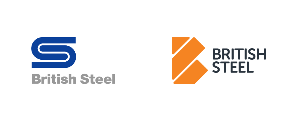
"A real corporate identity is based on an overall system approach, not just a logo. A logo gradually becomes part of our collective culture, in its modest way it becomes part of all of us. When a logo has been in our public domain more than fifty years it becomes a classic, a landmark, a respectable entity."
Typefaces:
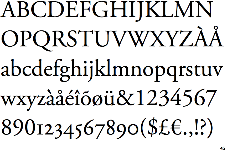 Garamond - original design produced by French Renaissance punch cutter Claude Garamond in 1530. Garamond is characterised by large counters in the a and e, and horizontal crossbars. Ascenders and defenders are long, and the f has a strong hook. Most top serifs are diagonal, slanting towards the left, here the influence of calligraphy is evident. Garamond is used in books, magazines etc.
 Bodoni - designed by italian typedesigner Giambattisa Bodoni in 1790. Bodoni features extreme contrasts between thick and thin strokes. Original forms have subtly bracketed serifs, although most contemporary variations exclude the brackets. Mathematical precision of the letters provides vertical stress, and the ascenders and descenders appear long in relation to x height. The M and W are narrow, the R features a curved leg and the Q features a low tail that extends vertically. Bodoni's ornate appearance means that it is mostly recognised as a display typeface, used in posters, brochures, sign systems etc.
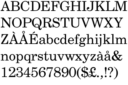 Century - developed by Lynn Boyd Benton in conjunction with renowned American printer Theodore De Vinne in 1896. Specifically designed to print ‘Century’ magazine beginning. Century was designed as an extremely readable typeface. Thick and thin stroke heights are somewhat heavier than most serif fonts, this is offset by generous white space between and within the letters. Unique characteristics of each letter are clear and slightly exaggerated. Century is used in body texts, books, magazines etc.
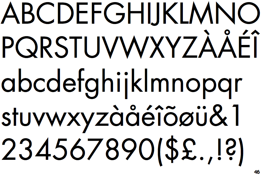 Futura - inspired by the Dutch De Sijil and Russian constructive movements, along with the Bauhaus and it's belief that 'form follows function'. Designed by german designer and educator Paul Renner, who applied elementary geometric form to typeface design as inspired by 1920s Europena designers. All strokes in each font are made of a single weight line, and the number of strokes to create each letterform are minimised. Futura is one of the most basic typefaces you can get. The O is a perfect circle, and A,B,D, P and Q were designed by adding a straight vertical line to the perfect circle.The T is composed of two straight lines, and the J has no curve. The G has no foot serif, and the Q is a perfect circle broken by a diagonal slash. Future is used in websites, posters, brochure, packaging etc.
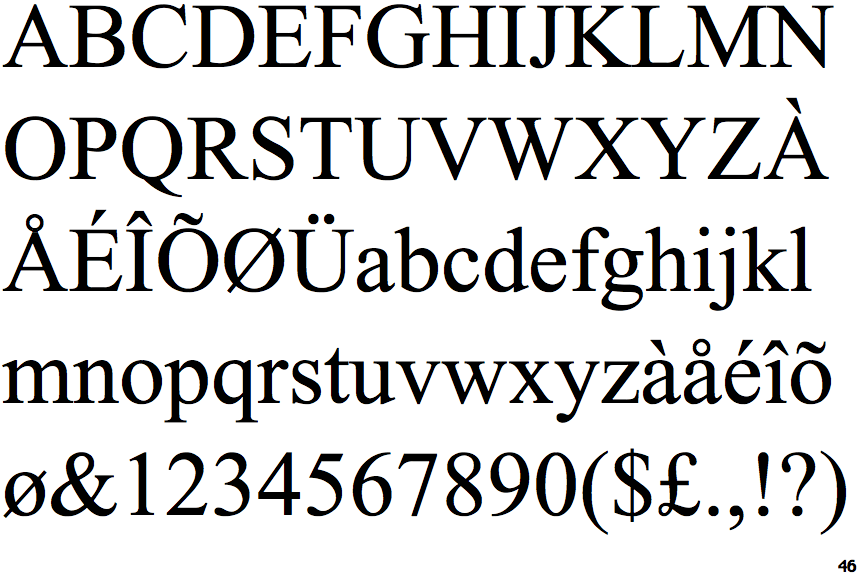 Times Roman - designed by Stanley Morrison in 1932, who was commissioned by ‘The Times’ newspaper to redesign the newspapers text typeface. Morrison designed this typeface using Monotype Plantin 113 as the basis. The resulting text face is similar but features sharper serifs and a higher contrast within stroke weights.
Times Roman has short ascenders and descenders, sharp bracketed serifs, and an oblique stress. The counters are very open and comfortable, like the large bowl of the lowercase A, and the rounded uppercase letters such as C and G. The variety of weights, widths, italics and other font variations makes it a Times Roman highly desirable and practical typeface, it is used in websites, body text, books, posters, newspapers etc.
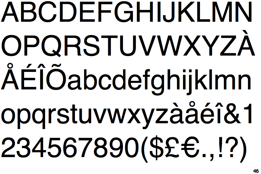 Helvetica - designed by Max Miedinger in collaboration with Edouard Hoffman in 1950s, in an effort to improve the Akzidenz Grotesk typeface. The result was Neue Haas Grotesk, in 1961 this was renamed to 'Helvetica'. Helvetica became the predominant typeface of many graphic designers of the International Typographic Style, also known as Swiss Style. This approach advocated clarity, precision and objectivity. In design, Helevetica echoes these qualities as it has possess no formal eccentricities, or distinguishing aspects of the design. The typeface is rounded sans-serif with large x height, counters within O, Q and C are oval, C has a narrow aperture and flat terminals, the R stands on a curved leg, and the A is double storied and features a tear-dropped shaped counter. Helvetica is used in websites, posters, brand names, album covers etc.
No comments:
Post a Comment