- Hairline serifs are much thinner than the main strokes.
- Square serifs are identified as anything thicker than hairline.
- Wedge serifs are triangular in shape.
- Un-bracketed serifs attach directly to the stroke of the letter form, usually at a right angle.
- Bracketed serifs create a curved transition from the serif to the stroke of the letterform.
There are also a range of serif classifications. These are Old Style, Transitional, Modern and Slab.
Old Style serifs (also called Humanist) are the oldest typefaces dating back to the mid 1400s. They are characterised mainly by their diagonal stress, where the thinnest part of the letters appear on the angled strokes, rather than the vertical or horizontal ones. Some of the typefaces that demonstrate these serifs are Adobe Jenson, Centaur, and Goudy Old Style.

Transitional serifs date back to the mid 1700s. They are generally the most common serif typefaces. They are characterised by the fact that the differences between the thick and thin strokes are more pronounced that in the Old Style serifs, but less so than the modern serifs. Some of the typefaces that demonstrate these serifs are Times New Roman, Baskerville, Calson and Georgia.
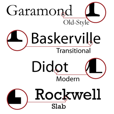 Modern serifs also date back to the 1700s. They are characterised by a significantly more pronounced contrast between the think and thick strokes, and have vertical stress, as well as minimal brackets. Some of the typefaces that demonstrate these serifs are Didot and Bodoni.
Slab serifs are characterised by having little to no contrast between the thin and thick strokes, and have thick, rectangular serifs. Sometimes they have fixed widths too. Also, the underlying letterforms sometimes resemble those of sans serif typefaces. Some of the typefaces that demonstrate slab serifs are Clarendon, Alexandria and Corona.
_______________________________________________________________________________
Relating to my brief, I believe that creating a new 'sharp' serif is quite an interesting concept due to the fact that it has potential to become more universal. Within my work, I am only applying my design to the Caslon typeface, however, due to the simplicity behind my design, I believe that this 'new' serif could easily be transferable onto others. From my research I now know that the design of a serif closely relates to the contrast between the thin and thick strokes within each typeface. That is why, if my 'sharp' serif was to become applicable, it would only be within typefaces that have previously been identified as containing transitional serifs. This is because Caslon it self is identified as a traditional typeface, meaning that the design changes I make to Caslon could be applied to other typefaces of the same contrast between the thick and thin strokes, but not as easily so to other typefaces characterised by different serifs.
No comments:
Post a Comment