Wednesday 13 December 2017

503 Leeds Nightline Brief - Final Outcome & Application

Final Logo Design:


Above is the final logo design that I have chosen. The design uses handwritten lettering to create a more relatable and trustworthy atmosphere for the viewer, as well as to make the logo more delicate and sensitive. The owl illustration was, in juxtaposition, created digitally and with straight clear lines. This was done in order to add a more serious and professional tone to the design. The illustration design highlights just the distinctive features of the owl, to make it easily recognisable. It is also slightly unrealistic, especially with the owls eyes, this was done in order to make the owl appear more friendly and approachable. The colour navy blue was chosen for the design as it is a serious yet calming colour. It creates a night time atmosphere which reflects the open hours of the service, as well as the time of day which is most quiet and peaceful. The composition of the logo sees the owl sit on top of the logo lettering, making the 'Leeds Nightline' the support for the owl. This symbolises how the service can also be a support for its target audience. The owl is also looking at 'Leeds Nightline', this again symbolises how the service can be looked towards and approached for support.

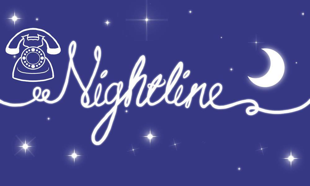
I decided to take away the 'star' illustrations from the logo design, as upon reflection I found that the stars made the logo design feel too juvenile, especially alongside  the delicacy and hand-made elements that already exist within the logo design. Without the star illustrations, I believe the logo design feels more serious and professional.


Application - Sticker Design:


An additional requirement for the brief, alongside the logo design, was to design either a leaflet or a sticker. I choose to design a sticker. The requirements for the sticker was that it did not exceed 10cm in any shape, and that it had all the slogan, contact and opening hours information about the service. The shape I choose for the sticker was round, this was because the circle is the most non-threatening shape as it doesn't have any corners. I though this would be appropriate for the audience as to make them feel calm and safe when reading the information. Also, the circular shape fits into the theme of night time as it hold connotations with the moon. With the layout of the sticker, I wanted to keep it simple and easy to read, as well as the logo fairly central. With the logo in the centre, the audience is instantly aware of what service the sticker is promoting. The information surrounding the logo, then lets the audience know more information, if they want to. To add some substance to the design, I had also decided to add a cloud-like shape to the sticker, within which the contact information would be placed. This was done not only to make the sticker more intriguing and visually pleasing, but to also bring an emphasis and draw attention towards the contact information, so that it was easily found and read on the sticker by the audience. The type I used for the contact information is a simple Helvetica regular, so that the information could be legible and clear, as well as because there was already a lot of content and a lot going on within the sticker. For the slogan, I wanted it to arc around the circumference of the sticker, so that it did not interfere with the rest of the content, but also was easy to read by the viewer. I considered having the slogan in the same Hevetica Regular as the contact information, however that proved to make the whole design of the sticker feel unbalanced and dull.

 To bring balance and cohesion to the sticker, I decided that having the slogan written in the same handwritten style as the logo would add a more sensitive and approachable feel to the sticker. I used a circular guide and wrote out the slogan by hand naturally creating a curve/arc in the sentence. When i digitalised and placed this within the sticker design, I believe it brought the whole thing together and created a cohesion and design consistence across both the logo and sticker designs.

Final Logo and Sticker Design:

Tuesday 12 December 2017

503 Leeds Nightline Rebrand - Design Development & Feedback

Design Development:

After my initial idea sketches, I took the design of the logo into digital development. I first looked at the owl element of the design, and tried some vector drawings/shapes that could represent the animal in an easy and not overly complicated way. I used my research and focused on the owl's eyes, beak and body shape to create the designs.


Drawing from my initial idea sketches, I then combined the handwritten type with my vector drawings. Some quick initial feedback had revealed that the handwritten type that I have used in the first line of the above image was the most interesting and appropriate for the brief. This was because the handwritten type looks quite delicate and soft, due to its elongated letterforms and the way the letterforms are composed in relation to one another. The vector illustrations of the owl proved to fit quite nicely within the logotype designs, and created an atmosphere for the branding that I think is quite appropriate. The illustrations paired with the handwritten type makes the designs feel soft and welcoming. The colour of navy blue that I have chosen to work with not only meets the brief requirement, as they had asked for the colour blue, but also connotes 'nightime'. This is appropriate because the service is open and used during the night, and so fits in with the darker atmosphere and calm feel of the night.

I quickly explored the contrasting colour combination, of white on navy blue. Although this was quite striking and pleasing, it made the text and the logo as a whole a little too illegible. This would not work at a glance-like setting, as the target audience would not be able to quickly absorb the information presented, and may miss the promotion of the service, therefore making them not aware of it and unable to utilise the services. 

Feedback:
During the feedback session, I had shown the design work I had done up to date, and asked for feedback relating to how appropriate it was for the target audience, as well as any other comments and criticism my peers/tutors had.

- The owl illustration doesn't quite match the handwritten type, maybe it could also be drawn.
- I don't agree [with the above feedback], I feel like there is a nice balance between the handwritten and the clean illustration. If it was all done by hand it might be too shabby/rough.
- Maybe try working with just the owl's face and the type.
- I think it works for the target audience, because the vibe is friendly and 'nice'. It feels safe.
- Don't have the owl as sleeping, it doesn't make sense as the service is 'awake' at night.
- Maybe play around with the composition a bit more.
- The handwritten type is effective, I say carry on with that.
- I like the little stars, it adds a calming and trusting vibe to it.
- Text may be a little illegible, although it is the most interesting/appropriate  out of all of them.
- The choice of colour I think is appropriate, as it makes it more serious and professional in a way, but also trustworthy/reliable.


Design Development:


 One of the points at feedback was that the type/text may be a little illegible, but that the style of it was the most appropriate. Therefore, I decided to go back and try to create some more handwritten type examples in the same style as the favoured one, but give the letterforms more clarity. This proved quite difficult, as re-creating the style again was challenging due to the natural way letterforms become skewered through writing. Although some of the handwritten designs were not as good, I still managed to work with them.
Another piece of feedback suggested that I try and create the owl imagery/illustration in the same hand-made style as the lettering. Taking that into consideration, I attempted to drawn some owl imagery by hand. This was quite challenging, as to get the owl drawings in the same style as the lettering, it had to be not too complicated and quite quickly drawn, to get sharp and confident lines. However, this in turn made the drawings visually poor. Nonetheless, I decided to see how they would work with the text.
Another piece of feedback I heavily took on board was that I should not make the owl sleep, as the nightline service is 'awake' at night. This was something that had skipped my mind and would have made the designs of the logo look quite silly if it had not been pointed out. Because of this, when doing the owl drawings by hand, and further digital developments of the illustrations, I made sure to have the owls' eyes open.
Experimenting with putting the hand drawn owl illustrations with the text proved to be unsuccessful. The consistency of the line widths, and the overall style of the logo designs looked inconsistent. The drawing, themselves quite poor, made the quality and professionalism of the overall design weaken, therefore I decided to go back to my digital owl illustrations and work with them.
Trying out different handwritten type earlier within the same style of lettering, again proved to not be as successful as the previous design. It made the logotype design feel unbalanced and gave the design a sketch-like overall look and feel. I decided that the previous handwritten lettering was far more effective and appropriate for the logo, and that any issues about legibility could be dealt with by scaling the logo and by placing it on the right coloured backgrounds.

Guest Speaker - It's Nice That - Connor

It's Nice That - A blog started in 2007 as part of a uni project, to inspire creatives.
Has to adjacent companies: 'anyways' (design studio) and 'lecture in progress'.

'Lecture In Progress' - "Advice, insight and inspiration for the next generation of creatives."
A good platform to find different types of jobs/careers within the industry.

If you're doing a publication, its really useful to print all the pages out quite small and arrange them on a board. It gives you an overall view of the flow and mood of the publication.

They do a feature called "The Graduates" where they feature fresh graduates which gives them great exposure. This is something we can apply for when we graduate.

It's really important to do stuff outside of your studies/work as it allows you to be more open and free in your creativity.

It is important to mock things up physically - to communicate the ideas more clearly.

"Keep learning new skills"
"Don't pretend you know how to animate"
"Don't forget to apply for The Graduates"

Monday 11 December 2017

Design Process

6 Stages of Process

Brief:
Analyse
Interpret
History
Contexts

Research:
User/Audience
Purpose
Functions
Client
Contexts
History
Meanings
Social/Political

Ideation:
Concepts
Message
Type Choices
Layout
Colours
GROUNDED IN RESEARCH/BRIEF

Development:
Iterative changes
Experiments
Innovation
Multi-media
Testing
Evaluating
Feedback
Commutation (testing the ideas by contrasting )
GROUNDED IN RESEARCH/BRIEF

Prototypes/Proposals:
3x developed outcomes
Testing
Feedback
Evaluation
GROUNDED IN RESEARCH/BRIEF

Final Outcomes:
Developed through iteration
User-focused
Fulfils the purpose
Meets the brief
Justified in relation to the research
Conceptually driven
Innovative

Interrogate your design process:
Did you analyse/interpret the brief?
Di you think about the context of the brief?
Did you outline the problem?
Was your research thorough and meaningful?
Did you arrive at some ideas through research?
Did you generate more than 1 conceptual idea?
Did you generate multiple visual/creative solutions?
Did you develop several possible solutions?
Did you go through an iterative process of experimentation and improvements?
Did you propose a number of possible solutions as prototypes?
Did you develop your prototypes further?
Did you test and experiment with your production process?


Saturday 9 December 2017

503 Leeds Nightline Rebrand- Research and Initial Ideas

Research:


Existing nightline service branding:


For inspiration, I first looked at the existing branding of other nightline services. There are many similarities that occur across the branding, the colour blue and the imagery of night being the main ones. As one of the brief requirements is for the branding to include the colour blue, that cannot be avoided, however, I knew that I could still steer away from 'night' imagery. A lot of the  existing branding is also quite delicate and pleasing to the eye, this is understandable and appropriate due to the nature of the services they provide. This 'sensitivity' and 'calmness' is also something I knew I wanted to include in my branding design, as I believe it is one of the most important factors in making the branding approachable and appropriate for the target audience of students; those seeking to use the nightline services.

Owls (for imagery referencing):


One of the brief requirements was for the logo design to feature owl imagery. For this reason, I also researched/looked into owls and their different features that I could utilise. I found that the owl's eyes, beak, ears and body shape were the most distinctive, and so that inspired my idea generation and initial designs.


Initial Ideas:


Using my initial research, I started doing some initial drawings of ideas for the nightline logo. I used the owl images as references for different ways I could incorporate owl imagery into the logo. I also looked into different uses of type and composition. What I was aiming for was a friendly and welcoming feel for the logo, as well as something professional so that it could be taken seriously.


Next, I focused on exploring just the type/logotype. I had chosen the type/font of the logo to be handwritten, as it makes the logo design feel more personal and in turn trustworthy. Having handwritten type I believe would make the logo and branding of the service more approachable and relatable to the audience. It would also add some sensitivity and friendliness to the design.

Friday 8 December 2017

503 Leeds Nightline Rebrand Brief

Brief:

What we do:
Leeds Nightline offers anonymous, confidential, non-judgemental and non-directive listening for all Leeds-based students (about 90,000 students across nine higher education institutions). The idea is that whenever someone needs to talk and most the city is asleep, we’re here (at least between 8pm and 8am). We do offer information if asked, but will never give advice or suggest what someone should do.

How we can be contacted:
• Listening line (0113 380 1381) and Information line (0113 380 1380) are both open from 8pm till 8am every night of University term

• Emails (listening@leedsnightline.co.uk) and instant messaging (http://www.leedsnightline.co.uk/) • Instant messaging available 8pm to midnight every night of term
• To volunteer with us email training@leedsnightline.ac.uk or for any further information about the brief email publicity@leedsnightline.co.uk or external@leedsnightline.ac.uk

Our brand currently doesn’t reflect our society or how we’d like to be seen by the student population. Our largest problems are:
• It feels outdated, which isn’t appealing. We need a fresher feel which fits better within branding aimed at students.
• It isn’t eye catching, meaning that our message doesn’t get to the audience it needs to
It’s currently too ‘cutesy’ – people don’t take the services seriously which could exclude many potential callers
It’s inconsistent – we need a full brand identity which creates cohesion across all outputs so that students always know who we are and what we do
• We need a more professional look and feel so that students have confidence in our service.


Your task if you are selected:
If you are selected, you’ll need to do a full rebrand. This will include producing a new logo, colour ways, type choices and layouts for different outputs. You’ll have to include all your work in a set of brand guidelines so that it can be used for years to come. Our main advertising is done through stickers, business cards, flyers and our website (all of which will need addressing if you win). Follow up from the initial project may include the occasional ‘give it a go’ poster, but nothing dramatically new or time-consuming. See below for specifications for content we will require in the project.

Logo

• Needs to be relatively simple as will be used on all of our material, so not too overpowering 
• Bold and simple 

Stickers: 

• Roughly 10cm diameter, any shape
• Text needs to be viewable from the distance of a toilet seat 
• It needs to be appealing for all genders - not too girly which is the issue with our current stickers 
• Both numbers (Listening line 0113 380 1381, Information line 0113 380 1380)
• Our motto “When life gets complicated, we’ll listen, not lecture”

Business card: 

• Same content as stickers, just not as sticky 
• Only difference is that they are double-sided, you can decide how the information should be distributed

What you need to send us:
We want to get an idea of how you would approach this problem. You can do this however best suits you – with mood boards, sketches or more developed digital work. As long as you get across your ideas, it’s fine.  See below for some examples of what could work


Things to consider:
- Nightline has always used blue as its primary colour – we’d like blue to still feature prominently in the new colour palette (we really don’t want to have to buy a different coloured owl costume).  

- Owl imagery is also really important to our brand – keep up some kind of owl imagery in the new brand (this can be more subtle than we currently have!)
- Make it feel relevant to a wide university audience – try to ensure callers won’t feel excluded by having gendered branding  

Tuesday 5 December 2017

Brief Exploration

How do you balance what you want to do, design or produce with what the brief requires?
Do the briefs offer enough breath and scope for the development of a range of responses whilst at the same time allowing you to focus your practice?
What is the realistic timescale for completing the brief? Are you working to these?
Have you clearly identified what the problem is before you start?
Where is the challenge in the brief and what will you get out of doing it?

50x Ideas/Responses can be:
- a word
- a sentence
- diagram/sketch/thumbnail
- mind map/brainstorm
- ask a question
- personas/audience
- mood boards

Monday 20 November 2017

Module Evaluation

I have found this module to be very interesting, but at the same time challenging.
Studio Brief 1 was especially difficult for me, as we had to let go of our content and work on the design of someone else's. This would not usually be the issue, if the content I had received was equally as engaging and interesting to me. Unfortunately, the content of the publication I had to design was very unappealing and uninspiring to me. This affected my enthusiasm and commitment to design, and as a consequently made my final outcome not as successful and effective as it could have been. I realise that as a designer in the real world, you almost always have to design with other people's content, however even knowing this I struggled to dedicate myself to the work. On the other hand, I was quite happy with the way I interpreted the brief to work alongside my dislike of the content. I was able to create a concept of humorous and satirical design that I quite enjoyed executing. The final outcome for Studio Brief 1, although not some of my best work, still turned out to be have better quality, execution and concept than I expected.
Studio Brief 2 I found a lot more interesting and engaging. Design for screen is something I am more comfortable with as I had explored it in my first year. The content for the design was something that we got to choose, which I felt a lot happier and more excited about. My chosen media to design for was a car console interface. I choose this because it was something that from experience I knew would benefit from a re-design, and it would also be a challenge for me as the media is quite alien and unexpected. The concept and aims I created for the design I believe were really strong and appropriate. The final outcome, therefore, I was very happy with as I believe the design decisions I made helped to communicate my aims clearly. Of course, the final designs were not perfect, as there were some elements such as colour and button sizes that could have been considered more. However, overall I am very proud of what I achieved for Studio Brief 2, and am confident in exploring design for screen further.
Overall, it is noticeable that the design for screen brief I enjoyed and succeeded in far more than in the design for print brief. This may be due to the fact that I am more used to designing for screen, and less comfortable at designing for print. However, I still enjoyed both briefs and their production, and although I am not completely happy with my final outcomes, I am happy with the work I produced and confident in my abilities and potential to do better.

Friday 17 November 2017

Smart Car Console - Final Design Feedback

- It is clear and well layed out.
- I do not like the purple, it is a bit dull.
- Maybe do mock ups of playlist/song covers.
- Keyboard seems too small, I have a touchscreen in my car and it is very fiddly and it has bigger letters than this.
- I think you should re-think the colours.
- All functions included are perfect, they're simple and you wouldn't want more as that may confuse.
- For the keyboard maybe have a voice search, it's really long and hard to type whilst driving.
- Good that it's simple and not distracting, as you need to focus in the car whilst driving.
- Good consistent design throughout.
- Simple, and easy to navigate.
- Nice consistent pictograms.
- Maybe have a siri mode.
- Colours look a bit similar to windows.
- Interface fits a car, as it's easy to use
- Maybe refine the colours
- I like the simplicity of the design and function.
- Colour scheme could be thought about more in relation to the audience.
- Really like the designs, they're simple and obvious, as well as easy to use.
- Size of the keyboard may be too small to type as driving, could be dangerous.
- I like they idea of separate colours and how they're connected to certain areas of interface.
- Colours may be slightly childish.

Wednesday 15 November 2017

Smart Car Console - Final Designs

After establishing the typeface, colour scheme, and some initial layout and design elements, I continued to design the whole of my interface with the purpose and aim of the interface in mind.
The aim was for the interface to be as simple and stripped back as possible, so that any function of the interface could be reached within 3 steps. The purpose for the interface was for it to be quick and easy to use.

Home Screen

The home screen has 4 categories with each having a designated colour.

'Music' Category

Within the music category, there are a further 4 categories: Radio, Playlist, Spotify and Settings. The 4 sub-categories are distinguished with a different shade of purple. This was done so that the user is able to identify that they have navigated into the main 'Music' category, and different shades of purple were used to further allow the user a distinction of which sub-category they will be navigating/have navigated to.

When navigating into the 'Radio' sub-category, the user is able to see their pre-set favourite 8 stations.


At the top left of the screen, as well as on most screens within the interface, it is communicated where within the interface the user is currently at. This is communicated through both symbols associated with that part of the interface, and the one word explanation.

After selecting one of the pre-set stations, they user is taken to a screen confirming their selection.


At the bottom left of the screen, as well as most screens within the interface, a back button is placed. This is so the user is able to go back to the previous page at any time throughout the interface.

Using the touchscreen, the user is able to swipe both ways and navigate between their pre-set 8 favourite stations.

When navigating into the 'Playlist' sub-category, the user is shown the playlists from their connected device. The user is able to swipe between the sets of playlists if there are more than 8.

After selecting one of the playlists, the user is taken to a screen confirming their selection, at the same time as the playlist starts to play. The user is able to swipe both ways and navigate through the songs within that playlist.


At the bottom right of the screen, as well as in some of the screens within the interface, a speedometer symbol is shown. This is the only 'new' symbol that the user will have to learn the function for, as all of the other symbols used within this interface play on familiarity and function, as the user will most likely have seen and used that symbol before. This new speedometer symbol is the connection between the second part of this interface design, the design of the speedometer behind the wheel. The idea of this interface design is that it is linked with the speedometer behind the wheel which would also be a digital screen. By pressing the speedometer symbol on the main interface/console, the user is able to transfer the information from this screen onto the speedometer, to allow the information to be even more accessible and quick for the user.

When tapped on the search icon on the top right of the screen, a search bar and keyboard appear. The user is able to type the name of the song they wish to search for. As they type most relevant suggestions appear below the keyboard.

If the initial suggestion is not the song the user was looking for, more relevant suggestions will continue to come up as the user continues typing.

When navigating into the 'Spotify' sub-category, the user is shown their saved playlists from their connected Spotify account. They are able to swipe through the sets of playlist if there are more than 8.

After selecting one of the playlists, the user is taken to a screen confirming their selection, at the same time as the playlist starts to play. The user is able to swipe both ways and navigate through the songs within that playlist.

When navigating to the 'Settings' sub-category, the user is shown 8 Music setting functions they are able to control. By tapping one of the functions they would be taken to another screen showing them their options.

'GPS' Category

Within the 'GPS' category, the user has the option of seeing their location, searching for a location, or selecting one of the 4 pre-set sub-categories for locations they may need to travel. Within 'Starred' and 'Recent' journeys there would be a list of locations. If the user was to tap 'Home' or 'Work', the GPS will automatically start the journey to that pre-set location.

If the user taps on the search bar, the map and sub-categories will disappear allowing room for the keyboard to pop up.

As the user types in the search bar, suggestions will appear underneath with the most likely locations the user is looking for. The user is able to scroll through the suggestions if needed.

If the user taps to view their 'Recent' journeys, the journeys will appear in the style of the search bar. The journeys will have the 'Recent' symbol next to them to show the user what it is they are looking at. If the user was looked at 'Starred' journeys, a start would appear instead.

When the user chooses a location/journey, the map will flood the screen to allow the most clarity of information. The GPS system is in a similar style to Google Maps, as it is the most familiar and easy to use. The top part of the map shows the directions the user is to take, the bottom part shows the journey statistics, as well as the speed limit which updates as the user drives down different roads.


'Phone' Category

Within the 'Phone' category, the user has the option of quick calling one of the pre-set 3 main contacts, or looking at the sub-categories of 'Starred', 'Recent', 'All' and 'Missed [Calls]'. The contacts and their pre-sets are controlled through the connected device/mobile.

If the user navigates to the 'Starred' sub-category, the screen will display the 6 pre-set 'Starred' contacts. The top right of the screen gives the symbol and option to search 'All' contacts within any sub-category, and the bottom right of the screen gives the symbol and option to create a group call.

When the user choses a contact to call, the user is taken to a screen confirming their selection. For the duration of the call, the phone icon will be green to show to the user that the call is connected. This will also be confirmed by the timer below the contact name. The user at this stage also has the option of adding a contact to create a 'Group Call'.

When the user or the person they are speaking to ends the call, the phone icon will turn red to show to the user that the call is disconnected, and shortly after, the screen will fade away back into the part of the system that the user made the call from.

If the user decides to create a 'Group Call', they will be given the option of selecting the contacts from the sub-category within which they pressed the option. So, if the chose 'Group Call' within the 'Starred' sub-category, the user can only select any of the 'Starred' contacts for the group call.

If the user creates a 'Group Call', he will see all of the contacts involved in the group call on the screen. The green phone icon within each individual circle will confirm the connection of the call.
'Car' Category

Within the 'Car' category, there are 4 sub-categories: Service, Driving, Bluetooth and Display. The 4 sub-categories are distinguished with different shades of blue.

Within the 'Service' sub-category, there are 8 service topics. If there is something that requires the users attention, the icon will change to an exclamation mark within a triangle, and the colours will be inverted to draw the users attention.

When the user selects the service needing their attention, the user will be taken to a screen confirming their selection and the need for attention. Some form of information regarding the service will be given, and an assistance number provided if needed. The bottom right of the page also has a short-cut to call the assistance number straight away if the user wanted to.

If the user selected a service without their being any attention or warning symbols on it, the user will be taken to the general service information screen. This will provide a rough idea of how the service is performing and roughly how long until the service will need to be addressed again.

Within the 'Driving' sub-category, the user is provided with 8 driving function he is able to control.

When selecting one of the functions, the user is given the details of what he is able to control, and the choice to do so. In this case, the driver can chose to turn off and on 'Side collision warning' and 'Lane departure warning'.

To show which option the user has chosen, it will be highlighted in blue with white text. The option that was not chosen will be in white with blue text.

Within the 'Bluetooth' sub-category, the user is shown which device the interface/console is connected to. He is also provided with 4 options to make changes to the connected device: 'Disconnect', '[View] Paired Devices', 'Connect New Device' and 'Delete Devices'.

Within the 'Display' sub-category, the user is able to chose from 8 different function he can control. These functions allow the user to personalise and customise their experience with the user interface, as well as make some technical/functional changes to the interface.

As the console/interface design is for a car, something that had to be considered is the night mode. For the console/interface to be safe, it has to have a night mode that can be manually or automatically activated for when it gets dark. If this was not an option, the console/interface would glow in the drivers face and not only distract them, but also obscure their vision. For this reason, I also created a 'Night Mode' version of the interface above, which utilised the same designs and colours, but with a more muted and appropriate atmosphere for driving in the night.