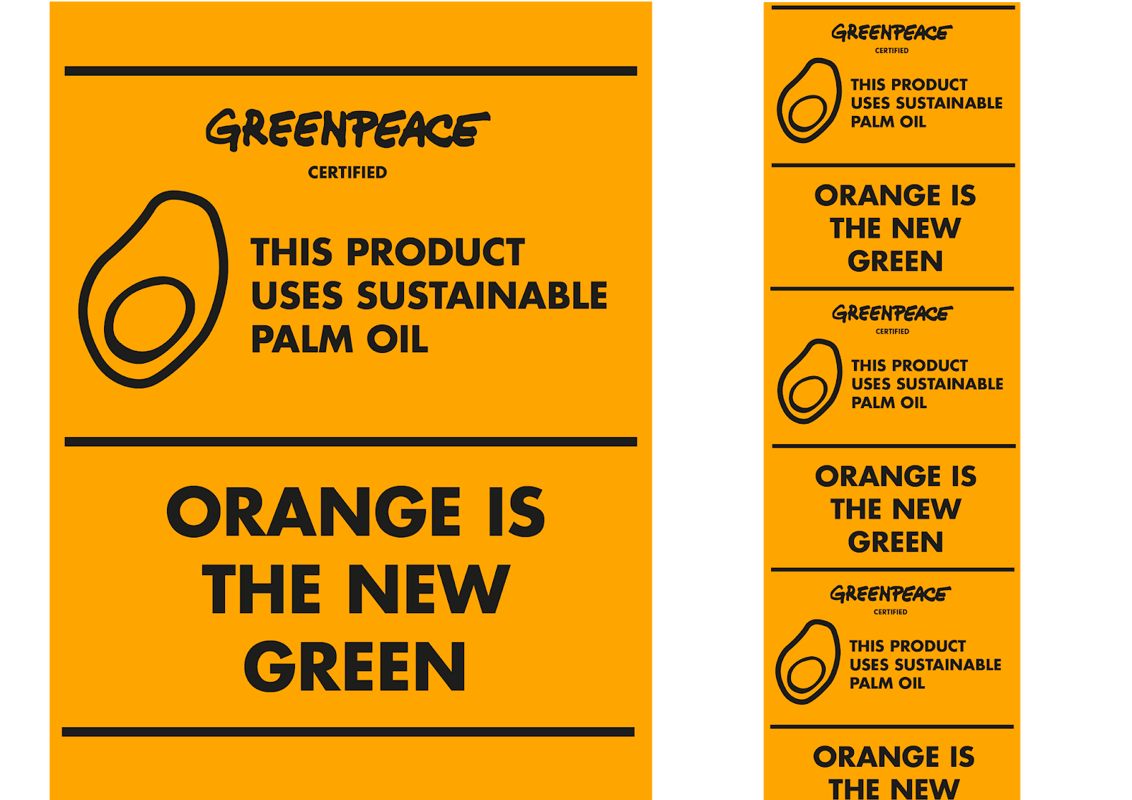
Following my initial idea feedback, I decided to carry on with creating a 'certification' mark for palm oil that was new and different from all the others that already exist. The feedback that I took upon was to work with or alongside an organisation. I chose this organisation to be Greenpeace, this is because unlike RSPO or other organisations, Greenpeace is a lot more reliable when it comes to sustainable palm oil use certification. Also, Greenpeace is a well-known and respected organisation, so in theory working with them would provide my project and certification mark more authority, and make the audience trust it and take it more seriously.
I took my initial logo idea sketches and started to work with them digitally. I focused a lot around manipulating the shape, form and colours of the palm oil fruit. I did this because the palm oil fruit naturally contains colours red and orange, ones that would instantly stand out against all the other 'green' certification marks. Also, because it would allow the audience to be able to visualise what 'palm oil' is more clearly and feel more personally connected to it. They may feel bad and be less likely to buy a product containing unsustainable palm oil if they know it looks like a pretty fruit and remind them of other fruits that they enjoy to eat.


Through this process I also came up with the slogan 'Orange is the new green'. This highlights the use of orange in the certification mark, and makes it more memorable.
I started working with the certification mark and new slogan, and started to create a 'strip' that would go across products to show that they use sustainable palm oil. I choose the form of a strip, as I believe it would be the easiest to implement onto existing products, as it could simply be added over existing packaging. Also, because the shape and area that it would cover on the product would be unavoidable for the audience to see.
I began working with the typeface 'Futura' as it is bold and matched well the lines within the certification mark. I continued the use of the bright orange to strengthen the brand identity and to enhance the slogan 'orange in the new green'.

Feedback:
- Look at different types of packaging, how would the strip be applied to all the different shapes?
- Maybe it could be a sleeve or sticker - some form of temporary packaging? Over the seal fo the product? So you have to look at it before you open it.
- Can it be a temporary thing - a week or month's campaign? Think of how companies would react if you cover half of their designed packaging and product information from the audience?
- If it was a campaign, you could design stickers, posters, adverts, billboards, etc?
- Work with the palm oil fruit, I think the logo is good but could be a little bit more modern.
- The bright orange is very effective, it would definitely stand out in the shop on the shelves.
No comments:
Post a Comment