After my feedback session, I first made all the small changes that have been discussed. The feedback session was very useful, as it gave me a better understanding of what they wanted with this magazine. It also confirmed to me that I was doing the right thing, as they were happy with the style and layout I had been doing this far.
I continued to add content into the magazine design and play around with the layout of each page.
 |
| As said in the feedback session, I extended the content and gave 'Sono' a double page spread. This allowed to increase the amount of imagery and visuals I included, and also gave the information/copy a little more breathing room. Following the feedback, I also inserted the 'Gravity' ad that relates to thin client/project into the same spread. |
 |
| Following the feedback, I extended the team photo and made it full bleed. I also searched for more photographs from their website and extended the square grid I had started earlier. I decided to take focus away from the Christmas card design, and focus more on the concept and the fun/playfulness of it. This layout I believe showcases the personality of Tall much better. |
 |
| As the feedback asked to take the 'Gravity' ad out, and make the 'LDF' a full one-page spread, I requested more imagery from this project, and when I received it I was able to fill up the page. Even though there is still little text/copy, I used the imagery in a way that fills up and space and makes it seem like that little copy was intentional. I started rough layout design of the 'Tall's Tips' section as well. I had the idea in mind that because this was the section of the magazine that was about 'Tall' rather than a project/client, that this page should really embrace the brand guidelines and make it obvious that it is written by and about Tall Agency. |
 |
| To improve the 'Gravity' feature I decided to give it a double page-spread, as well as increase the size of the imagery. As I wanted this page to be eye-catching and intriguing for the reader, I thought that the imagery should be the most colourful and vibrant. I also decided to include the vector icons created for 'Gravity', which would aid the copy/text and also give the double-page spread a more technical, serious and professional feel. |
 |
| I started to work on the contents page. I decided that any are in the magazine that was not about one of Tall's client, or didn't have a clear visual language already built for it (like 'Tall 80s' and 'Gravity' do), then I will simply follow the general Tall branding guidelines to design those pages. Tall's branding guidelines are quite simple, as they use mainly black and white colour scheme and the 'Gotham' typefaces. This meant that I could play around with using typography to create something that would not only seem like it was part of Tall's branding, but also be something that is quite fresh and visually engaging. I decided that oversize use of words/heading and numbers could be used to do this. |
 |
| Following feedback, again I added the 'Gravity' ad next to/near the client/project from which it was derived from. Here I also designed the Tall news section. As there was quite a lot of copy/text within this section, I decided to take the traditional newspaper-style column approach to communicate all the 'news'. As established previously, I utilised black and white as a colour scheme and used oversized typography to showcase and clearly communicate the Tall brand. |
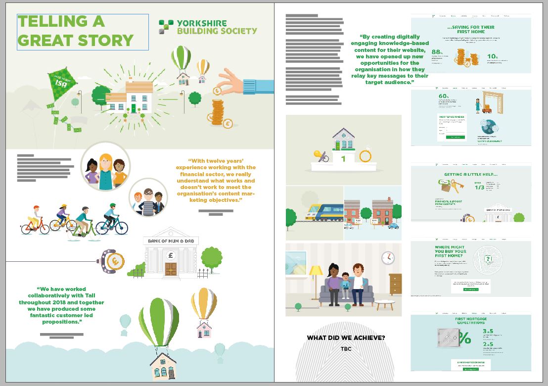 |
| Following feedback I got rid of the coloured circles encompassing the quotes, and reduced the colour scheme I was using. I decided that to make the quotes stand out slightly, but not so much that they become distracting, I will use colour. This instantly gave the whole spread more breathing room, and made the relationship between the text/copy and the imagery more seamless and visually pleasing. The Creative Director also changed the name of this spread from 'Day One's' into 'Telling a great story'. |
 |
| Following feedback, I decided to gave back to my previous ideas and use the 'See the world in a New Light' image as a whole instead of just its icons. However, I got rid of the quote within the image and added the heading of this feature instead. I thought that this visually would be quite pleasing and give the feature a more seamless fell. Also, there would be no confusion for the reader what is the title of the feature. I also added a 3D design Tall had done, as requested. |
 |
| One of the small features that should have been included in the magazine was a 'Welcome to Tall' bit. However, this being such a small feature, I struggled with not only making it look good visually, but also finding a place for it in the magazine where it did not look too distracting or like an after-thought. In the end I used my expertise as a designer and decided to not include this section at all. |
The Creative Director also asked me to think about what the name of the magazine should be. I took inspiration from the agency name 'Tall', their speciality in digital design, as well as their liking towards the space/astronomy theme I had discovered during my research stage. I tried to think of names that could be quite subtle but meaningful.
- Taller
- Reaching Higher
- Digital Heights
- Elevate
- Tall Review
- Mission
- Sky High
- Rocket
- Higher
- Tower
- Above and Beyond
- One Step
- One Leap
- Looking Back
- Above
- Forward
- Beyond
- Mono
- Lift Off
- Digital Explorer
- Tall and Beyond
- Taking Brands Forward
- Digital Thinking
- Venture Higher
- Uncharted
Front Cover Design
For the front cover design, I wanted to clearly demonstrate who's magazine this is, and so I utilised the branding guidelines and Tall's brand identity to create some simple designs that very clearly communicate Tall. I used their brand graphic elements as well as their 'Gravity' workshop elements and colours.
 |
| In this design I used Tall brand graphics and 'Gravity' icons. I kept the colour in the 'Gravity' icons to possibly give the front cover design a pop of colour and make it more visually stimulating. |
 |
| In this design I kept strictly to the black and white colour scheme of Tall's branding and utilised their brand graphics. I created a composition that hints at the theme of digital and looks interesting. |
 |
| In this design I kept the same composition with the 'Gravity' icons and explored some different colours. I used photoshop to impose one of the 'Gravity' posters into the design to give some cooler and more space-like hues. |
 |
| In this design I used another 'Gravity' poster to give the composition some warmer hues. Throughout all front cover design I kept the black background to ensure that the Tall brand is clearly communicated, even with the more excessive use of colour. |
 |
| In this design I again added cooler hues, this time to all the graphic elements. I tried to make the front cover design something that would be equally communicate of the Tall brand, but also something that is new and fresh and visually engaging. |
 |
| In this design I again utilised one of the 'Gravity' posters and imposed its colours into the brand graphic composition. I really liked how this visually hinted at the space/astronomy them that Tall favours as a brand/agency. |
 |
In this design I imposed colours from yet a different 'Gravity' poster. I only used 'Gravity' posters as guides for colours as like stated earlier, I wanted the front cover design to wholly communicate Tall agency, ad so I set myself the boundaries of only experimenting with and using 'Tall' and 'Gravity' branding elements.
|
The next step was to adapt the initial front cover design to include the Tall logo and magazine name. After some discussion and feedback with the Tall team members, from all the name ideas I previously stated, we choose the name 'Forward'. This name is representative of the fact that even though we are looking back at the clients and work that Tall have done, the magazine is still a symbol for Tall moving 'forward' and for the even greater work that is ahead. The name symbolizes being excited for the future.
 |
| I started to look at how the Tall logo could be incorporated into the front cover design. |
 |
| I also played around with moving some of the graphic elements to make room for the name of the front cover. |
 |
| I definitely wanted to include the Tall logo, and tried to find the right space for it so it does not distract from the name of the magazine, or look like it should be part of it. To do this, I decided to add the word magazine after the Tall logo, to make t clear that the magazine is produced by them, but that 'Forward' is the name of it. |
No comments:
Post a Comment