I made sure to stick to the following brand guidelines I had discovered during my research...
Headings: Gotham Black, Bold or Light
Sub-headings: Gotham Book, Medium or Gotham Rounded Medium
Body Copy: Gotham Book or Gotham Rounded Book.
(Although in the brand guidelines only 'Gotham' is stated, I was told by the head designer that 'Gotham Rounded' may also be used)
Colours: Black #000000 White #ffffff Light Grey #dadada Space Grey #26242e Blue #0511f5 Purple #7c0ce8 Green #2debae
 |
| I knew I wanted the magazine to have some type of branding consistency throughout. I made sure to use the same typeface, colours and brand graphics throughout the magazine. In this first page that I designed, I found an interesting way to utilise the brand graphic and create a guideline for how to display the 'What did we achieve?' quotes. I also liked the use of white text overlapping a photograph, and considered this as something that could be consistent also. |
 |
| Moving onto the next project, I found that it will be quite difficult for me to give the magazine a very clear and cohesive style, as each story/client Tall have worked with is so different. Whereas the previous client 'Express' had website design and very high quality photography, this client, YBS has illustration. I knew at this point that I will need to give each page design their own personality and allow for the work to shine, rather than trying to dull it by forcing it to be like the rest of the magazine. In this design I played around with the placement of the illustrations, and also tried to find and interesting way to display quotes. I thought that a circle and different colours could make them stand out. |
 |
| Different page, different client, and again a completely different style and personality to the imagery. Here I decided to let the imagery guide my designs and built the copy around the 3d render of a printing machine. I really liked this layout as I thought it is very clean, minimal, modern but also communicates everything it needs to very easily. |
 |
| A lot of the imagery provided with this client had a dark or black background, I decided to embrace that and give the page a black background also. I wanted to make the imagery sit seamlessly with the page, however to do that effectively I needed vectors of the shapes within the images. Although I had asked the Tall team to provide me with those, they could not find it and therefore I feel this page in the final outcome suffered in quality slightly. Nonetheless I felt like I was doing quite well at embracing each client and project and the tone/atmosphere of each project quite well, and communicating them in clear but also visually engaging layouts. |
 |
| Here I kept trying to find the right visual to present quotes. A lot of the quotes either were by members of the Tall team, or by their clients, so I thought that these should be highlighted as the magazines aim is to showcase the Tall team and their personality, as well as to promote them. I tried here incorporating the brand graphics into the quiote. |
 |
| Here I tried putting the quote into a white circle, however, this felt a little too familiar, maybe hinting at the use of colour of 'PC' world. Mimicking another company was definitely something I wanted to avoid. |
 |
| I really liked this use of a colourful gradient for the quotes, as I thought this would work very nicely at making them standout. However, because of the gradient and the colour, the text/copy was loosing legibility, and that was something that would not have been acceptable. |
 |
| As well as content about Tall's clients and projects, they also wanted to include some fun projects and information about them as a team/studio within the magazine as well. I knew that for these pages I had more freedom with the way I present the content, and that I could be more playful with it. The imagery given for this feature all had quite different shapes/formats, so I tried to collect them in a way that would be visually interesting and make the reader want to find out more. |
 |
| Another important feature that Tall wanted me to highlight within the magazine was their 'Gravity' workshop. From the 'Gravity' guidelines the had given me, I extracted visuals I thought would be appropriate to promote the workshop. I wanted to make the feature about 'Gravity' as visually enticing and eye-catching as possible, so that the reader takes an interest in reading about it and in this way promoting 'Gravity. This feature was the only where I did not use the same 'Gotham Black' typeface for the heading, because the 'Gravity' workshop stands as a separate service that Tall provides, and so I thought it would be best to communicate and present it in the way that they had designed the service. |
 |
| I tried to be quite playful with the layout, because I wanted it to be eye-catching. That is why I explored 'breaking' the grid/layout and having some overlays. |
 |
| I started to go back over some of my designs with fresh eyes. I changed this layout because I felt that the previous one was a little too chaotic and the information was not presented clearly. I imagined that if I had the vector files, that I could place the different icons in any place I wanted, and so worked with the idea that the icons could line up as a sort-of underline, and then the text/copy can be presented neatly and clearly underneath it. |
 |
| Going back to the 'Gravity' feature, I was not liking the previous designed because they did not feel very similar to what I had seen in the 'Gravity' guidelines I looked at during my research. I wanted this feature to really represent and showcase the service. I tried to tone-down the playfulness as that is what was causing the issue, and tried a nice and clean layout instead. Although this looked a little more appropriate, unfortunately it also looked more boring. I knew that I will need to experiment with this feature a lot more in the future. |
 |
| For Leeds Digital Festival, there was not very much copy or imagery provided, and it was set in the planning as being only a small feature. For this reason I decided to include on the same page as it a 'Gravity' ad. There were 3 1/4 page ads provided within the content for the magazine, and Tall wanted me to include them in the same way that paid ads would be included in magazines. For the Leeds Digital Festival designs here, I tried to make do with the small amount of copy I had, and also extracted some of the illustrations Tall had done, from the LDF website to scatter round and fill the space more. I thought this was very effective, as although there is not a lot of copy, the work and imagery does a very good job at promoting and showcasing what Tall had done. |
For the feedback session, I showed the work I had done so far. We did this session quite early on so that we could see weather they explained right what they're looking for and if I incorporating that information right. The session was with the Creative Director and Head Designer. We printed the first draft out onto paper so that it was easier to imagine the magazine in context, as well as to confirm to me if the text size was big enough/legible.


- For the 'Express' page. The top image should not be advertising them, but advertising us. You were not provided with the right imagery. It should showcase what we did and what is special about it - it is the fastest website we've ever built.
- Text is legible and the size is great, maybe just increase the leading between the lines slightly to make it easier to read.
- For the 'What did we achieve' bits, make the statistics eg. '100%' bold.
- Get rid of the circles for the quotes on the 'YBS' page. The circles and their colours are a little too unlike our agency branding, and they distract from the other content. Integrate the quotes into the text more.
- For the 'NeonSigns' feature, use the whole 'See the world in a new light' graphic rather than just the icons from it. Showcase some of the 3D work we did also.
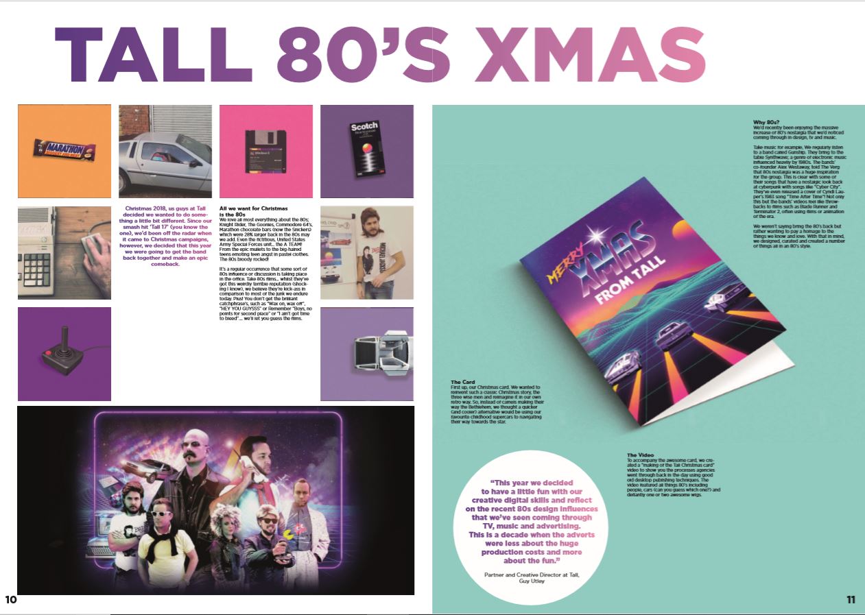
- For 'Tall 80's' make the black team photo full bleed within the page. Really like the Instagram-like square layout, maybe extend that further and take more images from our website.
- Increase the 'LDF' into a full one page feature.
- Increase 'Sono' into a double page spread and show off more imagery.
- The 'Gravity' ads try and put them with the feature, as I now see their not really working in a random advert type of way.
- Think about a name and front cover design for the magazine.
- Overall really happy with what you're doing, keep at it and if you need any assets or content just ask.
No comments:
Post a Comment