Tuesday 31 January 2017

Use of colour in Graphic Design

Booklet content:

The use of colour in graphic design holds infinite importance. Colour influences us all at a basic, even primal level. Over the thousands of years of human evolution, we have learnt to ‘read’ the world around us using colour. We see red as ‘danger’ because of blood and fire, we see green as ‘peace’ because of nature. Understanding the power that colour holds over us, and harnessing this effectively is what graphic designers strive for. However, colour is also very subjective. What evokes one reaction in one person may evoke a completely different reaction in someone else. This may be due to personal preferences, or even cultural background. For example, Western colour associations see Black as the colour of ‘mourning’, whereas, in many parts of Asia, that colour is white. There is also some evidence that our age is a factor in our preference of colour. Expert Faber Birren, in his book ‘Color Psychology and Color Therapy’, found that blue and red “maintain a high preference throughout life” but also that “with maturity comes a greater liking for hues of shorter wavelength (blue, green purple) than for hues of longer wavelength (red, orange and yellow)”. When working on a brief, a graphic designer would have to take into consideration their audience and base their colour decision-making on studies such as the one carried out by Faber Birren.

Meanwhile choosing colours for a design can be highly scientific; it is more often so than not, highly subjective. Colours have the ability to influence mood, emotions, and perceptions; take on cultural and personal meaning; and attract attention, both consciously and subconsciously. That is why, for the graphic designer, the challenge is in balancing these complex influences that colour can have, and conveying them into an attractive and effective design. To tackle this challenge, the basic understanding of colour theory is vital.  Traditional colour theory can help the designer to understand what colours work well together and what kind of effect different combinations of colour would have on the design. The elementary understanding of the colour wheel, hue, shade, tone, tint, saturation, and value can have a massive positive impact on design decisions. Small alterations to any of the qualities of colour can entirely change the communication of a design.


The psychology of colour is another aspect of colour theory that can be highly utilized. Thinking back to the idea of colour association at a primal level, there are certain subconscious moods and emotions that different colours can induce within the audience, depending on the context they are presented in. Specifically in Western culture: Red can be warmth, danger, energy, liveliness, violence, power, and love; Orange can be cheerfulness, activity, energy, optimism, creativity, and youthfulness; Yellow can be happiness, cheerfulness, friendliness, freshness, caution, and quarantine; Green can be nature, life, growth, health, freshness, wealth, and illness; Blue can be peace, cleanliness, calmness, sadness, trustworthiness, stability and professionalism; Purple can be royalty, honor, mysticism, religion, luxury and femininity; Black can be power, luxury, sophistication, death, evil, mystery, mourning, and neutrality; and White can be purity, innocence, goodness, perfection, sterility, cleanliness and minimalism.

Monday 30 January 2017

OBJECT - Design Development


Following crit feedback, I started to develop my battery packaging idea. I choose to focus significantly on colour within my design. I did this because during my initial research, I had found that most battery packagings are boring and unexciting, and that most people do not care about the brand of batteries they posses. The purpose, therefore, of my project was to create battery packaging that would be intriguing and exciting for the audience, something that would be a pleasing purchase for them and stay memorable.

When looking at the colours I was to use within my designs, I wanted the colour to correspond with the emotion. For this I researched into colour theory. The book 'If It's Purple, Someone's Gonna Die' by Patti Bellantoni lists various psychological associations of colour. She states "warm reds tend to sensual and lusty, or romantic" therefore, for the emotion of 'Love' I've decided on a soft gradient of pink and white. White because it is generally associated wit purity and good, much like the traditional idea of love. Yellow is "associated with happiness", and orange is "nice" and "warm", so I've used a gradient mix of yellow and orange for the emotion of 'Happiness'. For the emotion of 'Motivation', I've used a gradient mix of purple as it "can represent dreams", and blue because it is "associated with intellect". Blue-green/teal "inspired openness and interaction", and green "symbolises nature, life and health", so I've used a gradient mix of teal and green for the emotion of 'Hope'.

The design of the box is grey, so the design of the batteries packaging could be showed off more. Also, if the packaging was just as colourful as the batteries, the design concept as whole would become too gimmicky and wouldn't be taken seriously by the audience. The use of white text creates a relation between the battery packaging and the box packaging. The lack of black text on the box packaging, although it is present on the battery packaging, slightly flaws the consistency of design. The thick white line on the top of the front of the packaging is designed to be cut through, this is so the audience could see inside the packaging and get a glimpse of the battery packaging. The different colours of each different 'emotion' battery will be distinct through the gap, and would engage the audience/draw their attention.

Following my crit feedback, I'd made the decision that I want my batteries to be sold as standard. This is so the purpose for the product could be more easily met; the audience may not want to buy 'emotional' batteries if they are simply a gimmick, however, if they are legitimate and appropriate for standard home use, it might make them more likely to be drawn to the purchase. The production and distribution of the batteries would be standard as any other, in shops and supermarkets.

Pantone, CMYK & RGB Research


Pantone LLC, a wholly owned subsidiary of X-Rite, Incorporated, is the world-renowned authority on color and provider of color systems and leading technology for the selection and accurate communication of color across a variety of industries. The PANTONE® name is known worldwide as the standard language for color communication from designer to manufacturer to retailer to customer. 

In 1963, Lawrence Herbert, Pantone's founder, created an innovative system for identifying, matching and communicating colors to solve the problems associated with producing accurate color matches in the graphic arts community. His insight that the spectrum is seen and interpreted differently by each individual led to the innovation of the PANTONE® MATCHING SYSTEM®, a book of standardized color in fan format.
Pantone has since expanded its color matching system concept to other color-critical industries, including digital technology, fashion, home, plastics, architecture and contract interiors, and paint. Pantone continues to develop color communication tools for a variety of industries and aggressively adopt new digital technology to address the color needs of design and production professionals.


CMYK Color Mode
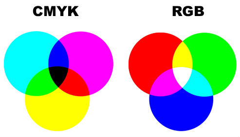
If printers are using a digital printing method, they would print color on paper using CMYK colors. This is a four color mode that utilizes the colors cyan, magenta, yellow and black in various amounts to create all of the necessary colors when printing images. It is a subtractive process, which means that each additional unique color means more light is removed, or absorbed, to create colors. When the first three colors are added together, the result is not pure black, but rather a very dark brown. The K color, or black, is used to completely remove light from the printed picture, which is why the eye perceives the color as black.


RGB Color Mode
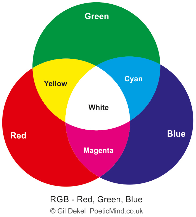
RGB is the color scheme that is associated with electronic displays, such as CRT, LCD monitors, digital cameras and scanners. It is an additive type of color mode that combines the primary colors, red, green and blue, in various degrees to create a variety of different colors. When all three of the colors are combined and displayed to their full extent, the result is a pure white. When all three colors are combined to the lowest degree, or value, the result is black. Software such as photo editing programs use the RGB color mode because it offers the widest range of colors.


Booklet content:

Pantone, as it’s known today, was founded in 1962 when Lawrence Herbert bought it from a small business that manufactured colour cards for cosmetics companies. He immediately changed the direction of the company, and developed the first colour matching system in 1963. The primary product in the Pantone Matching System (also known as PMS) is the Pantone Guide. This consists of a large number of small thin cardboard sheets, printed with a series of related colour swatches and bound into a small flipbook. The idea behind PMS was to allow designers to ‘colour match’ specific colours when a design enters production stage, regardless of the equipment used to produce the colour. Todays PMS features 1,341 solid Pantone colours, printed on coated, uncoated and matte papers. Pages also contain RGB and CMYK symbols, indicating the colours achievable on screen, in colour printing, and both.

CMYK is a colour mode that utilizes the colour Cyan, Magenta, Yellow and Black in various amounts to create all the necessary colours when colour printing. It is a subtractive process, meaning that more light is removed or absorbed to create each individual colour. When the first three colours are added together, the result is not purely black, which is why colour K (Black) is added to completely remove light from the print, which the human eye perceived as black. 

RGB is a colour mode that utilizes and combines the primary colours Red, Green and Blue in various degrees to create a variety of different colours for electronic displays. It is an additive process, meaning when all three of the colours are combined and displayed to their full extent; the result colour is pure white. When all three are combines to the lowest degree, the result colour is black.

International Klein Blue Research


The letters IKB stand for International Klein Blue, a distinctive ultramarine which Yves Klein registered as a trademark colour in 1957. He considered that this colour had a quality close to pure space and he associated it with immaterial values beyond what can be seen or touched.

Klein invented the paint with the help of a chemical retailer by suspending pure, dry pigment in crystal-clear synthetic resin and compatible solvents (ether and petroleum). Unlike traditional binders, the new colorless carrier did not dull the individual particles of pigment, but left them with their original brightness and intensity.
The novel medium was versatile enough to be brushed, sprayed, rolled, or even thickened and built up on a surface. It quickly dried to a fragile-looking but durable matte finish that, like velvet, offered a plush, light-absorbent surface that seemed to dissolve into a dark, glowing liquid depth.

In the years leading up to 1957 Yves Klein had been refining his use of color, striving to capture a shade of blue that would encompass his entire experience - eradicating the horizon and combining the earth and the sky, laying bare the range of his own emotions, unlocking an experience of the endless void of space, but the right blue was hard to find. Whenever he found a pigment that satisfied him, the process of mixing it with any agent in order to apply it to a canvas changed the shade and destroyed the effect.  Klein attributed a particular role to the color blue, which embodied for him the most abstract aspects of tangible and visible nature, such as the sky and the sea.


IKB 79 was one of nearly two hundred blue monochrome paintings Yves Klein made during his short life. He began making monochromes in 1947, considering them to be a way of rejecting the idea of representation in painting and therefore of attaining creative freedom. Although it is difficult to date many of these works precisely, the early ones have an uneven surface, whereas later ones, such as the present work, are finer and more uniform in texture. Klein did not give titles to these works but after his death in 1962, his widow Rotraut Klein-Moquay numbered all the known blue monochromes IKB 1 to IKB 194, a sequence which did not reflect their chronological order. Since then further examples have been identified and these have also been given IKB numbers. In 1974 Rotraut Klein-Moquay wrote to Tate saying that she was fairly certain that IKB 79 was one of about four monochrome paintings Klein made when they were together at Gelsenkirchen, West Germany in 1959.


Yves Klein quotes:

"Blue has no dimensions; it is beyond dimensions, whereas the other colours are not... All colours arouse specific associative ideas... while blue suggests at most the sea and sky, and they, after all, are in actual, visible nature what is most abstract."

"I am against the line and all its consequences: contours, forms, composition. All paintings of whatever sort, figuratives or abstract, seem to me like prison windows in which the lines, precisely, are the bars."

"The world is blue."

"Every phenomenon manifests itself of its own accord. This manifestation is always distinct from form, and is the essence of the immediate, the trace of the immediate."

Examples of IKB in artists' work:


Booklet content:


International Klein Blue (IKB) is a distinctive ultramarine, which Yves Klein registered as a trademark colour in 1957. He invented the colour with the help of a chemical retailer by suspending pure, dry pigment in crystal-clear synthetic resin and compatible solvents. Unlike traditional binders, this new process did not dull the individual particles of the pigment, and allowed the original brightness and intensity of the colour to stay present. Klein considered this colour to have a quality close to pure space and he associated it with immaterial values beyond what we can see or touch. Klein attributed a particular role to the colour blue, which embodied for him the most abstract aspects of tangible and visible nature, such the sky and the sea. Being a student of Roisicrucianism and of Eastern religious, Klein entertained esoteric and spiritual ideas in which blue played a vital role as the colour of infinity. Monochrome abstraction is the use of one colour over an entire canvas, and a practice that he was heavily attracted to. Klein likened monochrome painting to an “open window of freedom, as the possibility of being immersed in the immeasurable existence of colour”. One of the most noticeable pieces of work by Klein, that incorporated his IKB were his anthropometries, or body paintings. Klein used the body as a “living paint brush”, and by covering his models in his IKB paint, he directed them to press and drag their bodies across paper and canvas, leaving impressions of the paint. The resulting work created and interesting atmosphere where they represented the temporary physical presence of the models.

Joseph Albers Research

In 1950, at the age of 62, Albers began what would become his signature series, the Homage to the Square. Over the next 26 years, until his death in 1976, he produced hundreds of variations on the basic compositional scheme of three or four squares set inside each other, with the squares slightly gravitating towards the bottom edge. What may at first appear to be a very narrow conceptual framework reveals itself as one of extraordinary perceptual complexity.

Though Albers began work on the Homage paintings in 1950, he was introduced to color theory very early in his career, when he enrolled as a student at the Bauhaus in 1920. The Bauhaus was a revolutionary school of art and design in Germany, founded by Walter Gropius in 1919. Its philosophy was to integrate the principles of fine art and functional design, and many of the most important artists in Europe were teachers there. When Albers was a student, the foundation for all Bauhaus education was the Vorkurs, or preliminary course, taught by Johannes Itten. The course covered the fundamentals of material, composition, and color theory, and was one of the most influential and widely disseminated aspects of Bauhaus curriculum.

The idea of creating space through color goes back to a technique known as atmospheric perspective. The best examples can be seen in landscapes of the Dutch Golden Age and Italian Renaissance artists such as Leonardo da Vinci. The principle of atmospheric perspective is that objects that are far away are less saturated in color, and have less contrast. Looking at the mountains behind Leonardo’s Virgin of the Rocks, each set of mountains that is farther away is closer in color to the sky than the set of mountains in front of it.

This technique had been used to create space in representative paintings going back to antiquity, but Albers was revolutionary in applying it to abstract art. His experiments in the Homage series paved the way for artists such as Bridget Riley and a whole generation of Op artists, who also pushed the limits of two-dimensional media by creating large-scale optical illusions. Though Homage to the Square may seem boring and repetitive to some, their simple beauty is often compared to classical music, like the work of Bach: a study on theme and variation.


Quotes by Joseph Albers:
"In visual perception a color is almost never seen as it really is — as it physically is. This fact makes color the most relative medium in art. In order to use color effectively it is necessary to recognize that color deceives continually. To this end, the beginning is not a study of color systems. First, it should be learned that one and the same color evokes innumerable readings. Instead of mechanically applying or merely implying laws and rules of color harmony, distinct color effects are produced-through recognition of the interaction of color-by making, for instance, two very different colors look alike, or nearly alike"

"They all are of different palettes, and, therefore, so to speak, of different climates. Choice of colours used, as well as their order, is aimed at an interaction - influencing and changing each other forth and back. Thus, character and feeling alter from painting to painting without any additional 'hand writing' or, so-called, texture. Though the underlying symmetrical and quasi-concentric order of squared remains the same in all paintings - in proportion and placement - there same squares group or single themselves, connect and separate in many different ways.

"I have also come to the conclusion that the square is a human invention, which makes it sympathetic to me. Because you don't see it in nature. As we do not see squares in nature, I thought that it is man-made. But I have corrected myself. Because squares exist in salt crystals, our daily salt. We know this because we can see it in the microscope."

"Easy to know that diamonds are precious. Good to learn that rubies have depth. But more to see that pebbles are miraculous."

"If one says "Red" (the name of a color) and there are 50 people listening, it can be expected that there will be 50 reds in their minds. And one can be sure that all these reds will be very different.

"In visual perception a color is almost never seen as it really is — as it physically is. This fact makes color the most relative medium in art."


Booklet content:

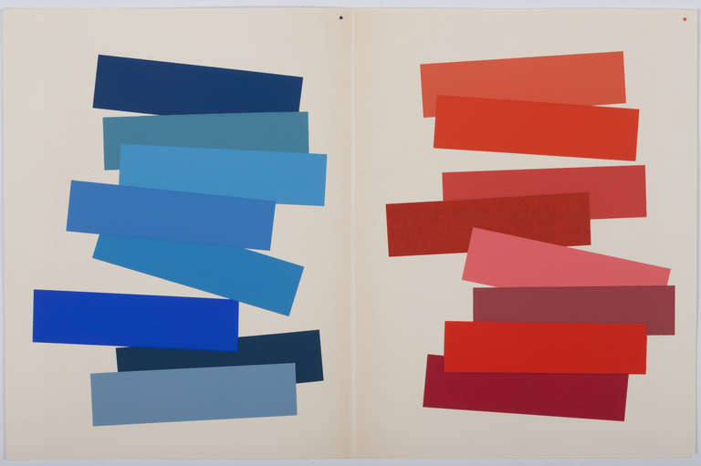
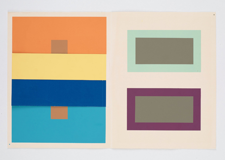
Joseph Albers, born 1888 in Germany, is most well renowned for his signature series ‘Homage to the Square’. He started the series in 1950, at the age of 62. Albers believed that the most essential subject of any painting was colour. He wanted to show that all that was needed, to carry out the full weight of meaning, emotion and aesthetic, was colour. The formats of these painting consisted of three or four squares, placed within each other and each square slightly stepped down in relation to the last. By stepping down the squares he was able to break the flatness of the surface and create a spatial atmosphere. Through his choice of colour, he was then able to control this atmosphere, pushing the square forward or back; drawing us into the painting or have it press towards us. Albers also believed that the most precarious characteristic of colour was its instability. In natural light the colour we see changes during the course of the day. In artificial light the same colour differs according to the type of bulb. Colour in paint or ink format, has a completely different look than the same colour on screen or cinema. Another belief he developed through his work was that there are two aspects that dramatically affect the way we perceive colour: quantity and environment. A colour in large amounts appears different than the same colour in small amounts, and the neighbouring colours alter the perception of the main colour. Using these beliefs, each painting from Albers’ ‘Homage to the Square’ series creates a different world from just three of four colours.

Friday 27 January 2017

OBJECT - Initial Design Ideas and Crit Feedback


The first idea was to create sheet music using the 'graphic musical scores' I had developed during my research stage. The purpose was to visually communicate the 'Batteries Not Included' theme song. I would have looked further into the works of Cornelius Cardew and Gyorgy Ligeti, as well as the visual language of legitimate sheet music to aid my design process.


The second idea was also based on the 'Batteries Not Included' Theme song. I would have designed a series of limited edition soundtrack CD covers for the film. I would have used the designs from my research into the song to create unique covers, that still held a sense of uniformity and created a series of 'collectables'.

The third idea was to create a new brand/concept of battery packaging that reflected positive human emotions. From my research I had learnt that most people do not pay much attention to their battery brand, and that in general battery packaging is unnoticeable and boring. The packaging would have different colours for different emotions, and would be sold as either standard use batteries or gimmicky gifts.

Crit Feedback:
- Second idea sounds too boring, and not as well though out.
- The emotional battery packaging idea is the strongest.
- Think about the production and distribution of the product.
- Make a physical 3D mock up.
- Decide on whether they would be for standard use or as gimmicky gifts.