Though Albers began work on the Homage paintings in 1950, he was introduced to color theory very early in his career, when he enrolled as a student at the Bauhaus in 1920. The Bauhaus was a revolutionary school of art and design in Germany, founded by Walter Gropius in 1919. Its philosophy was to integrate the principles of fine art and functional design, and many of the most important artists in Europe were teachers there. When Albers was a student, the foundation for all Bauhaus education was the Vorkurs, or preliminary course, taught by Johannes Itten. The course covered the fundamentals of material, composition, and color theory, and was one of the most influential and widely disseminated aspects of Bauhaus curriculum.
The idea of creating space through color goes back to a technique known as atmospheric perspective. The best examples can be seen in landscapes of the Dutch Golden Age and Italian Renaissance artists such as Leonardo da Vinci. The principle of atmospheric perspective is that objects that are far away are less saturated in color, and have less contrast. Looking at the mountains behind Leonardo’s Virgin of the Rocks, each set of mountains that is farther away is closer in color to the sky than the set of mountains in front of it.
This technique had been used to create space in representative paintings going back to antiquity, but Albers was revolutionary in applying it to abstract art. His experiments in the Homage series paved the way for artists such as Bridget Riley and a whole generation of Op artists, who also pushed the limits of two-dimensional media by creating large-scale optical illusions. Though Homage to the Square may seem boring and repetitive to some, their simple beauty is often compared to classical music, like the work of Bach: a study on theme and variation.
Quotes by Joseph Albers:
"In visual perception a color is almost never seen as it really is — as it physically is. This fact makes color the most relative medium in art. In order to use color effectively it is necessary to recognize that color deceives continually. To this end, the beginning is not a study of color systems. First, it should be learned that one and the same color evokes innumerable readings. Instead of mechanically applying or merely implying laws and rules of color harmony, distinct color effects are produced-through recognition of the interaction of color-by making, for instance, two very different colors look alike, or nearly alike"
"They all are of different palettes, and, therefore, so to speak, of different climates. Choice of colours used, as well as their order, is aimed at an interaction - influencing and changing each other forth and back. Thus, character and feeling alter from painting to painting without any additional 'hand writing' or, so-called, texture. Though the underlying symmetrical and quasi-concentric order of squared remains the same in all paintings - in proportion and placement - there same squares group or single themselves, connect and separate in many different ways.
"I have also come to the conclusion that the square is a human invention, which makes it sympathetic to me. Because you don't see it in nature. As we do not see squares in nature, I thought that it is man-made. But I have corrected myself. Because squares exist in salt crystals, our daily salt. We know this because we can see it in the microscope."
"If one says "Red" (the name of a color) and there are 50 people listening, it can be expected that there will be 50 reds in their minds. And one can be sure that all these reds will be very different.
"In visual perception a color is almost never seen as it really is — as it physically is. This fact makes color the most relative medium in art."


Booklet content:
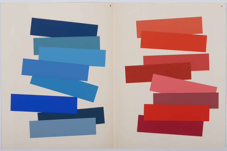
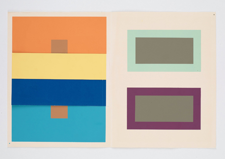
Joseph Albers, born 1888 in Germany, is most well renowned for his signature series ‘Homage to the Square’. He started the series in 1950, at the age of 62. Albers believed that the most essential subject of any painting was colour. He wanted to show that all that was needed, to carry out the full weight of meaning, emotion and aesthetic, was colour. The formats of these painting consisted of three or four squares, placed within each other and each square slightly stepped down in relation to the last. By stepping down the squares he was able to break the flatness of the surface and create a spatial atmosphere. Through his choice of colour, he was then able to control this atmosphere, pushing the square forward or back; drawing us into the painting or have it press towards us. Albers also believed that the most precarious characteristic of colour was its instability. In natural light the colour we see changes during the course of the day. In artificial light the same colour differs according to the type of bulb. Colour in paint or ink format, has a completely different look than the same colour on screen or cinema. Another belief he developed through his work was that there are two aspects that dramatically affect the way we perceive colour: quantity and environment. A colour in large amounts appears different than the same colour in small amounts, and the neighbouring colours alter the perception of the main colour. Using these beliefs, each painting from Albers’ ‘Homage to the Square’ series creates a different world from just three of four colours.
No comments:
Post a Comment