Wednesday 29 March 2017

Studio Brief 2: 80's Denim Culture Research

The 1980's denim culture consisted of a lot of personalised denim jeans and jackets. Badges, buttons, zips, pins, iron-ons, and even drawn/painted elements could be found on the jeans and jackets. Ripped and acid-washed/faded elements were also popular.


Friday 24 March 2017

Studio Brief 3: Initial Idea Presentation Feedback

- Think more about the 'half' aspect of the idea. Work with opposites, two sides to the branding.
- Make a dot out of dots for the logo. Look at Damien Hirst's dot paintings.
- Use black dots as part of the wayfinding and branding ideas.
- Think of the curation of the exhibition. Possibly have two parts = Old vs New, Outside vs Inside etc
- For the rating interaction system, think about creating rules that the audience can follow and create something more artistic rather than just random.
- Use colour and people's work as the background for the posters, with the black dots/logo on top.
- Think about textures/ locations and how to link the branding to Leeds public spaces.
- Identity NEEDS to communicate: public spaces, print and celebration.

Studio Brief 2: Other Idea Development & Feedback

Following feedback, I first decided to explore creating a poster just for one act that played at Roundhay Park, rather than the whole decade of artists. For this, I focused on Bruce Springsteen, and his 'Born in the USA' tour that was so popular and had a big impact in Leeds. I explored the tour/album imagery as well as imagery associated with the artist himself, as suggested by feedback.


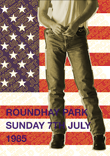
All three design ideas use the american flag imagery that was associated with "Born in the USA" tour, as well as the previously used quote of "crowd just went wild". All three also include text/heading of "Roundhay Park Sunday 7th July 1985", which is where and when the concert took place. What I struggled with was incorporating more specific details about the artist, as I didn't want to include his name within the text/heading as that would be too obvious and un-interesting. The USA flag already plays as a symbol however, without further visual guidance it is too vague. I tried to incorporate a newspaper clipping from the time, and clippings from Springsteen's album covers. Unfortunately, doing so made the poster designs feel awkward, as there was no cohesiveness between the digital designs and the photographic elements of the posters. The use of several symbolisms also feels over-done and too obvious, and the overall visual impact of the posters less than satisfying. 

Following different feedback, I also decided to explore poster design around not just one, but several of some of the biggest artists who played at Roundhay Park in the 80's. These were - The Rolling Stones, Madonna, Michael Jackson and Bruce Springsteen. Also, as suggested by the feedback, I've decided to look at "subtle details" and symbolisms, if there are any, of each artist and creating imagery for the poster using those.


The imagery I used was the denim jeans for Bruce Springsteen, the white glove for Michael Jackson, the tongue logo for The Rolling Stones, and for Madonna simply her image, as I couldn't think of any specific object/symbol that could communicate her clearly. The composition I made is fairly random, and there is a lot of negative space left. This makes this poster design really dull and unsuccessful.


In an attempt to fill some of that negative space, I repeated the composition I created several times, this not only filled the space but also created a much more interesting visual impact. I also added the previously used "crowd just went wild" type treatment as it added more texture and further increased the visual impact. The use of a simple "Roundhay Park Leeds 1980s" heading, however, although alongside the imagery may make it more obvious what the event is than previous ideas, still doesn't quite make it clear enough.


To aid the communication of the event, I added the list of the artists. This, along with the images and the heading makes it a lot more obvious that the event is the concerts. The use of the repeated composition, as well as the "crowd just went wild" quote overlaying the images, give the images some vagueness which would in turn make the audience more intrigued and make them look closer in order to identify what they are.


I also re-visited the idea of the repetitive "80,000 people dancing". Because I've kept the "crowd just went wild" text overlay, and added the extra quote, I removed the repetitive composition of the imagery in the background, so not to over-whelm the poster design. I kept the heading and the artist list to allow clarity in the communication of the event.

Overall, these poster designs have been more visually interesting and intriguing than my previous ideas. The use of colours came partly from the desire of significant contrast, and partly from the 80s poster culture of also using bright colours. The manipulation of typography I believed has been subtle but effective, and gives texture to the designs which significantly elevates their success. The imagery used is appropriate as it communicates all the listed artists well, however, I believe that the composition of the images is too simple and feels unconsidered. The style of the different images also doesn't match, so there is slight inconsistency in the visual impact. Although the idea behind the designs is appropriate and effective, I feel that the execution and especially imagery considerations need to be reconsidered and a way to create more cohesiveness across the design needs to be found.

Feedback
- Make the poster about all the artists rather than one, as that makes it more celebratory.
- Considered finding physical objects that represent each artist and photograph them.
eg. for Michael Jackson - buy a fancy dress white glove.
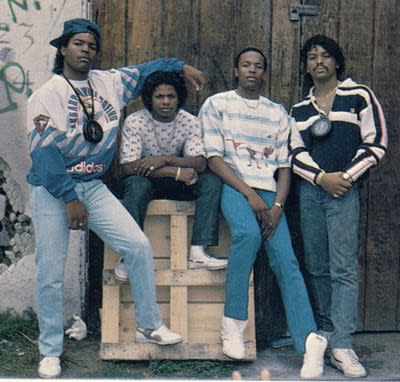
- Could you focus on the person attending the concert rather than the artist. eg. the teen with the denim jacket and lots of badges.
- Look into the 1980's denim culture, how can that influence your work.
- Possibly design a tour poster and focus it around Leeds being the headline city.
- Look back unto your event - "before the Arena" is the main concept, so work with that in mind.

Wednesday 22 March 2017

Studio Brief 3: Initial Ideas

Our identity idea was to focus on the 'halftone' process of screen-printing, where artwork has to be digitally halftoned in order to create the screen-printing positives, and therefore allow the ink to flood through the screen. The name 'Halftone' was chosen for it's simplicity and direct representation of our identity.


We explored the use of logotype as well as a logo. We wanted to represent the aspect of 'halftone' within our logo/logotype, so we looked into creating the letter 'O' into a halftone. We decided to make the branding of the exhibition dominantly black and white, so to not distract from the artwork within the exhibition. We also decided upon the typeface Helvetica, as it was originally designed to be specifically without impression or have any inherit meaning, which was appropriate to our ideas of keeping the branding neutral and not attention stealing from the exhibition artwork.

We all then went on to apply our chosen identity and initial logotype designs to some branding content. The outcomes were all very different as we all applied our personal different styles to them, however, this gave us many directions to chose from and laid down solid foundations for the development of our project. Some of the ideas are explained and my personal contributions to this design stage are captioned as such.

Poster Ideas:


This idea looked at using the patterns from the architecture of
Leeds Central Library, as well as the logo and logotype.
 

This idea focused on showcasing the artwork, with the exhibition information placed around it.


The idea behind this poster was to turn students artwork into 'halftone', so to create and unbiqitous but intriguing design. 


My Poster Idea - Exploring adding colour into our branding, or possibly showcasing people prints through a 'transparent' element of the logotype.

My Poster Idea - The focus would be on the artwork, with the rest of the
 information clear but not intervening.


Invitation/Flyer Ideas:

My Invitation Idea - The invitation was to open up from the middle to reveal the information,
and until so it would have been kept closed with a sticker of our logo.
Beer Mat Ideas:

We had considered beer mats in order to reach a younger target audience, as many young people visit bars and pubs so would come across them, as well as often picking them up to take home and use.


This idea was to also focus on the artwork and to promote it simply
alongside the logotype.


This idea was to utilise the beermat as also a flyer, and it would contain
all the information of the exhibition.


Wayfinding/ Signage Ideas:

We had considered for the logo to be incorporated into the way finding, with the use of numbers to lead the public, or to simply use the plain logo with the idea that the clear/empty side of the circle would show the direction to walk in.


Curation Ideas:

This idea was to create a rating system using black dots, to go with the theme of halftone,
as well as allow the public to interact with the exhibition and give their opinions.


Tuesday 21 March 2017

Studio Brief 2: Initial Idea Development & Feedback

Following my initial idea reflection, I went on to explore collage for the imagery of the poster, and adding additional information through text, to aid the communication of the event within the poster.


The focus of the collage was a photograph of a crowd during the 80s, in Roundhay Park. The aim of the collage was to create an exciting and buzzing atmosphere, in a way to bring the photograph to life and give it movement. I used various colours/patterns to differentiate the people, as well as represent how they may have been feeling inside; the use of small cut-up fragments collaged i different directions gives the feeling of an explosive and chaotic expierience. However, I didn't fill the whole photograph with collage in order to not lose context of the image, but simply to exaggerate and enhance it.


Thinking forwards to the production of the poster, I decided to convert the collage into a 'threshold' as well as a 'grayscale' image. This will allow the collage to be manipulated into 1 or 2 colours later one, if it makes into the final design.

The following designs incorporate the collage.


This design uses the 'greyscale' edit of the collage, and is manipulated into two colours. The quote "80,000 people dancing" is also included. The collage creates an interesting visual element, however, due to the text overall as well as the separation of colours, it becomes too abstract and loses context. Once again the poster doesn't communicate quite as well as I would like, the idea of there being a concert, nor the fact that it took place in Leeds and in the 80s.


This design does a better job at communicating the message. The collage of the crowd, this time in the 'threshold' edit seems to be clearer and more comprehensive. The use of the title makes it clear what event is being presented, and the use of the quote, this time "crowd just went wild" creates an interesting texture and visual impact. Although all the key elements are there and the communication is clear, I feel as if the poster design still doesn't have enough impact and is slightly boring, and so it's worth exploring some other imagery and text content ideas.

Feedback:
- Look into the artists that played at Roundhay, and work them into the poster.
- Possibly focus on just one artist, rather than the whole decade.
- Maybe look at and play with the subtle details of each artist - e.g Michael Jackson white glove.
- Consider paper stock - acetate/newsprint/coloured card etc.
- Possibly go to Roundhay Park and work with physical space - e.g. making a sculpture & photograph
- Look at any major celeb moments that happened - eg. someone breaking a guitar
- Research the people you got the quotes from and contact them for more if possible.
- Look into the aesthetics and culture of the 1980's and possibly apply that to your design.

Friday 17 March 2017

Studio Brief 3: Leeds Central Library Research

The Central library provides access to
Assistive technology
Community information
Council papers and planning applications (online)
Drama  collection
Employment and training advice
Events and activities for adult and children
Free internet access
Intellectual property
Learning sessions
Leeds Tapestry - 16 panels of extraordinary work of art about the history of the city.
Newspapers and journals
Online resources
Photocopiers
Printing - black and white, colour
Quiet study area
Readers' group and writers' group
Request service
Special collections


The building itself was designed by George Corson, a Leeds architect with Scottish roots who in fact won the competition to do so. He divided the building into a 'business side' situated on the ground floor and a Free Public Library on the first. The present restoration work has now fully restored the Tiled Hall to its original magnificence, after a £1.5m refurbishment of the gallery and the adjacent Art Gallery. The renovation was completed in June 2007, including opening up the magnificent Victorian tiled hall (used as a café and bookshop) which links the gallery and the library. At first floor level there is direct access from the gallery to the Art Library.