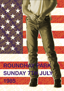
All three design ideas use the american flag imagery that was associated with "Born in the USA" tour, as well as the previously used quote of "crowd just went wild". All three also include text/heading of "Roundhay Park Sunday 7th July 1985", which is where and when the concert took place. What I struggled with was incorporating more specific details about the artist, as I didn't want to include his name within the text/heading as that would be too obvious and un-interesting. The USA flag already plays as a symbol however, without further visual guidance it is too vague. I tried to incorporate a newspaper clipping from the time, and clippings from Springsteen's album covers. Unfortunately, doing so made the poster designs feel awkward, as there was no cohesiveness between the digital designs and the photographic elements of the posters. The use of several symbolisms also feels over-done and too obvious, and the overall visual impact of the posters less than satisfying.
Following different feedback, I also decided to explore poster design around not just one, but several of some of the biggest artists who played at Roundhay Park in the 80's. These were - The Rolling Stones, Madonna, Michael Jackson and Bruce Springsteen. Also, as suggested by the feedback, I've decided to look at "subtle details" and symbolisms, if there are any, of each artist and creating imagery for the poster using those.
The imagery I used was the denim jeans for Bruce Springsteen, the white glove for Michael Jackson, the tongue logo for The Rolling Stones, and for Madonna simply her image, as I couldn't think of any specific object/symbol that could communicate her clearly. The composition I made is fairly random, and there is a lot of negative space left. This makes this poster design really dull and unsuccessful.
In an attempt to fill some of that negative space, I repeated the composition I created several times, this not only filled the space but also created a much more interesting visual impact. I also added the previously used "crowd just went wild" type treatment as it added more texture and further increased the visual impact. The use of a simple "Roundhay Park Leeds 1980s" heading, however, although alongside the imagery may make it more obvious what the event is than previous ideas, still doesn't quite make it clear enough.
To aid the communication of the event, I added the list of the artists. This, along with the images and the heading makes it a lot more obvious that the event is the concerts. The use of the repeated composition, as well as the "crowd just went wild" quote overlaying the images, give the images some vagueness which would in turn make the audience more intrigued and make them look closer in order to identify what they are.
I also re-visited the idea of the repetitive "80,000 people dancing". Because I've kept the "crowd just went wild" text overlay, and added the extra quote, I removed the repetitive composition of the imagery in the background, so not to over-whelm the poster design. I kept the heading and the artist list to allow clarity in the communication of the event.
Overall, these poster designs have been more visually interesting and intriguing than my previous ideas. The use of colours came partly from the desire of significant contrast, and partly from the 80s poster culture of also using bright colours. The manipulation of typography I believed has been subtle but effective, and gives texture to the designs which significantly elevates their success. The imagery used is appropriate as it communicates all the listed artists well, however, I believe that the composition of the images is too simple and feels unconsidered. The style of the different images also doesn't match, so there is slight inconsistency in the visual impact. Although the idea behind the designs is appropriate and effective, I feel that the execution and especially imagery considerations need to be reconsidered and a way to create more cohesiveness across the design needs to be found.
Feedback
- Make the poster about all the artists rather than one, as that makes it more celebratory.
- Considered finding physical objects that represent each artist and photograph them.
eg. for Michael Jackson - buy a fancy dress white glove.
- Could you focus on the person attending the concert rather than the artist. eg. the teen with the denim jacket and lots of badges.
- Look into the 1980's denim culture, how can that influence your work.
- Possibly design a tour poster and focus it around Leeds being the headline city.
- Look back unto your event - "before the Arena" is the main concept, so work with that in mind.


No comments:
Post a Comment