Jacques Greene is a Canadian DJ and music producer.
According to 'Irish Times', his 'Feel Infinite' album is expressed as having "finely-spiced and exquisitely decked-out sounds". As well as the tracks "each calibrated to remind you of the glow of the old-school yet without succumbing to the cloying and often debilitating nostalgia which hobbles many such cuts". The design of the album artwork also seems to reflect old-school design and nostalgia of the 80s/90s era.

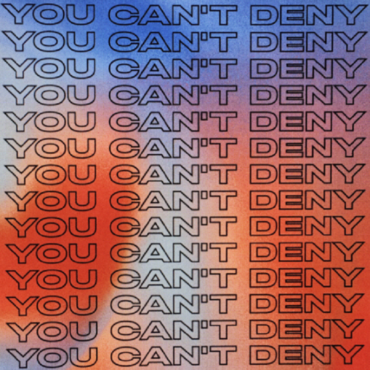

Because my chosen event is concerts that took place in the 80s, I've chosen to explore similar design elements as Jacques Greene albums artworks. I will focus on the treatment of type, and the 'outline' features of text. Such elements are also present in tickets/posters from the 80's, which reinforces the appropriateness of this exploration.
Potential Typographic Treatments:


The text used for the poster is a quote of someones experience of the Roundhay park concerts in the 80s, as well as a newspaper article headline from the time. The repetition of "people" is a form of visual reinforcement of the quantity of "80,000". It fills the space and adds a sense of grandeur to the posters. The use of outline type allows the imagery underneath to be seen more clearly. The imagery used is mostly documented images of the concerts that took place at Roundhay park during the 80s. Although the typographic treatments of type are interesting and the imagery relevant, the posters seem lacking as they do not have much context and so do not communicate the event well enough. The use of colours are intended to be contrasting and attention grabbing, playing on the concert posters of the time which also used bright and bold colours. To further the design, imagery and textual content of the poster needs to be considered, to allow a clearer and more relatable communication of the event.
No comments:
Post a Comment