The brief asked to design a publication that would include research done on colour so far, as well as a pantone colour palette taken from a photograph of a street in Leeds.
Photograph and Colour Palette
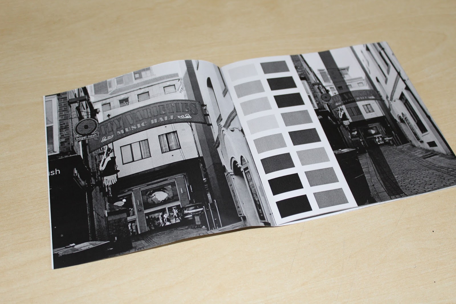
The photograph used:
The first colour palter extracted was:
This first colour palette was surprising, as I hadn't expected such a variety of colours to come from just one photograph. All the colours extracted were different, however, some were too simple or had too similar tones, therefore I decided to edit the colour palette slightly and keep just the most distinctive colours.
The second colour palette:
Design of the Publication - First Attempt
The first design of the publication was done on Illustrator, and formatted to be A5. I believe this first publication design was unsuccessful, because there was little focus or attention given to design principles throughout the design stage, and therefore the outcome was less than satisfying.
The typeface used was Futura, and although the typeface is a favourite of mine, it didn't feel as if it was appropriate to the publication. It gave the content of the booklet a juvenile and lazy feel, which is not what I had intended. What added to this was the typeface size of 11pt. Although 11pt is usually still an appropriate pt size to use, when placed within the format of an A5 publication, it becomes visually too big and makes the publication feel unprofessional.
Another mistake within the design of this publication was the minimal use of grids and layout, I had used a limited amount of guides to place the content on the pages. This also lead to big gaps of negative and white space within the pages, once again giving the publication a lazy and unprofessional atmosphere. I had not utilised the space of the page in an appropriate manner, especially the size of the images, which were all different and left a lot of space unaddressed. Because of the different image sizes and limited use of guides, there was also limited cohesiveness throughout the pages of the publication. It is evident that when designing the publication I did not take into consideration the format of it as closely as I should have, and therefore the design features I placed within it suffered visually.
Other design elements I were not happy with was the recurring faded blue line on each page. This was an attempt to give the pages cohesiveness and make them seem as part of a whole, however seems an after thought and doesn't really have any significance.
What I did like the idea behind but not the execution was the front cover, where I utilised the colours I had extracted from my photograph of a street in Leeds and place them in similar blue lines as the faded blue line on the other pages. The two of coloured lines looked quite visually pleasing and I thought it was very appropriate to use the same colour palette that I had extracted, however, the vertical lines seemed to hold no real significance in relation to the rest of the publication, and also seemed like an after thought.
 |
| Limited amount of guides used |
First Design Digital:
First Design Physical:
Another problem I faced within the first design was the production. This first publication had a very rushed and thoughtless production, which included printing each double page spread separately and sticking them together. This along with the inappropriate design, made the physical publication overall have an extremely unprofessional feel, and I was completely not happy with the outcome. The format size of A5, as well, felt boring and too safe for me, I felt like the space within the pages was not utilised enough and that possibly I was working with too big a format than I would be comfortable with. I had aimed to create a publication that I could be proud of and that would showcase my design abilities, however, at the time it's clear that my design abilities were not as polished and thoughtful as they were when I decided to re-design and develop the publication.
Design of Publication - Developments and Final Outcome
After having looked and considered all the design mistakes and disappointments I had made in the first attempt of the publication design, I decided to redesign it and address all the issues that it had. The first thing I looked at was format. I had noted that I found A5 boring and not comfortable to work with, therefore I had decided upon changing the format of the publication into a clean square shape, 150 x 150 mm. I found this format a lot more interesting to work with, and found that it also allowed a sense of cohesiveness to form throughout the publication, as other design elements also worked with the square element.
The next issue I addressed what typeface and type size. Previously I had used Futura, which I had found to seem too juvenile and lazy. Therefore, I decided upon changing the typeface to another favourite of mine, 'Helvetica Light'. The neutrality of 'Helvetica', and the softness of the 'Light weight', allowed the text and content to seem more professional and significant. The 'Light' weight I believe also made the text feel more appropriate to the format of the publication, as it was easy and comfortable to read within the small square, whilst anything thicker in weight would have made the text feel too bold and rough.
Another problem given attention was grids/layout and the presentation of the content. Previously, I had used a very limited amount of guides, which made the pages have limited cohesiveness and made the publication feel unprofessional. When re-designing the booklet, I had utilised a specific grid system upon every page. One of the big differences in design was the application used. Within the first attempt I had used Illustrator, which was limiting in it's accurate use of guides as it was not specifically designed for publication design. However, Indesign is an application that was designed exactly for this purpose, therefore when switching to Indesign I was able to have access to far more specific features that would allow me to create guides and layout designs that were accurate and easily conveyed across all design pages. By using these guides to present the content of my publication, I was able to form rules for myself that when followed I was able to create a noticeable cohesiveness throughout the design. For example, one of these rules was that the text was to go on the left, and the images on the right.
Another rule I had made for myself was that the images were to fill the page. This was in response to a problem within the first publication design attempt, where I noted that the images were too small, and that there was too much negative/white space. Addressing both problems at the same time, I used the images to fill the right side of each page completely. There was still negative space within the spread designs, on the left page where there was only a subheading and body text. However, I believe because the right page of the spread was filled, that having the left page fairly empty and minimal created an interesting and appropriate balance. If I had filled the left page of the spread in the same intensity as I filled the right, it would have made the overall feel of the spread too over-whelming and cluttered.
 |
| Many specific grid and guides used |
One of the main ideas from the first publication design that I had transferred and adapted in the second design was the use of the colour palette from the photograph, within the design of the cover. I used the square colour combinations I had created in the first publication, and formed them into a square pattern that was to fill the front and back page of the publication. The square and fill element of the front and back cover created a link to the format and the layout of the design, making the cover design more appropriate to and communicative of the publication content.
Final Outcome Digital:


Final Outcome Production:
A big problem within the first publication outcome was the production, and how lacking skill and attention it had been. Therefore, for the re-design of the publication I had wanted to make the production more special and interesting. I created a black and white mock up, to test how the publication will look physically, and whether all design elements were appropriate. For example, the text pt sizes, the image sizes, the format measurements and etc. I also attempted bookbinding for the publication, so unlike the previous design, I didn't need to use glue and make the outcome seem cheap. The bookbinding proved to be successful and added a sense of originality and authenticity to my publication, so I was decided upon using the method for the final outcome also.
 |
| Book binding - outside |
 |
| Book binding - inside |
The production of my publication had been planned and seemed as fig in full colour it will be successful. However, I still felt that it was missing something special, especially the front cover. One of the noticeable things was that it was missing a title for the publication, this was due to me previously struggling to decide upon an appropriate title. However, after a while I decided to not over-complicate it for myself and keep it simplistic, deciding upon a title of 'Colour'.
To give my publication something unique and special, I had the idea of using acetate as the front cover, with the title of 'Colour' printed over it so the colour palette designs could be seen through underneath. As I was designing the front cover, I had realised that simply one word on acetate would be pointless and that I needed something more. This is when I had the idea of repeating the same pattern as the front cover of the publication, on the additional acetate cover, and just simply rotating the pattern to align different colours together. This was done in the hope that the acetate would give the colours some transparency, and that the colours on the paper stock would change as the acetate is placed on top of it, giving a partly interactive and playful element to the publication. I also deleted two square patterns in the middle to allow the title 'Colour' to be more legible and clear, and to a sneak peak of the colours underneath to be seen.