Here was my first attempt:


Here was my second attempt:

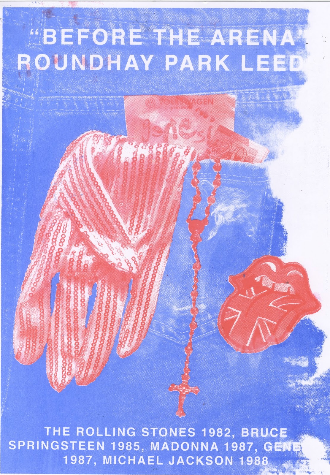


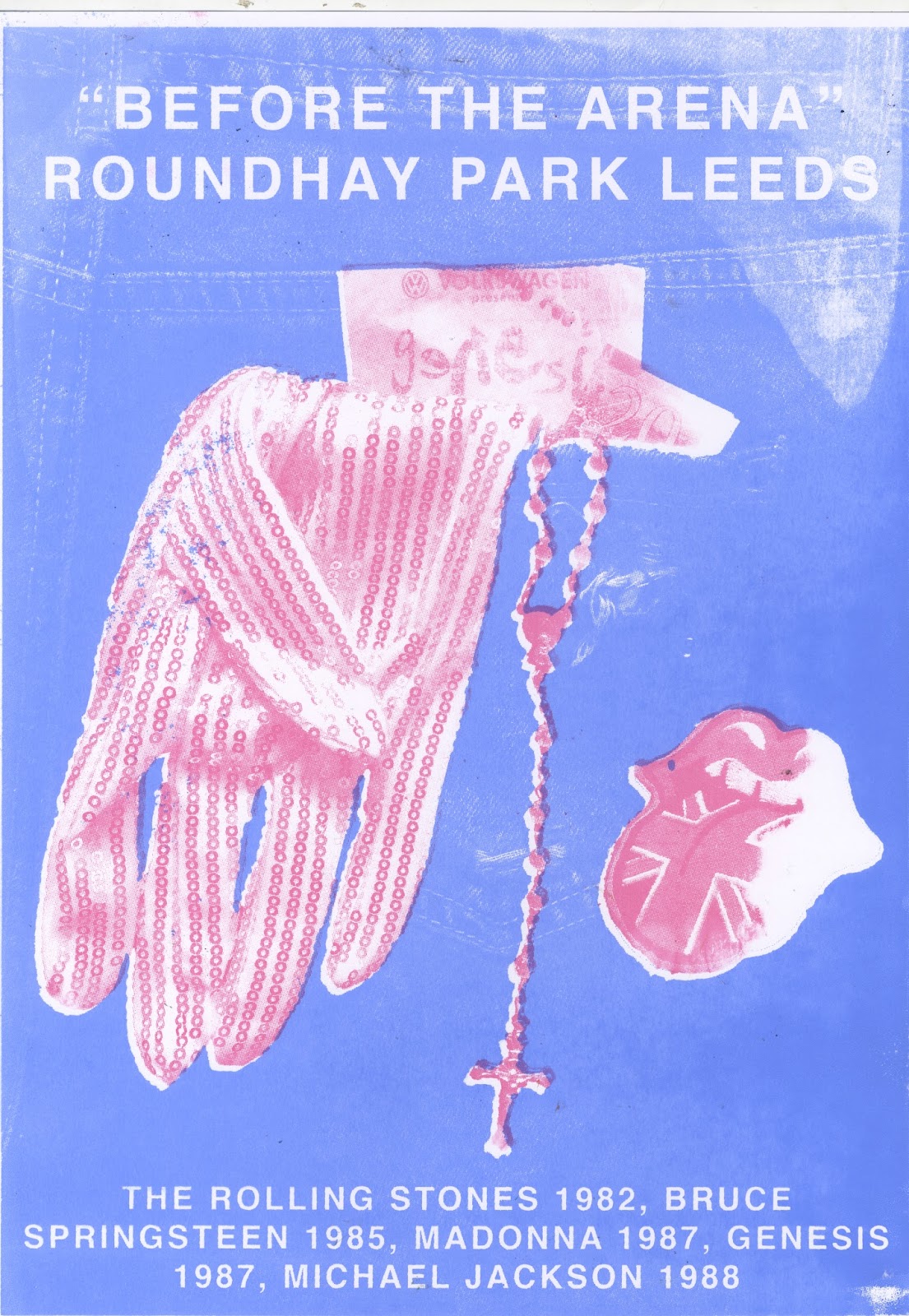


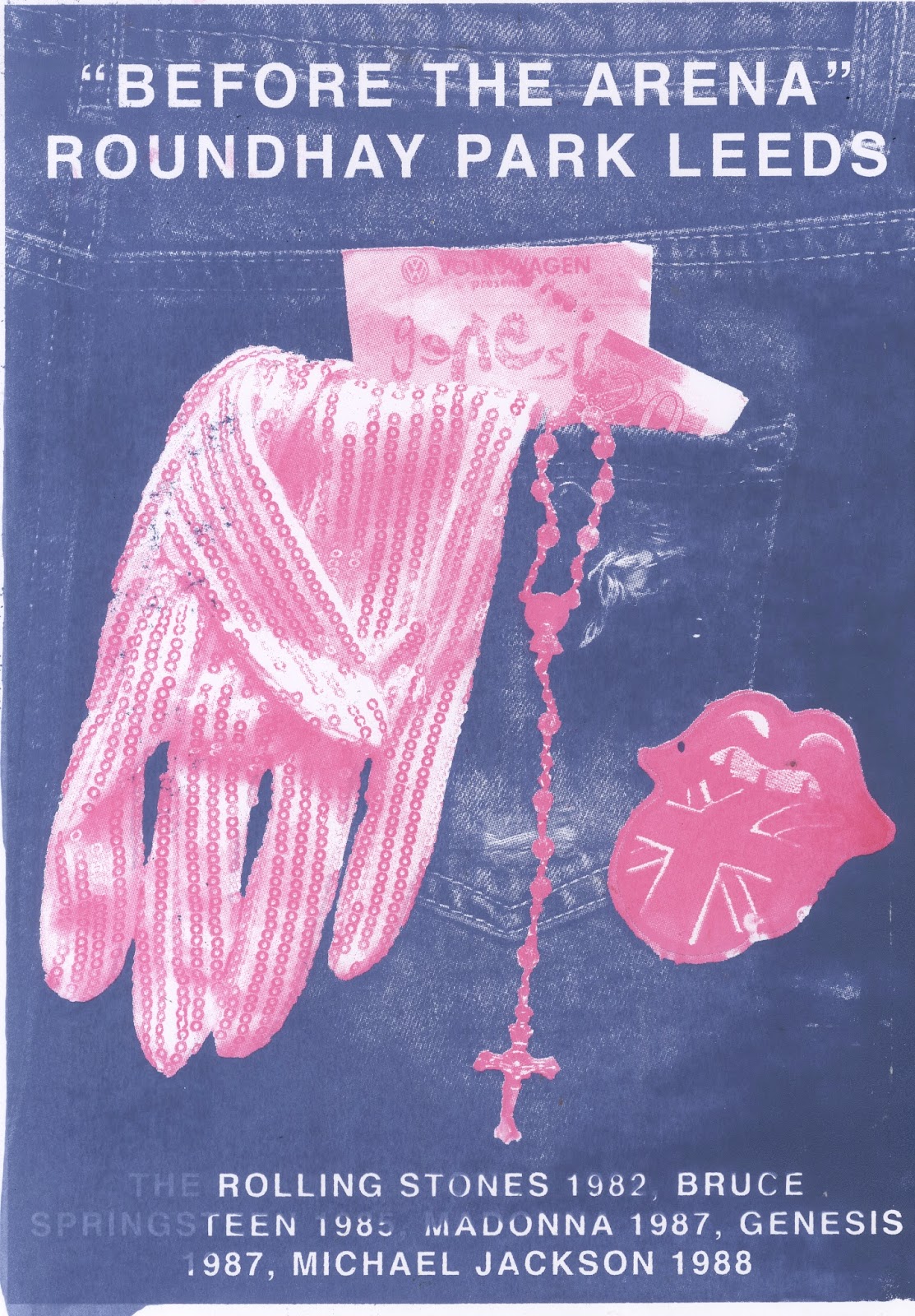


The different colour combinations I had tried out were dark blue or light blue, and pink or red. The dark blue proved to have a much clearer resemblance to denim, as well a it allowed the details within the positive to come through and be seen much clearer. The light blue was aesthetically interesting, but didn't communicate the message quite as well. Both pink and red did I a good job at creating a contrast between the background denim colour, and were both visually stimulating to view. The pink, however, I believe is more appropriate when placed alongside the blue as the colour combination holds less stereotypical associations than the blue and red (which can be wrongly associated with USA, UK, Pepsi etc.)
No comments:
Post a Comment