Friday 19 May 2017

Module Evaluation

The 406 Module has by far been the most challenging, as well as interesting. To begin with, it felt quite intense knowing the quantity of work we had to produce, and that one of the briefs will be collaborative. However, at the end of it all looking back, I realise that the module has not been out of reach of my abilities. I have thoroughly enjoyed most of the studio briefs, and am generally happy with the outcomes I have produced. 
The first studio brief, designing the penguin book covers, was very engaging. It being a live project I feel made me want to perform better and motivated me to push myself. For one of the book cover designs, I created illustrations. This is something that I would not usually do and was slightly out of my comfort zone, however, I was very happy with the result as I believe the illustrations are what made the design as successful as it was. I believe I learned a lot about analysing design details within this brief, and had created final outcomes that had strong design, as well as strong reasons for the design decisions that I had made.
The second studio brief needed me to use the traditional media of screen-printing to create a celebratory poster to be part of an exhibition. This was in a way also a live brief, and generated similar motivation. I had not expected to enjoy the process of screen-printing as much as I did, even with the large quantity of frustration that I went through during busy print room times, and unsuccessful prints. The screen-printing process taught to me appreciate and embrace my mistakes more, which shows within my final submission, as the second layer of colour is slightly off set. I believe this gives the print authenticity and originality, as there is a certain pleasing and aesthetic quality to the imperfection. 
The third studio brief was where I began to struggle with the quality of my design outcomes. This brief was collaborative, and required us to design a branding identity for our exhibition. The concept we had come up with, I believe was very strong, and we had many strong ideas of how make the exhibition and it's branding interesting and unique. Unfortunately, I believe we suffered from having too many ideas, and therefore our final outcomes were not as cohesive as they could have potentially been. My personal contribution to this brief was largely idea generation and development feedback, I engaged a lot with my peers and we all had many conversations and discussions about our work. I believe this is a very important aspect of teamwork, and the reason why we were all quite happy to be working together. The actual design contributions I created, however, I think were not as successful or as representative of my capabilities. I worked with social media, and again, whilst the ideas were strong and had a lot of potential, the execution of them was disappointing to me. To improve, I wish I had focused more on the design details and had dedicated more time to develop and improve my designs.
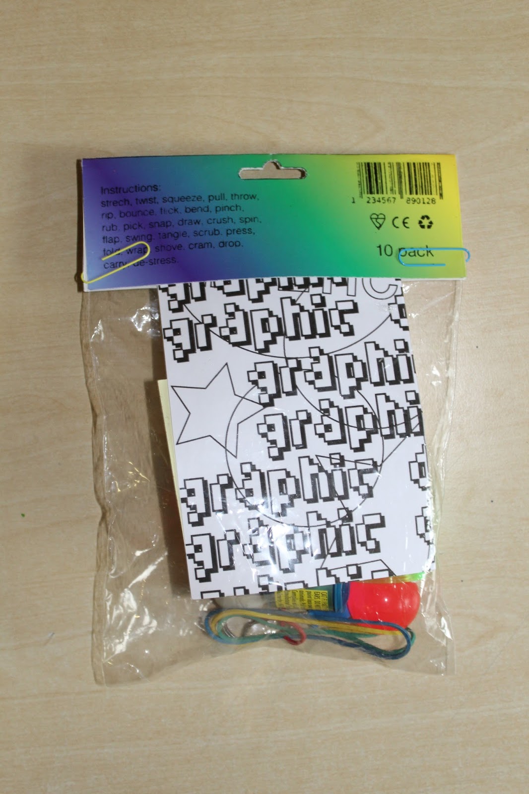
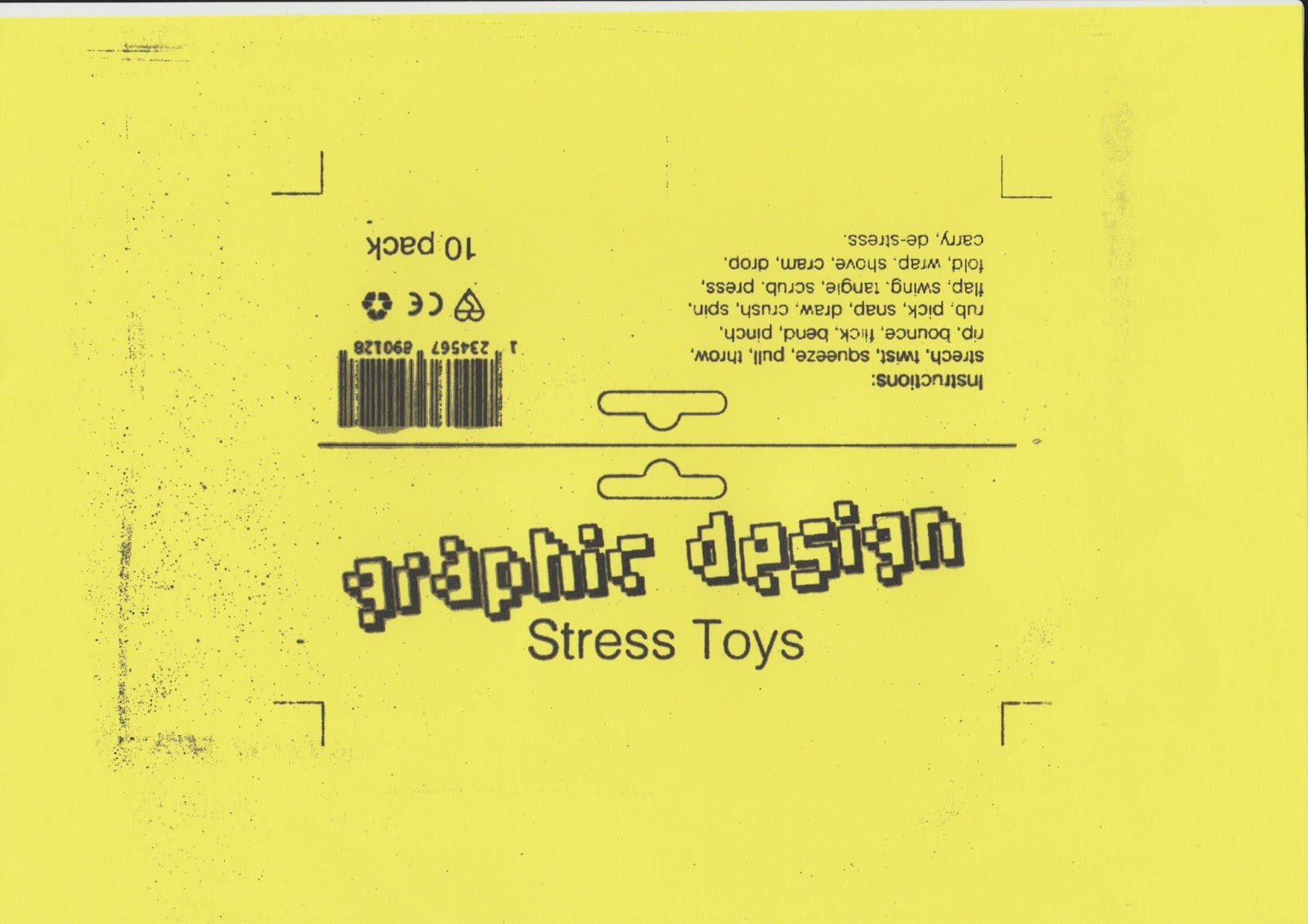
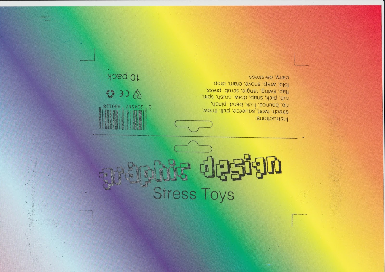
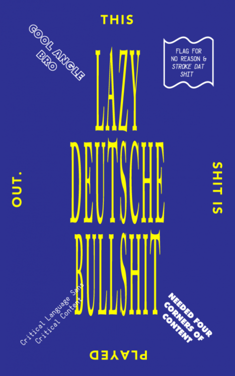
The fourth and last studio brief asked us to speak from experience and create something to give to the new Level 4 students next year. I designed a 'Graphic Design Stress Toys' package. I believe the final outcome was successful to the extent that it communicated what I had intended it to, however, the actual design and production of it I feel could have been much better. The design of the label I feel was left somewhere in the middle of design development due to time constraints, and because of it, it isn't as strong as it could have been. The quantity of work I produced for this brief, I feel is also lacking, as there were extra things I could have designed, such as an instruction manual of how to use the objects/toys within the package. The unsuccessful parts of this brief I believe were all due to a lack of time, and/or time management. 
Overall, I believe that throughout this module my strongest quality was my idea and concept generation. The actual design was at times very strong but at times also quite weak and disappointing. I believe this was due to the nature of the studio briefs and the circumstances that surrounded them. At the end of the module, and at the end of the year, I am very happy with what I have learned and achieved not only within this module, but also throughout the whole year. 

Thursday 18 May 2017

Studio Brief 4: Final Outcome, Feedback & Evaluation


The final outcome is a pound shop product style package that sells 'Graphic Design Stress Toys'. The objects it contains are: a bouncy ball, a splash ball, a yoyo, a mini slinky, a party popper, a bull dog clip, post-it notes, elastic bands, a ball of blue tac and a colouring sheet. The aim of the objects was for the audience to be able to play and fiddle with them during stressful situations. Some of the objects were chosen for their entertaining factor, and others for their relevance to the course. The label design was created with the aim of juxtaposing cheap product design with clean minimalistic design. Cheap product design was communicated through the use of the 'Humanoid' typeface within the title, and the reflective metallic stock the label was printed on. Clean minimalistic design was communicated through the use of 'Helvetica Light' as the body text, and the simplistic layout of the labels information. The reflective stock also in a way communicates both design approaches, as it has the eye catching and attention grabbing nature that cheap pound shop packaging also has, but does so in a more sleek and clean manner.

Rationale:
The idea was to create a toy package in the style of pound shop products, but also make it clean and sleek. Therefore, it was purposefully made to seem partly cheap and ugly, but also quite visually striking. The objects/toys are all aimed to be played or fiddled with, in the hopes of de-stressing. The comment I am making about my experience on the first year is that it is very stressful, and that you need to find many different methods of de-stressing. The content of my outcome is relevant to Level 4 students because not only does it contain small fun items they can keep as Freshers memorabilia, but also they contain some materials that will become useful them within their studies. The chosen pound shop packaging format I believe is appropriate because it showcases the student financial limitations, as well as adding as sense of humour and entertainment to the outcome. The LCA resource that is showcased within my work is the screen-printing room, where my label design was produced. The label shows how the traditional print process allows to be more experimental and explore different materials, such as reflective metallic sheets.

Feedback:

- The outcome definitely serves its purpose as it's fun to play with.
- Well designed for the theme purpose.
- Original and cool idea
- The reflective stuff feels cringe, but its also what makes it really nice to look at
- Maybe you could have included even more graphic design related objects. eg. ruler, pen drive, small paper stock book etc.
- Using the pixelated type gives the design the 'poundshop' look, which is really good as that's what you aimed for.
- You could have included paper clips as they're fun to play with.
- The colouring sheet is really interesting and fits well with your branding.
- I think all the objects are well chosen, they're appropriate and seem fun to play with.
- I would have liked to get that at the start of the year, as it actually has useful stuff in there and looks fun to play with.
- You could have had better instructions, like how to use each object or when to use it. eg. Deadline days.

Evaluation

The final outcome for this project I believe has been successful, as it communicates and serves the purpose of what it was intended to. The idea was to create a package that would provide the students with objects that could help them to de-stress, feedback revealed that this was an "original and cool idea" and that "the outcome definitely serves its purpose and is fun to play with". The package was intended to communicate a style of pound shop product packaging, and feedback confirmed that it was "well designed for its theme". It was also mentioned how "the pixelated type gives the 'poundshop' look", showing how the detail paid to typography has helped to communicate my intentions. The de-stressing purpose of the package was also met, as feedback stated that "all the objects are well chosen" and are "fun to play with". The target audience of Graphic Design Level 4 freshers was also considered when choosing the content that would go into the package, as there are certain objects that from my personal experience I didn't realise that I would need. Feedback agreed as someone "would have liked to get [the package] at the start of the year, as it actually has useful stuff in there". Another successful design element was the use of reflective metallic sheets for the label design, as not only was the design meant to be in the style of pound shop packaging, but also clean and sleek. This was confirmed during feedback as someone said that "the reflective stuff feels cringe, but its also what makes it really nice to look at". Improvements for suggestion were that "even more graphic design related objects" were included, and that the instructions "could have been better". There were many limitations for what objects to include within the package, as I wanted to keep the production costs down, however, more graphic design orientated objects would have made the overall package more relevant to the target audience. The instructions on the label design were purposefully minimal and vague, to encourage the audience to figure out how they would want to use the objects. Nonetheless, I agree that these instructions could have been clearer and the freedom of will more acknowledged. Overall, I believe that the final outcome for this brief, although not perfect in communicating its purpose, has a strong concept and production, and has interesting and visually impactful elements.

Wednesday 17 May 2017

Studio Brief 4: Final Outcome Production

Having finalised all the objects to be included within the product, and screen-printed the label stock, I was ready to bring all the elements together to create my final outcome.
The final decision I had to make was choosing the label stock. The two that I had liked the most were the rainbow coloured card, and the reflective metallic sheets. To make this decision easier, I tested out both of the stock in context with the objects to see which would be more appropriate.


The rainbow coloured card proved to not be as successful as I had expected it, once it was placed in context with the rest of the product. The balance between cheap packaging and clean graphic design on the label appeared to be lost amongst the chaotic nature of the products content. The small differences in design detail I had put it were overwhelmed and made unnoticeable, which in turn made the outcome overall not meet the intentions. The product looked disappointing and cheap, to the extent where none other inclusions of graphic design principles were noticed.

The reflective metallic paper, however, impressed me again, as it seemed to bring not only the label design, but also the content of the product to life. The cringe element to the stock made it obvious that not only the stock, but also the label and products were deliberately designed. The reflectiveness of the stock communicates the eye catching and attention grabbing nature that cheap pound shop packaging seeks to have, but does so in a more sleek and clean manner. For this reason, I decided to choose the reflective metallic sheets as the stock for my final outcomes.

Studio Brief 4: Label Production

Having finalised the digital label design, created the positive for screen-printing, and finalised what objects will become part of the content, the last part was to actually create the label.

Although at this stage I was decided upon using the rainbow coloured card as the stock for my labels, I still wanted to experiment and explore with different colours and materials. Below are outcomes of my screen printing.


The full one colour outcomes I thought were very visually pleasing. However, I thought that they didn't communicate my intentions as well as the other stock, because the single colours could have created a miscommunication to the audience due to colour psychology and associations. If I had chosen the pink stock, for example, the audience would have assumed that the product is only for girls. The product should be appealing for all genders, as Graphic Design is a diverse course. 


The rainbow coloured card outcome I was pleased with, as it looked exactly as I had expected it to. The choice of black text proved to be more legible and clear against the rainbow background. The outcome I believe communicated all that I had intended it to, and gave the label information an exciting and lively atmosphere. 


The metallic and reflective stock was what I was the most pleasantly surprised with. It was something that I had not planned, yet I thought it would be quite interesting to try. The outcomes were very striking, and required photography instead of scanning, unlike the other prints, due to their reflective nature. I think the reflective aspect makes them very visually impactful and would be an intriguing element for the audience. The metallic and reflective nature of the stock is what makes it slightly cringey, it feels like its too much and that its been over-designed. However, this is what I had intended for my design to do, therefore it makes these outcomes successful. 

Tuesday 16 May 2017

Studio Brief 4: Object/Toy Developments

Following previous feedback, I decided to add more Graphic Design orientated objects to the list of things that would be included in the 'Graphic Design Stress Toys' product.

The objects I added were: post-it notes, bull dog clip, blue-tac ball, elastic bands, and a colouring sheet. These objects were added not only because they associate with the Graphic Design discipline, and are common within its practice, but also because they are also objects that you could play and fiddle with. Excluding the colouring sheet, they also all have a second purpose as objects that can come in handy and be useful for the Level 4 first years to have.


The colouring sheet was created as it was mentioned within previous feedback that some people find colouring as a method of de-stressing and relaxing. The colouring sheet was created using outline type, and feature the phrases "if in doubt use Helvetica", designed in an outline Helevetica Bold, and "graphic design" designed in the same 'Humanoid' typeface as was used in the product title design. The design also features a variety of circle and star shapes in order to add more layers and detail to the design, to make it more reassembling of colouring sheets and make it more interesting to actually colour. The layout and style of design is following the same cheap packaging design theme, and purposefully seems random and unprofessional.


Studio Brief 4: Design Development 2

After researching Critical Graphic Design, I realised that my new combined design approach does not need to be so rule specific. Instead of focusing the different design principles on just one of the two initial design approaches, I can intertwine the different elements from both of the approaches and create my own 'critical' piece of design.

To do this, I focused on typography, and the combination of typically clean and typically ugly typefaces. For the 'clean' typeface I decided to use Helvetica Light, this was because Helvetica is well-renowned for it's vast application within graphic design works, and is also neutral which provides a good foundation for the juxtaposition to come. For the 'ugly' typeface, I looked into a small variety of fonts found on free font websites online. I did this because I wanted the secondary typeface to be ridiculous and humorous, something that I would never use anywhere else, and that could clearly communicate a sense of purposefully bad design.


These designs instantly felt more intriguing and exciting, as the addition of a secondary 'ugly' typeface elevated the overall visual impact of the label design. Only the words 'Graphic Design' had been applied with the secondary typeface, this is because although the use of the typeface is to give the design more excitement, it is still considered a 'cheap' typeface which if overused would ruin the delicate line between 'good' and 'bad' design. To further enhance the secondary typeface and it's meaning, it is placed on a slight 5 degree angle. This breaks the grid slightly and hints back to cheap packaging design that has no rules. 


I also explored how the secondary typeface should be presented, whether it should be just outline, black and white outline, or solid colours. I had decided upon just outlined, because I thought it to be the clearest and the most legible. It also limits the use of colours I would have to screen-print and brings the time and cost of the production down.

The final secondary typeface I had chosen was the pixelated typeface called 'Humanoid'. I chose this  because the pixels hold a reference to digital, which is what Graphic Design is dominantly based around. Also, I believed it to be the most balanced and comfortable when placed alongside 'Helvetica Light', as well as being an appropriate size and weight that fills the empty space sufficiently. 

Having chosen my final design, I created a positive for it that could then be printed and exposed on a screen, to allow me to put my design through the screen-printing process.


Studio Brief 4: Critical Graphic Design Research

"Critical graphic design is a vague and subjective term. The meaning of the word “critical” in relation to graphic design remains unclear, resulting in an overuse and misuse in design magazines, books and websites."

"In the book The Reader (2009), the design researcher Ramia Mazésuggests three possible forms of criticality in design. The first has to do with a critical attitude toward a designer’s own practice. The designer makes an effort to be self-aware or reflexive about what he or she does and why. Mazé argues that this can be understood as a kind of internal questioning and a way of designers positioning themselves within their practice. The second form is the “building of a meta-level or disciplinary discourse.” This involves what Mazé calls, “criticality within a community of practice or discipline,” and trying to challenge or change traditions and paradigms. Designers are critical of their discipline while actively and consciously working toward its expansion and evolution. In the third kind of criticality, designers address pressing issues in society. The critique is not targeted at a designer’s own discipline, practice or even at design in general, but at social and political phenomena. In practice, the three modes of criticality often overlap, intersect and influence each other."

The way I understand critical graphic design is that it is design that is subjective, and can be put up for questioning. However, all design is subjective, as no one piece of design is able to please every single person. But I must assume that critical graphic design is design that upsets more people than it pleases, and therefore creates a debate for whether the design is actually 'good' or not. From the examples of critical design I found, it seems as if the design is purposefully meant to be slightly 'bad', and that the goal of the design is to be questioned and debated.


OUGD404 Design Boards

https://issuu.com/miglesaveikyte/docs/ougd404_design_boards_ms264000

Monday 15 May 2017

Studio Brief 4: Design Development 1

After having looked at packaging and stock, I decided to incorporate the format of the packaging label, and the rainbow colour stock I had found within my design explorations.


The addition of the rainbow coloured paper I feel added a much softer tone, and allowed the information to be more clearly visible. However, the designs themselves felt a little disappointing, as if they were missing something. The aim was to communicate both cheap and professional graphic design elements, yet the outcomes so far still felt unexciting and dull, even with the new addition of rainbow colours. The minimalism of the typography and layout also made the rainbow colours lose their visual impact, which revealed that the playfulness and excitement from the cheap design elements was something still missing. 

Module Evaluation

I believe I had learned and achieved quite a lot throughout this module. Design principles has taught me things that I had not know or paid attention to before hand. For example, the use of grid and layout. Before this module I knew that grids were used in design, but somehow it was so obvious to me that I had never intensely applied it to my own design. However, after exploring using grids throughout the studio briefs, I had learned that using grids can completely change the outcome of design. I feel this is evident in my colour booklet, and how the first version was disappointing, but the second version, which paid much closer attention to grids, layout and all the other design principles, has turned out far more successful. Learning about grids and layout has completely changed not only the way I personally design, but also how I see other design. What I enjoyed this module was not only learning how to use the grid, but also how to break. In my penguin book cover design, I broke 'The Marber Grid' by flipping it. I found this quite exciting as it felt as if I was breaking 'graphic design rules' however, I believe it also achieved very interesting and unique results. I enjoyed the fact that by doing something in a sense destructive to the design, you are able to create something new and fresh. Another thing that I enjoyed and have learned a lot about is the use of colour. My initial designs throughout the project didn't pay much attention to the use of colour, and how it affected the communication of my designs. However, after going back on those designs with more knowledge about colour, I was able to see the mistakes I had been making and develop my designs to be more considerate of colour combinations and the appropriateness of colour used in different design settings. Another thing I have learned to pay a lot more attention and consideration to is format and stock. In my booklet design, the format of the first design was boring and expected, and the stock was ordinary. When wanting to improve the impact fulness of my booklet, I had thought a lot more closely to the format and stock I was to use, and came up with a completely square format of 150 x 150 mm and an acetate cover for the booklet. I believe these two elements have contributed hugely to the success of my booklet and have really pushed me to think more about the format and materials of all design outcomes I was to produce. What I struggled with the most throughout the project was applying design principles I learned within my design, my early outcomes for the studio briefs I believe show and understanding of design principles, however they lack in using them in an effective and impactful manner. Later developments of those outcomes I believe showcase a lot better what I had learned and apply them in a much more appropriate and successful manner, however I believe that there still are improvements to be made and skills to be learned. The fundamental design principles of design I feel are things that are incorporated differently by each designer, and how they apply them, and whether it is successful or not, is subjective. That is why, although I am happy with the outcomes for this project, I believe they are successful only to an extent, because although I'm proud of what I have done, I know that I could have utilised and applied the knowledge learned a lot more skilfully and have produced far more impactful final outcomes. Overall, however, I have enjoyed the module thoroughly and believe it has significantly effected the way I have worked not in just this module, but other modules also.

Sunday 14 May 2017

Studio Brief 4: Packaging and Stock Research

I had already decided what format of packaging I would be using for this project. However, I wanted to look closer into what design features were present within the labels, what materials/stock was used to create the packagings, and how it was put together.


To do this, I looked at the packaging that came with the objects/toys I had already purchased for the project. I found that important design features that were present in both of these labels were: bright colours, bar code, quantity of product, CE and Recycling icon, warning labels, instructions, and a hole to hang the product with. I found that the material/stock that was used was used for the label was cardboard or thick card, with clean digital print on the front, and plain/clear stock on the back.


I found that the material/stock used for holding the content of the product was plastic bags. 
The way that the packaging was put together was with the use of staples, attached with the two sides of the cardboard and the plastic bag between it. I also found that to allow just two staples to hold everything together, the label has a specific design The label has the front and back joined at the top, to allow the bottom to hug the plastic bag, and the staples to attach them all together. 

Thinking ahead to the materials I will use within the production of my product, I looked into materials/stock that was available and affordable for me. For the bag to contain the products within, I decided to also use plastic, as that was the cheapest option, as well as allowing a transparent element that would aloo the audience to see the product. For the label, I looked into getting cardboard or thick card, and came across rainbow coloured card. I thought that this would be appropriate to use as it perfectly communicates cheap product packaging, as well as creates a playful and fun atmosphere. 

Studio Brief 4: Initial Design Development

Following feedback, for the design of the cardboard label, I had decided to look into combining the two different design approaches I had looked at previously.

First I looked into combining the bright and bold colour palette of the cheap label designs, with the typography and layout treatment of the clean designs (Fig.1). I found this to be quite successful, as the previous issue of the clean design approach was that they were too boring, however, when combined with the colour palette of the cheap designs, they seems to become a lot more exciting and striking.

Fig.2 shows the opposite, combining cheap design approach typography with the clean design approach colour palette and layout. This I didn't think was as successful, as the combination of the two design approaches felt too forced and the results were less than satisfying. The content seemed to be restricted within the colour palette and layout, and lost the sense of attention and excitement that it possessed within the initial designs. It was clear that combining the clean design approach towards typography and layout, with the cheap design approach's use of colour was the most suit choice, and that it had the most potential to create interesting visuals.

Fig.3 is a quick exploration of the front, as well as the back side of the cardboard packaging, and shows initial considerations of what typical packaging information can be included. For example: bar code, warning labels etc.
Fig.1

Fig.2

Fig.3


Saturday 13 May 2017

Studio Brief 4: Initial Design Ideas, Toys & Feedback

Having decided on the type of packaging I will be using, I then went on to develop ideas for the design of the cardboard label, and purchase objects/toys that would be included in the product.

Label Initial Designs

There were two design approaches I had considered when creating ideas for the design of the cardboard label. The first approach was a play on cheap/bad designs that you would often see on pound shop packaging, with deliberately bad design elements. Such would include: the price written big, bright contrasting colours, typefaces taken from free font websites, no definitive layout/grid, cluttered/overcrowded content, irrelevant imagery and a mix of typefaces. The second approach was clean and stylised design that would create a juxtaposition against the cheap packaging and products. The design elements would include: minimalistic colour schemes, sleek and modern typefaces, precise layout/use of grid, limited and appropriate imagery, and no unnecessary information.


After some sketches, I went on the create some digital versions of the two design approaches I was considering. To communicate the cheap design approach, I focused on the use of colour and typefaces. The colours used were bright and bold, and the typefaces were unthoughtful and generally ugly. This was because typical cheap packaging utilises bright colours in an attempt to make the products eye-catching and attention grabbing, and the typefaces typically used are free or cheap. Because of these reasons, the design outcomes are usually very in-cohesive and random, with seemingly no professional design input. For this reason, I wanted to explore this design approach, with the hope that I could produce some 'bad' design but in a purposeful and 'good' way. However, because I had followed the bad design elements that are present in such packaging too closely, the results I had produced did not seem at all purposeful or 'good'.


To communicate the clean design approach, I focused on minimalism within colours and content, as well as precision within layout. The use of a basic black and white colour is typical of minimalistic and 'clean' design, so it was not surprising that the outcomes for this design exploration met my intentions. However, the combination of black and white, with the format of a cheap cardboard label, makes the design feel awkward and out of place. The use of minimal content I believe also contributes to this issue, as most of the design explorations only contain the name of the product and nothing else, which is uncommon for such label design. Also, the use of just black and white makes the designs feel boring and unexciting, which doesn't communicate a sense of playfulness or toys that I was aiming for. The use of layout I believe has been successful, as it allows the content of the label to be balanced and communicate the hierarchy of information much clear than the previous designs. 


Objects/Toys Initial Purchases

When searching for the objects/toys to include within my 'Graphic Design Stress Toys' product, I was looking for things that a student could fidget and play with. Also, I had wanted for some of those objects to be quite juvenile, as I believe that sometimes forgetting that you're an adult and playing with a children's toy creates a sense of calmness and relaxation.

The objects I had found were: splash balls, bouncy balls, yo-yos, mini slinkys, spiral hair bands and party poppers. I choose these objects because I thought them to have a lot of playfulness and fiddling potential, and had personally found them interesting. As my target audience are Level 4 students, and I am a Level 4 student myself at the moment, I knew that my personal interest would be appropriate chooses to meet the requirements for the objects that I had set.


Feedback:

- Maybe look at including more graphic design specific objects. e.g.. paper clips, blue tac, pencils etc.
- Still keep the objects you have.
- Look into critical graphic design - 'purposefully bad' and 'ugly' design.
- For the label design, maybe combine both cheap and clean design approaches. 
- Consider having instructions inside, to show how each object can be used.
- Potentially make a colouring sheet to go inside it, as some people like to colour to de-stress.