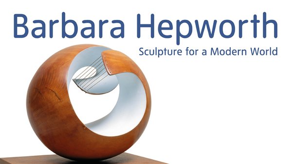
The exhibition I decided to create a poster for was 'Barbara Hepworth: Sculpture for a Modern World' that was run by Tate Britain.


Creating the Imagery
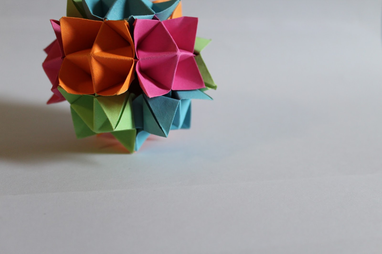
Barbara Hepworth and her sculptures are abstract and use various interesting forms, for this reason using paper folding/origami I also wanted to create a sculptural piece that would use interesting abstract shapes and be visually impactful. I found a video online on how to create a 'spiked ball'. I thought this would be quite appropriate as, like Barbara Hepworth's sculptures, it is something unique that I haven't seen before, especially as it is made out of paper.
I followed the instructions in the video step by step to form my spiked ball. I decided to use paper of different bright colours to make the sculpture more visually exciting and impactful.


I photographed the individual pieces, as well as the whole piece put together. I did this so that I could have a bigger variety of abstract shapes to choose from and to give myself more choice when it came to the digital development of the poster design.


Digital Development
After looking back over all the photographs, I decided upon focusing on one with the whole ball, as I though it looked more impressive and attention grabbing, and therefore more appropriate for a poster design. I used Photoshop to enhance my chosen photograph, and to bring out some of the colour and contrast details, to further exaggerate the sculptural form and make it more impactful for use on a poster design.
 |
| Before |
 |
| After |

 |
| This was the layout design I has chosen as the final, as I believe it holds the most balance in imagery and text compared to the other designs, as well as allowing the hierarchy of information to flow clearly and easily. |

The typeface I used was the original Tate brand typeface. This was because I learned that all posters promoting an exhibition happening at a Tate museum utilised just that typeface, this set for me a design limitation, as for my exhibition poster design to be appropriate to the venue where it took place, I had to make it cohesive with all the other posters of Tate. I also made the text and Tate Britain logo coloured grey, this was partly because again many Tate posters use a grey instead of white or black for their text. The bigger reason for this was that white or black text just didn't visually work against the grey toned background, it felt too awkward and out of place. Whereas the dark grey felt a lot more cohesive with the background, and created a sense of softness and balance within the design.
Another element of the poster design I had considered was the back of the posters, and how it was currently blank. If the posters purpose was to be displayed then a blank back was appropriate as no one would see it, however, if the posters purpose was display as well as for the audience to be able to take a copy with them to keep as memorabilia, the blank back would be boring and a design opportunity missed. Considering that the poster could be taken, I wanted to create a design that would go on the back, that would allow the audience to choose between the side with or the side without the information if they wanted to put the poster up. I wanted to keep the design of the back simple yet in sync with the front design, that is why I decided to create a pattern from the paper sculptures photograph. I edited the photograph down into a square, and made a pattern in a brick-like structure. This was a simple process, however it created an interesting design and was both appropriate for display and in sync with the front of the poster.

 |
| Back of poster |
A feature that the brief asked for was that the poster was designed at an A1 size, with the intent of it folding down to A4, and having a 'sneak peak' or preview of the poster. To find a preview I wanted I experimented with black and white A4 print outs of my design, and visualised how it would fold down into A4 if it was A1.


I folded the paper in various ways to see what 'preview' outcomes I would receive, and the outcome always turned out to be two sides, a front and back preview. Below are the sets of preview I had discovered.
 |
| Front |
 |
| Back |
 |
| Back |
 |
| Front |
 |
| Front |
 |
| Back |
 |
| Back |
 |
| Front |
The final chosen 'preview' sides in colour:

Final Outcome:

No comments:
Post a Comment