The final decision I had to make was choosing the label stock. The two that I had liked the most were the rainbow coloured card, and the reflective metallic sheets. To make this decision easier, I tested out both of the stock in context with the objects to see which would be more appropriate.

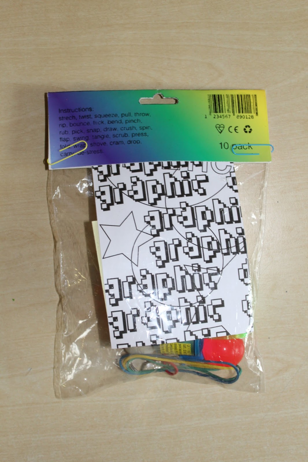


The rainbow coloured card proved to not be as successful as I had expected it, once it was placed in context with the rest of the product. The balance between cheap packaging and clean graphic design on the label appeared to be lost amongst the chaotic nature of the products content. The small differences in design detail I had put it were overwhelmed and made unnoticeable, which in turn made the outcome overall not meet the intentions. The product looked disappointing and cheap, to the extent where none other inclusions of graphic design principles were noticed.
The reflective metallic paper, however, impressed me again, as it seemed to bring not only the label design, but also the content of the product to life. The cringe element to the stock made it obvious that not only the stock, but also the label and products were deliberately designed. The reflectiveness of the stock communicates the eye catching and attention grabbing nature that cheap pound shop packaging seeks to have, but does so in a more sleek and clean manner. For this reason, I decided to choose the reflective metallic sheets as the stock for my final outcomes.
No comments:
Post a Comment