Although at this stage I was decided upon using the rainbow coloured card as the stock for my labels, I still wanted to experiment and explore with different colours and materials. Below are outcomes of my screen printing.


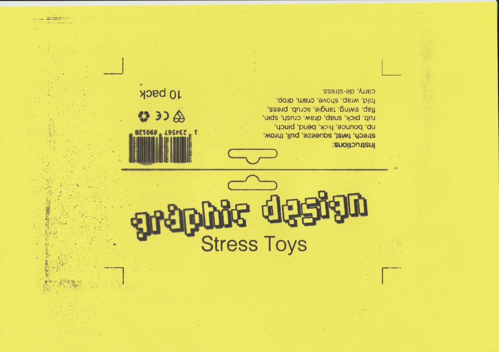


The full one colour outcomes I thought were very visually pleasing. However, I thought that they didn't communicate my intentions as well as the other stock, because the single colours could have created a miscommunication to the audience due to colour psychology and associations. If I had chosen the pink stock, for example, the audience would have assumed that the product is only for girls. The product should be appealing for all genders, as Graphic Design is a diverse course.


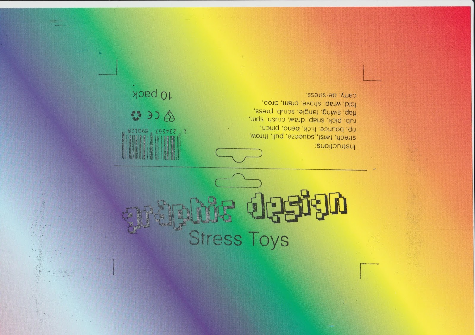


The rainbow coloured card outcome I was pleased with, as it looked exactly as I had expected it to. The choice of black text proved to be more legible and clear against the rainbow background. The outcome I believe communicated all that I had intended it to, and gave the label information an exciting and lively atmosphere.


The metallic and reflective stock was what I was the most pleasantly surprised with. It was something that I had not planned, yet I thought it would be quite interesting to try. The outcomes were very striking, and required photography instead of scanning, unlike the other prints, due to their reflective nature. I think the reflective aspect makes them very visually impactful and would be an intriguing element for the audience. The metallic and reflective nature of the stock is what makes it slightly cringey, it feels like its too much and that its been over-designed. However, this is what I had intended for my design to do, therefore it makes these outcomes successful.
No comments:
Post a Comment