- You could look into the UK driver laws/Car laws, what the car interface needs to have by law
- Possibly look at budget, what the car costs to make and what you could afford to improve
- Focus on the purpose of the design, and do everything to meet the purpose
- Make sure the design is as simple and stripped back as possible
- What makes your interface design unique and unlike the others?
- You could consider voice-controlled elements as part of the interface.
Response
The aim for this interface design will be for it to be as simple and easy to use as possible, therefore I will make that every design decision works towards that, and could be understood and navigated by anyone and everyone, not just my specific target audience. What will make my design unique and different to all other car interface designs is the simplicity, I will aim to make all the features and functions of the console accessible to the user in as little steps as possible, the goal being 3 steps.
Monday, 30 October 2017
Study Task 05 - Wireframes/ Smart Car Console Initial Ideas


Having researched into the smart car brand, their target audience, and their existing dashboard/main console designs, I created a wireframe of my initial ideas of how my design of the main console should look. The initial idea and aim for the design is for it have a very stripped back and simple user interface. This is because nowadays as technology is progressing, the amount of things the car can do and features that can be controlled are ever increasing, and so the user interface and experience of controlling them is becoming more complex. This is not only distracting and therefore dangerous for the driver, but it is also an inconvenience, especially for the main target audience of smart cars being urban city drivers and business people, who want to get to places quickly and get things done quickly. For this reason, the design of my interface hopes to provide the driver with the ability to get to the feature they want in as little steps as possible, as well as to make their driving experience with as little distractions coming from the main console as possible.
The initial ideas as shown in the wireframe start with a home screen that is split into 4 categories: Music, GPS, Phone and Settings. The Music category would hold Radio, Spotify, Phone music, and the music settings. The GPS category would hold only the GPS. The Phone category would hold all the contacts of the drivers mobile phone. And the Settings category would hold all information about the vehicle such as service warnings, as well as other settings that have not yet been categorised. By having four main categories, and within some another set of 4 categories, I hope to simplify the stream of information and function. By using common knowledge and associations, the driver should be able to realise which categories hold what function they wish to get to. For example, it is quite obvious that if you're looking for radio, it will be within the Music category. To simplify and make this even clearer, I will add succinct one word labels to each category and sub-category, as well as icons/symbols that would allow the driver to distinguish between the different categories even more.
Due to the nature of cars and their design, having everything controlled by touchscreen alone would be quite alien to drivers, as well as distracting. To use the touchscreen and hit the exact right spot to access a function the driver is after, would require to look away from the road. Also, it would not be just a glance, as the driver would have to look away from the road, at the touchscreen and take their time to process the information on the screen, hit the right button, and possibly continue to hit more buttons until they finally reach what they are looking for. This is obviously dangerous, and although there are times when the driver has a few moments where they can allow themselves such a distraction, eg. at a red light, most of the time this could not only be dangerous but also deadly. To counter such problems, a lot of cars utilise analogue buttons and dials. This allows the driver to learn the placement of the controls such as the volume dial, and be able to reach and control it without necessarily having to take their eyes of the road. This touch-and-feel method is something I have considered within my own design of the main console. To not counter my aim of the design being simple and minimal, I have created only 3 analogue functions. These are: the volume dial, the home button and the selection dial. The volume dial is self-explanatory, the accessible and familiar dial used to increase and decrease sound volume. The home button is also quite simple to understand, it could be used at any time throughout the navigation of the console system to take the user back to the main screen. And lastly, the selection dial, which can be used to easily and quickly make selections within certain parts of the console system, such as: song selection, radio station selection, playlist selection, phone contact selection and etc.
Sunday, 29 October 2017
Research - Smart Automobile Brand, Dashboard Designs and Target Audience
Smart Brand

Brand Slogan: "Urban Cars for City Driving"
"Smart is a cleaner, greener, more nimble company car."
"The new smart is packed with innovative solutions for infotainment, navigation and connectivity for stress-free city driving."
"So there’s even more reason to smile in your smart – less strain on the environment and less strain on your wallet thanks to lower petrol costs."
"when you’re buzzing around town, the automatic start/stop system automatically shuts the engine down when the vehicle is stationary – another clever feature to maximise mileage."
From the company's website, it is clear that they have a certain brand image and key features that they work towards. Their slogan "urban cars for city driving" sums up pretty well their aims, as they make small cars that would be ideal for driving and parking in a busy city. They have a section within their website dedicated to "Fleet and Business" showing that they take into focus the business person that would most likely be appealed by the small size and city accessibility that the smart car can provide.

Target Audience
As discussed previously, it is clear that the smart brand holds a focus towards the business person living in the city. From their website, within their "Fleet and Business" section they promote the features that would appeal to the city business person such as "infotainment, navigation and connectivity", "stress-free city driving", "lower petrol costs", "less strain on the environment" and "maximise(ing) mileage". These are things that would be important for the business person smart car owner, and therefore smart have chosen the right target audience to focus on. For this reason, when designing my console interface for Smart, I will also focus on the target audience of the city living business person, and aim my design to appeal to them.
Current Smart Car Dashboard/Console Designs

"Smart is a cleaner, greener, more nimble company car."
"The new smart is packed with innovative solutions for infotainment, navigation and connectivity for stress-free city driving."
"So there’s even more reason to smile in your smart – less strain on the environment and less strain on your wallet thanks to lower petrol costs."
"when you’re buzzing around town, the automatic start/stop system automatically shuts the engine down when the vehicle is stationary – another clever feature to maximise mileage."
From the company's website, it is clear that they have a certain brand image and key features that they work towards. Their slogan "urban cars for city driving" sums up pretty well their aims, as they make small cars that would be ideal for driving and parking in a busy city. They have a section within their website dedicated to "Fleet and Business" showing that they take into focus the business person that would most likely be appealed by the small size and city accessibility that the smart car can provide.

Looking at the brand guidelines, I found some colours that I could utilise within my design at a later stage. Using the colours of the brand could not only help promote the brand and showcase that he user interface design is unique to them, but it could also be a form of familiarity and comfort for the audience, as they would have come across these colours in previous other smart brand associated products/services.
Target Audience
As discussed previously, it is clear that the smart brand holds a focus towards the business person living in the city. From their website, within their "Fleet and Business" section they promote the features that would appeal to the city business person such as "infotainment, navigation and connectivity", "stress-free city driving", "lower petrol costs", "less strain on the environment" and "maximise(ing) mileage". These are things that would be important for the business person smart car owner, and therefore smart have chosen the right target audience to focus on. For this reason, when designing my console interface for Smart, I will also focus on the target audience of the city living business person, and aim my design to appeal to them.
Current Smart Car Dashboard/Console Designs
 |
| The home screen of the interface seems to be a little busy, there are sections here which the driver would not likely need to be told until they wanted to know, for example, the eco score. The visuals of the design do not seem to be as innovative as the smart brand presents itself through the design of their cars, the 3D effect on the buttons is a little dated and visually unappealing, as well as a little illegible. The layout of the information of the screen is what makes the visuals feel busy, there is too large a range of different sized shapes and there doesn't seem to be much cohesion between them. |
 |
| The GPS seems to be well enough designed to the extent that it will get the driver to where they want to go, however I believe it looks a little complex and confusing. The block of information on the right side looks a little cramped and doesn't allow for the information it is trying to communicate to come through as clearly as it could be. The 3D effect on the buttons is continued onto the GPS, which adds unnecessary flourishing that might only distract the driver. The design of the map itself, however, is quite successful and effective as it is simple and utilises colour to clearly communicate to the driver where they are and where they need to go. |
 |
| The Bluetooth device management screen is overlapped temporarily by the music volume pop-up. The idea of the music volume pop-up is good as it allows the driver to visually see how high and low the volume can go, however I believe that could be a little distracting as it would encourage the driver to look away from the road as they change volume. The Bluetooth device management screen at the back is also fairly good as the design of it is simple and stripped back, however, I feel as if the harsh orange colours could yet again be distracting for the driver, especially if they were driving at night. The 3D buttons again are displeasing and ineffective visual. |
 |
| The Incoming Call screen is a little chaotic and busy. There is a lot of information being conveyed at one time. It is a little confusing and unnecessary, as some of these elements are not required. eg. you would not need to be dialling a number to call if you are about to take a call already. Also, the buttons for answering or hanging up are a little small and obscure. The 3D effect on the buttons makes them a little hard to distinguish, and alongside the small size of them, that would be even harder to do at a glance if the user was driving at the time. The colour red for the background much like the orange previously feels a little harsh and more distracting than it needs to be. |
 |
| Here a much improved home screen design, where there is not as much information being thrown at the driver and the layout much clearer. Again, the 3D effect on the buttons does not seem to any favours as the buttons seem permanently obscured by light, and therefore a little hard to read and distinguish. The different colours for different categories/sections of information, however, is very effective as it would allow the driver to become accustomed with those colours and their functions, making their selection process much faster each time they come to use the system. Such colour categorisation is something that I could also utilise within my interface design. |
Research - Fonts for Cars and Dashboards
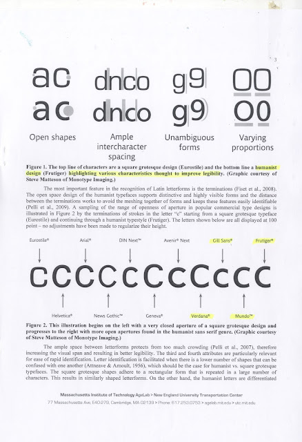
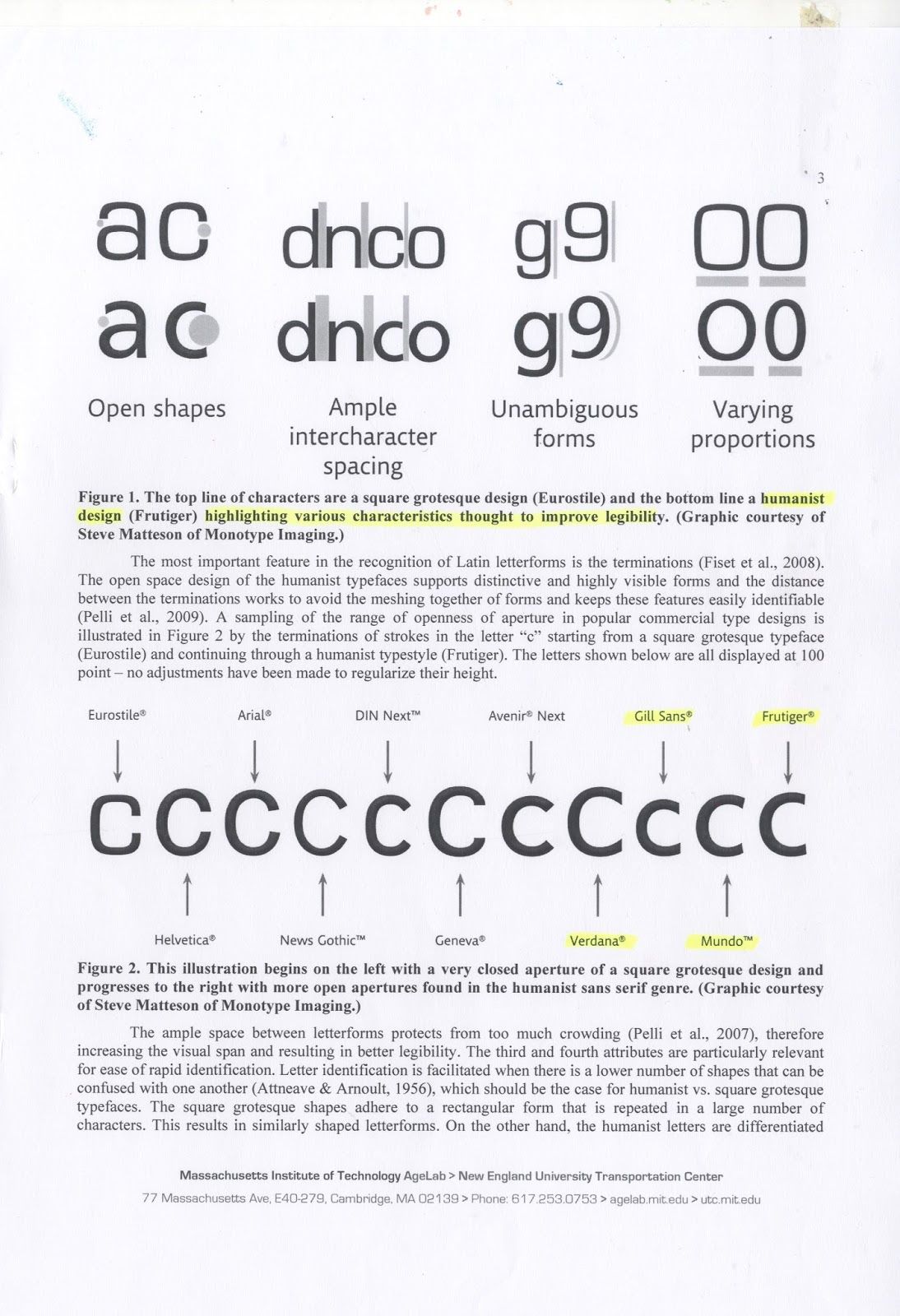
Humanist typefaces are the best choice for legibility, as they have:
Open shapes
Generous spacing
Varying proportion
Unambiguous forms
"An important factor in the recognition of Latin characters is their openness — the distance between the terminations, or stroke endings. The open design of a humanist font makes for highly visible, distinctive letterforms that avoid blending into one another. You can see the difference when you compare the variety of terminations in the letter ‘c’, from square grotesque typefaces like Eurostile, to the more humanist typefaces like Frutiger. Large counters (the white space in letters like ‘o’, ‘b’ and ‘a’) and x-heights (the height of lower-case letters compared to upper-case) also help generate more open shapes that are easier to distinguish at a glance."

The paper "An Evaluation of Typeface Design in a Text-Rich Automotive User Interface" explored this in even more detail.


Saturday, 28 October 2017
Primary Research - Driver responses to their dashboards
What do you think are the most important features/information you need to have access to whilst driving?
- Music
- GPS
- Speed
- Calling/link with phone
- Car service eg. oil, engine check
- Time
- Outside temperature
- Petrol levels
- What gear you're on
What features/information would you like to have access to that you currently don't, or that you think could be improved?
- Speed limit (linked with GPS?)
- Music in my field of view, rather than on the side/middle
- Weather information/forecast
- Automatic radio calibration based on location
- GPS more accessible whilst driving
- Radio functions should be simpler
- Labels of which button/knob controls which lights
- Air Con de-mist button/function, so it does it automatically, rather than having to play around with all the options before you get it working
- Speed shown in numbers rather than a dial
- An estimate of how long you've got left on the road
- When low on fuel GPS should navigate you to the nearest petrol station
- Tell you when to change gears
- Visual representation of parking, rear cameras? sensors?
- Link phone to the car so you could call/change music using car controls
Friday, 27 October 2017
Analysing Tesla Model S Interface
- 17 inch ipad in the centre of the dashboard. Controls phone, climate, music, radio etc.
- Only physical controls are the shifter, turn signals, wiper and hazard lights.
Pros
- Fonts are big, screen layout is very logical, and with large clear graphics.
- Buttons are big and responsive, enough to look once, touch once, and be confident it will work.
- Allows users to place two different functions in different panels at the same time.
- The speedometer is displayed on another screen, which also shows battery charge, satnav directions and the display for Tesla’s semi-autonomous Autopilot function. (This could also be a Con as there are arguably too many features accompanying the speedometer.)
- Buttons on the wheel allow to control some features/settings without having to use the touch screen. Some of the features/options that you can control from the wheel can be personalised.
Cons
- Big potential for distraction.
- Swiping, dragging and tapping is required to scroll through the very many options/settings.
- Without physical buttons to feel, you need to look away from the road to target the screen.
- Works only using a 3G/Wi-fi signal.
- The design, components and manufacturing process that went into the cars infotainment and instrumentation systems have more in common with a tablet/smartphone than a conventional car.
- The main module is the most complex design seen in a car, containing more than 5000 discrete components, 1000 more than the highest-end infotainment unit previously seen.
- Includes a web browser, which can be distracting and dangerous whilst driving.
- All options/settings are present, which makes the display feel over-crowded.


Sources:
https://www.consumerreports.org/cro/news/2013/05/driving-the-tesla-model-s-is-like-using-an-ipad-thanks-to-leading-edge-interior/index.htm
https://medium.com/sketch-app-sources/the-future-interface-of-the-automobile-ef8a0f07e895
http://www.telegraph.co.uk/cars/tesla/tesla-model-s-review/
http://www.greenbaypressgazette.com/story/money/2014/10/17/tesla-model-s-car-ipad/17461571/
- Only physical controls are the shifter, turn signals, wiper and hazard lights.
Pros
- Fonts are big, screen layout is very logical, and with large clear graphics.
- Buttons are big and responsive, enough to look once, touch once, and be confident it will work.
- Allows users to place two different functions in different panels at the same time.
- The speedometer is displayed on another screen, which also shows battery charge, satnav directions and the display for Tesla’s semi-autonomous Autopilot function. (This could also be a Con as there are arguably too many features accompanying the speedometer.)
- Buttons on the wheel allow to control some features/settings without having to use the touch screen. Some of the features/options that you can control from the wheel can be personalised.
Cons
- Big potential for distraction.
- Swiping, dragging and tapping is required to scroll through the very many options/settings.
- Without physical buttons to feel, you need to look away from the road to target the screen.
- Works only using a 3G/Wi-fi signal.
- The design, components and manufacturing process that went into the cars infotainment and instrumentation systems have more in common with a tablet/smartphone than a conventional car.
- The main module is the most complex design seen in a car, containing more than 5000 discrete components, 1000 more than the highest-end infotainment unit previously seen.
- Includes a web browser, which can be distracting and dangerous whilst driving.
- All options/settings are present, which makes the display feel over-crowded.
https://www.consumerreports.org/cro/news/2013/05/driving-the-tesla-model-s-is-like-using-an-ipad-thanks-to-leading-edge-interior/index.htm
https://medium.com/sketch-app-sources/the-future-interface-of-the-automobile-ef8a0f07e895
http://www.telegraph.co.uk/cars/tesla/tesla-model-s-review/
http://www.greenbaypressgazette.com/story/money/2014/10/17/tesla-model-s-car-ipad/17461571/
Tuesday, 24 October 2017
Research - Car Dashboard Design
Car Dashboard Design History
Conceal: Instead of making gauges and controls persistent, hide them until the user needs the info. The car’s temperature is only important if it is trending in the wrong direction. Alert only when that happens; otherwise there is no need for the information.
Examples of Dashboard Design (Good)
Sources:
- The original Ford Model T began production in 1908. The UI model was one of ‘direct control’, where the driver had only one dedicated leaver and gauge, for each function. It was a simple and purposeful design that did not distract the driver from operating the car in a safe way.

- Today's cars are more technologically advanced than the Ford Model T, so obviously need more dials, buttons and gauges. However, over the past 100 years we have become accustomed to accept that all the features of the car are presented at the same time.
- The truth is; many dials, switches and gauges seem to advertise that the car can do more. This was the mentality of the 1930’s, a time in which airplanes were becoming more popular. Many luxury car companies were designing the UI of their cars inspired by these complex airplane cockpit UI designs. This was done not necessarily to increase the usability of the product, but rather boast the technology under the hood.
- Dashboard complexity was driven by style instead of function. In this sense, features became a definition of luxury. This was a time in which designers were imagining the future to be more about technology and less about people. This trend has seemed to continue over the years, and gradually we have lazily come to accept the common dashboard as it is today.
- During the 1990’s car interiors were beginning to gain feature overload. The amount of buttons was becoming increasingly confusing. The Pontiac Grand Prix (5th Generation) for example: Four separate buttons for the lights, four more separate buttons for the wipers, and a steering wheel full of buttons for purposes unclear.
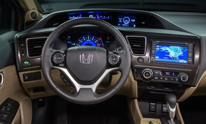
- Another example is the Honda Civic (9th Generation), which bore a wealth of screens: A screen for your infotainment, and two screens for your information right in your line of sight. This is an example of sensory overload.
- Nowadays, there has been an introduction of further elements to car UI, such as: smartphone integration, Bluetooth and Wi-Fi connectivity, autonomous driving and touchscreen displays. Driving is a dangerous activity and all these new features are beginning to become increasingly distracting to the driver.
Matt Krenn's Car UI Design
Matt Krenn’s touchscreen UI design is a touchscreen that isn’t plotted out into arbitrary menus and buttons. You can touch it anywhere and the various controls depend on how you touch it. Dragging upwards with two fingers turns up the volume; dragging up with three changes the audio source, four fingers controls temperature and five for airflow. Each has a unique sensitivity based on its function and can be triggered starting anywhere on the touch surface. Moving up or down with your fingers spread a bit wider offers an additional set of controls. All eight of these can even be remapped to the driver’s preference.
Although touch screens may not be new to car UI, this car UI touchscreen concept embraces the idea of on-demand UI and abandons the direct control touchscreen. This makes for a good example of a simpler, more intuitive on-demand user interface without causing distraction.
How to Improve Car Dashboard UI
Anticipate: Mapping apps have gotten good at anticipating when drivers need to hear the next direction. The rest of the car should operate in the same way. If the user is low on gas, the car could direct them to a nearby gas station instead of just alerting them about running low. If they are entering an area with a reduced speed limit, the car should highlight the speed relative to the limit.
Personalize: Dashboard UI today is largely a one-size-fits-all model. This is good for standardization, but does not reflect the different modes drivers adopt. For example, if the morning commute is all about Zen, the dashboard should be blank. Whereas a Saturday drive is often more about performance, so they may wish to see their speed and RPMs then. Another example is cruise control, people may rarely use it, but the controls are always there. The car should coordinate with the mapping app and identify places where cruise control might be appropriate, and only show the option then.
Examples of Dashboard Design (Bad)
Examples of Dashboard Design (Bad)
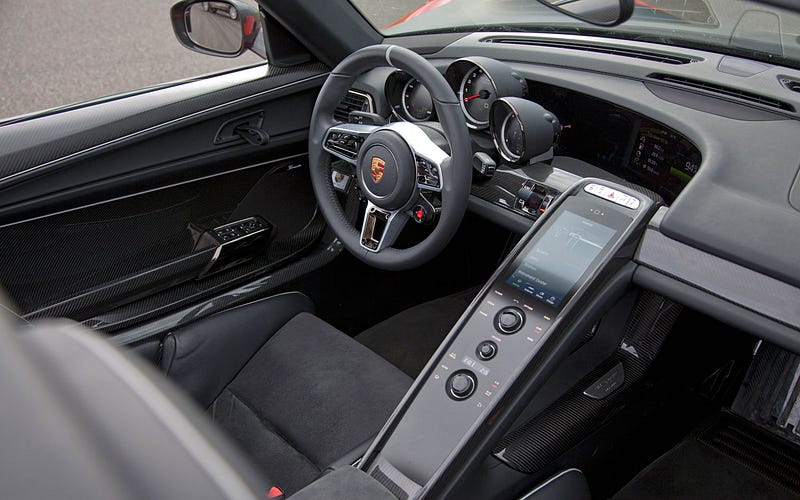 |
| Porsche 918 - The screen is at an awkward angle from the driver, and there is a risk of sunlight/daylight obstructing view/clarity. |
 |
| Audi TT - What is the purpose of the 3D car model and dials around it, this is too complex for the driver to be able to glance at. |
 |
| McLaren - The icons are illegible due to small size and dark background. |
 |
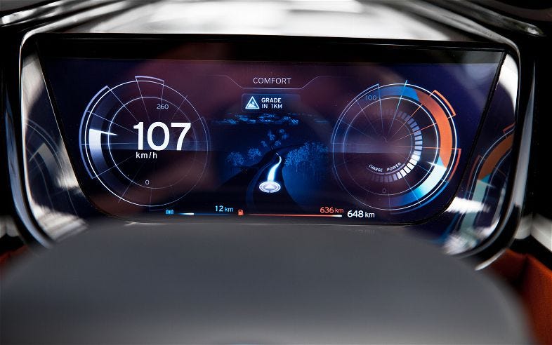
| Tesla - What is the purpose of 3D buttons, and some features being bigger than others. The use of space is confusing. |
 |
| Range Rover - There is too much going on, the driver would be overwhelmed by all the information/features. Legibility is poor. |
 |
| Lexus Concept - It is unclear what the information shown is, nor how to use it. |
 |
| BMW i8 Spyder Concept - It is unclear what the information shown is, nor how to use it. The displays are confusing. |
 |
| Porsche 918 - Why are the top selection buttons green and the bottom ones orange? |
 |
| McLaren - The icons are again small and illegible, as well as the columns are unevenly spaced. |
Examples of Dashboard Design (Good)
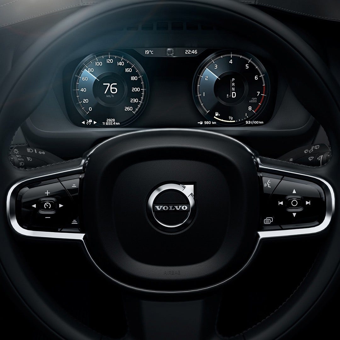 |
| Volvo XC-90 - Clean and clear display of information. Possibly lacking clarity for different functions/controls. |
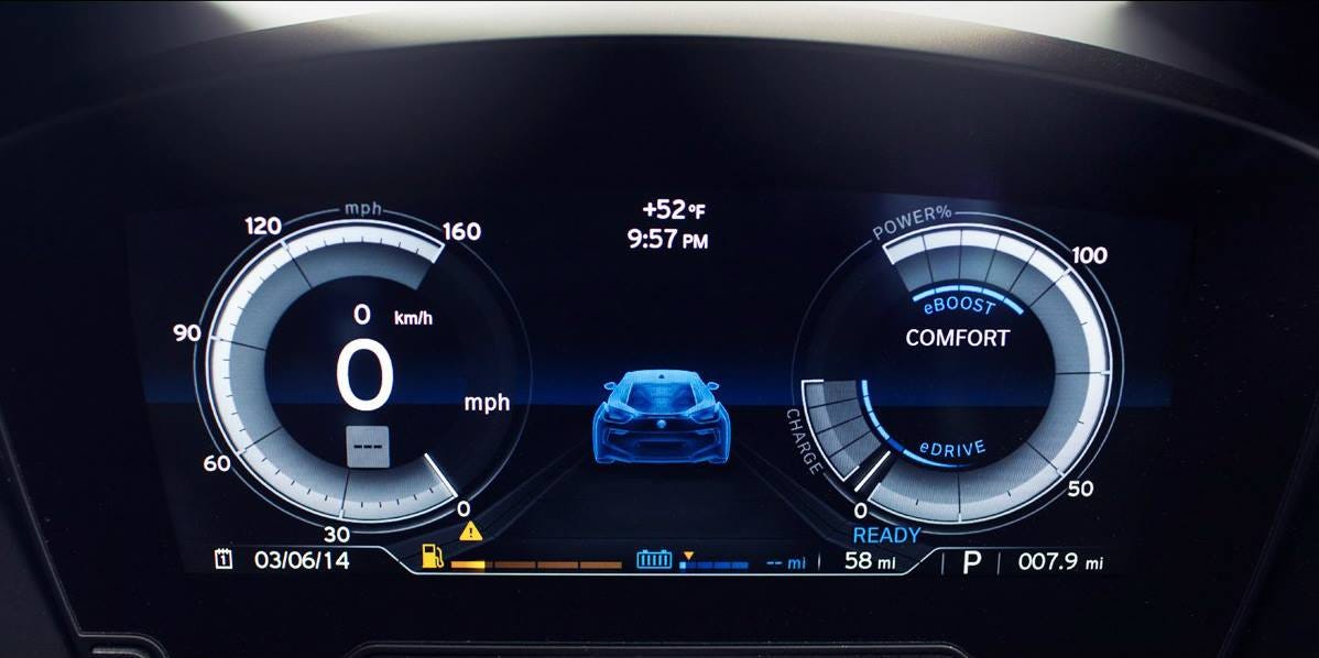 |
| BMW i8 - Clear and not over-crowded display. |
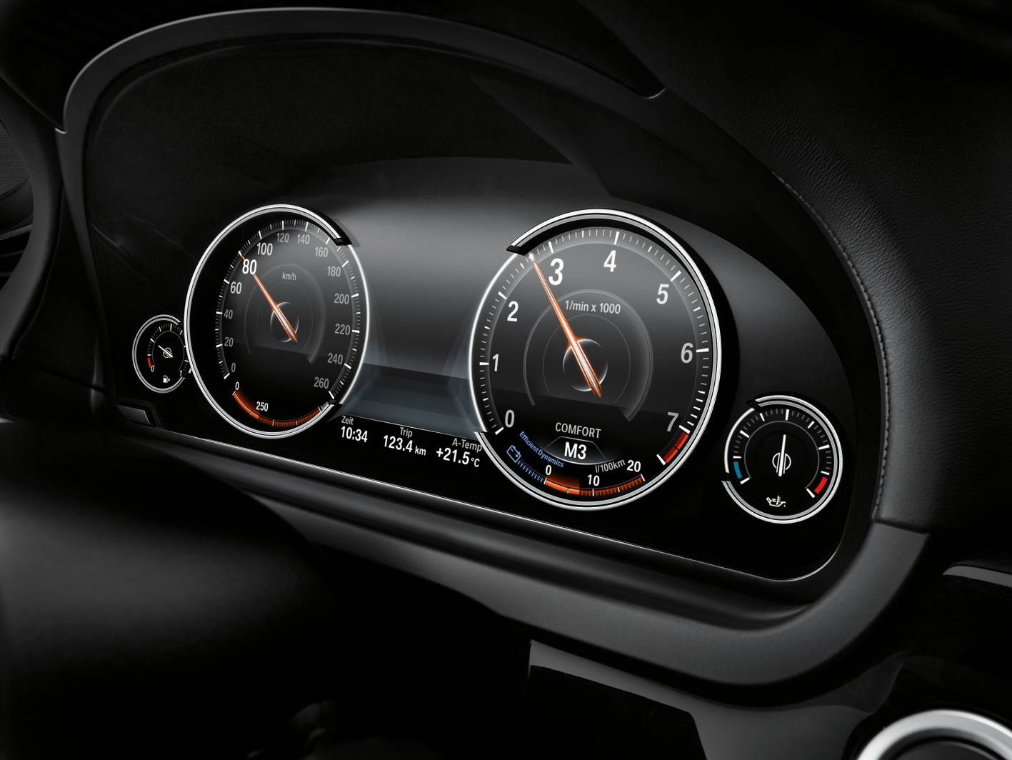 |
| BMW 7 - Neat and clean display of information. Not distracting for the driver. |
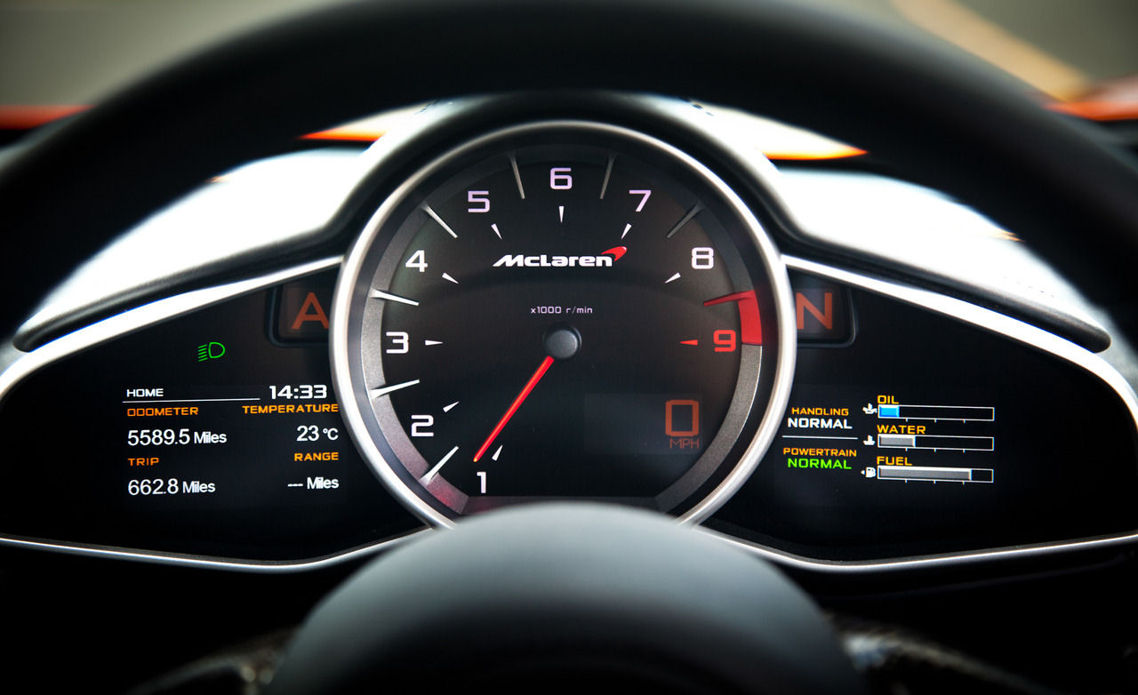 |
| McLaren MP4-12C - Key information provided clearly and accessibly for the driver. |
 |
| Audi TT - A good mixture of display and analogue controls. Neat and clean. |
https://medium.com/sketch-app-sources/the-future-interface-of-the-automobile-ef8a0f07e895
https://techcrunch.com/2015/10/08/why-the-car-industry-needs-to-rethink-the-dashboard-user-interface-design/
https://medium.com/@dnevozhai/car-dashboard-ui-collection-123ce3ab5303
https://medium.com/@dnevozhai/car-dashboard-ui-collection-123ce3ab5303
https://medium.com/habit-of-introspection/the-state-of-in-car-ux-9de33c96403d
User Experience Design
Research sources:
Google Design
Apple Developer - Human Interface Guidelines
Material Design
SP-AN
User Experience Design (UXD)
UX: What, When, Where, Why and How a user interacts with the product/design.
A UX designer makes the business needs and user needs meet in the middle.
A UX designer takes the users need into account at every stage of the products lifecycle.
HCI - Human Computer Interaction: The ways that people interact with digital systems.
Usability - refers to the ease and efficiency by which a user operates a system. Interaction design is, then, the organisation and construction of interactive elements.
UX refers directly to the ways the that the user/customer/operator experiences using the product/system/interface on their own terms.
UXD is the informed manipulation and development of the factors that influence the user's experience.
Therefore, UXD precedes visual design, UXD informs visual interface design. UX designers will set out the criteria by which the designer will operate.
UXD Process:
Analyse - business research/ user research/ data analysis and conceptualisation
Design - creating concepts/ interaction behaviours/ look and feel
Prototypes - realising design alternatives
Evaluate - verifying and refining
User Research - UX designers commit to a lot of user research. User research seeks to gain a better understanding of the needs of the user. They might do: focus groups, interviews, observations.
Identifying and conceptualising user roles, user needs, task flows etc.
Techniques:
1. Personas - Personas are characteristics of archetypal users. UX designers aim to design the most appealing interface for one or a handful of users - since it is impossible to please everyone it is better to have a small percentage happy than the whole user population half happy.
Personas are fictitious since they likely combine aspects informed from numerous sources. However, they must appear to reflect real people.
Characteristics in personas should:
- Reflect data found in user research
- Focus on the present
- Be realistic not idealistic
- Describe a challenging target user
- Provide insight to the users' context, behaviours, attitudes, needs, challenges/pain points, goals and motivations
2. Taks Flows/ User Flows - Work flows visualise (flow charts) the stages involved in completing certain tasks (task flow) or the journey a user takes through the system (user flow).
An Apple guideline is that to complete a task the task flow should be maximum of 3 steps.
3. Wireframes - Wireframes are the first step towards putting all the user research, personas, workflows etc. into a visual format.
The aim of the wireframes is to experiment and test hierarchies and informed layout strategies. UX designers will always refer back to the personas and workflows to test the wireframe layouts.
Wireframes can be low fidelity, quite simple and general, or they could be more complicated.
Monday, 23 October 2017
ONLY Studio
Award-winning branding agency helping organisations to use design and innovation to grow.
Based in Manchester with national and international clients.
Clients: goldsmiths, design council, lost village, mercedes.
Design for Screen
It is constantly evolving, fast-paced and with endless opportunities.
It is the primary means of consuming a brand, experiential and interactive, as well as 'here to stay'.
Their Design Process
Phase 1: Research (competitors, audiences, personas, principals)
Phase 2: Wireframing (ideation, test assumptions, client buy-in) (collaborative - including art directors, clients, developers etc. to create sketch boards, narrow down ideas etc.)
Phase 3: Design (use program Invision/Axur to make prototypes)
Phase 4: Front End (the final step, developing)
Projects they've done:
'Goldsmiths' Univerisity Website
- Had to work out the hierarchy of information during the wire framing stage, did a lot of testing exclusively with users.
- For the app they had to look closely at the layers/visual language to communicate the branding on a smaller scale.

'Printworks' Print Company
- They communicated the action of traditional print, the rolling, into the logo design.
- Considering the motion language, how they move, how they interact with each other.
- They mimicked the printing and created interesting and abstract visuals on screen.

'University of Suffolk'
- They idea behind the logo was 'change' so they used the 45% angle triangle, and also hinted their geographical location of South East, as no one seemed to know where Suffolk was.
- They used the 45% angle element throughout the branding of the university.

'Lost Village' Music Vestival
- They came up with the concept of a secluded, abandoned village lost in time, as the festival was to be set in a forest and have not well-known music acts playing.
- In theme with this, the logo was hand-drawn (representative of L&V), so it could be recreated by anyone by hand.
- They also created a bespoke typeface inspired by old alphabets and hieroglyphs.

'Helbers Paris' High-end Fashion Wear Brand
- They wanted luxurious branding.
- They paid a lot of attention to paper stock and materials.
- The look books were all oversized, to create a sense of grandeur and luxury.

'Bring Me The Horizon' Band
- They had 2 weeks to create and execute a concept to promote their new album.
- They worked with people in Poland and Amsterdam.
- They pulled content from social media, as the band was on tour at the time.
Sunday, 22 October 2017


Subscribe to:
Comments (Atom)