Following the feedback session and the further research I had done, I decided to embrace my dislike towards the content of the publication, and utilise that to create an advertising perspective inspired by the Hans Brinker Hotel. I approached the design of the publication with a humorous, mocking and irony concept, which in turn would make the advertisement/design draw the audiences attention as well as make it memorable.
Reflecting on the content provided to me, as well as the feedback received from my primary research into the target audience's response to what they love and hate about Wetherspoon, I came up with some slogans/titles for the different sections of the content. The slogans/titles such as "Cheapest watered down drinks in Leeds" and "The most ridiculously names nights out in Leeds" are what bring the mockery and irony elements into the design. Although I was a lot happier with the concept I was now pursuing, I was still not happy with the designs below. Although the background now being black communicated quite well the nightlife aspect of the content, the overall layout and design still felt bland and dull. The design and layout at this time felt quite corporate and formal, and this was something I did not want as for my new concept I was aiming for something more playful and fun. Also, due to this the designs did not create any sense of the bar being advertised, which was something I felt to be important as part of my new concept. I believe these issues were due to the limits of the format I was designing to. The format of a bound publication made it quite difficult to create a more informal, exciting or promoting feel to the design. Also, the use of photography I believe created a similar corporate and formal feel, as it made the designs and the content seem quite official and serious. Yet another feature that I believe hindered my concept was the use of Helvetica. Although the typeface is generally neutral and does not usually effective the outcome of a design, this time it aided the faults within the design. This was because alongside the publication format, and the professional photography, it even further made the design feel corporate and formal, and the sense of advertisement/promotion close to non-existent.


To try and solve all the issues I was having with my designs and to counter all the design features I felt were hindering the atmosphere and feel of design that I was going for, I decided to try and go for complete opposites of those design features and see how they could affect my concept and designs.
I firstly looked at the photography, and the contrasting opposite being illustration. I used the photography provided to me and created illustrations from them. I did this so I could keep a control on the communication of the illustrations, and make sure that they relate and enhance the content. This instantly created a far more playful and fun feel to the design. I decided to go back on myself and not use a black background so that I could play with the use of colours and try and enhance the illustration and its effect through their use. Also, through the use of bright colours I aimed to communicate the excitement and vibe of the nightclub environment, which effectiveness was looked at within my research into other club and bar promotional material. Although this was a significant improvement in what I was aiming for, simply changing the imagery within the design still not felt as if it was enough to communicate my concept clearly.


Having really embraced the use of illustration instead of photography, I held on to the change and addressed the problem of format I had in my previous designs. Instead of a bound publication format, I decided to explore the format of a poster. Knowing that I would face issues later on with the fact that the brief asked for a bound publication/book design, I still felt confident in exploring the format of a poster and knew that the conventions of a book can be challenged.
Instantly the designs gained a more relaxed and playful atmosphere. I believe this was due to the freedom gained not only by myself as a designer, but also by the white open space within the format, where the content and imagery had more breathing room and the layout could be experimented with. The poster format also clearly creates a sense of advertisement/promotion which is another feature of my concept that I am aiming for. The colour used for the text is taken from my initial designs, where the colour pink was colour picked from one of the photographs provided to me as part of the content. I kept this colour pink as it is bright and bold and so I believe it communicates well a sense of excitement and the feel of a nightclub. The colours for the background I explored were white, yellow and black. The white was simply a go to neutral colour which I hoped would draw attention to the illustration and the bright use of pink in the text, however, it turned around to make the whole design feel boring and bland. The yellow I hoped would aid the illustration and the bright pink text, and make the overall feel of the poster more loud and attention grabbing, like nightclubs are. Although the yellow was loud and attention grabbing like I had aimed, it did not however communicate the loudness and attention of a nightclub. I believe this was due to the combination of yellow, pink, and the soft pastels within the illustration making the overall design feel more daytime than night time, as well as looking quite happy and innocent. The use of black for the background I decided to explore due to my previous use of it in my initial designs for my new concept. The black proved to do the same as it did in those initial designs, and very well communicated the idea of a night time. Not only that, but alongside the bright pink I believe it came to communicate more specifically night clubs. I removed the colour from the illustration in hoped of letting go the idea of day time even more.


Although changing the photography and bound publication format from my initial design of this concept, into illustration and poster format, proved to be extremely effective and appropriate for what I wanted to communicate, I believed that I could still push it further. Because of this, I approached the third major issue I had with my initial designs for this concept, the typography/typeface.
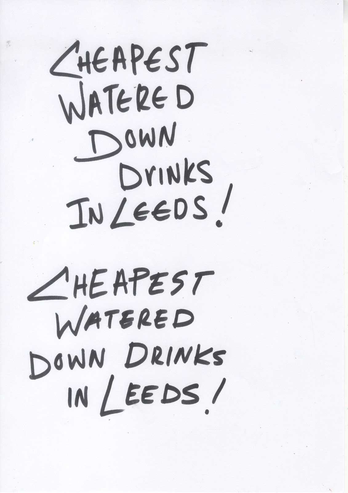
Instantly what popped into my mind was the hand-written calligraphy type I had used in my initial designs, and how they were chosen by my peers as the most effective and communicative of night clubs. Because of that I decided to try and hand-write the slogan/title of these posters and apply that to the design. This immediately gave my design a sense of edge that I was missing, and became not only something to communicate information, but a part of the design/illustrations itself. I decided to embrace the idea of the poster format and work it to aid the newly handwritten title and illustration by removing the body text. I used the colour pink for the title and illustration outline not only because I had explored and found out earlier that it was bright and bold and therefore appropriate to communicate the exciting atmosphere of a nightclub, but also because it created a sense of cohesiveness and connection between the title and the illustration. I used the colour black for the background as it communicates well the idea of night time, and paired with the bright pink as well as the content, communicates effectively the idea of night club.

Having explored some polar opposites of design, and worked some what backward from what I did not want to what I did want, I believe I had found the most suitable and effective approach to all the various design elements. I was very happy with this more crafty and hand-made approach to the design, and believe it is very appropriate for wanting to communicate the sense of mockery and irony, as well as advertisement for the bar. The somewhat 'bad' design that is created through the handmade illustrations and custom type works well alongside the content being mocking and humorous. The format of it being a poster and the fact that body text was taken away gives the design an exhibitionist feel, as if the poster should be taken and put on the wall, which gives the design the advertisement and promotional feel I was aiming for. This was the design approach that I would be continuing for the rest of the content of the publication.
No comments:
Post a Comment