- Title 'Impact of the nightlife industry' or 'Exploring Nightlife'?
- Possibly expose it/make it really big to show the atmosphere of the club
- Possibly have a pocket within the publication for a leaflet to come out
- Have the information be mobile/portable?
- You could have a personality quiz at the end which matches you to which bar you should go and/or what type of nightlife person you are
- Secret messages in UV? Like in clubs/lights
- Vouchers/Business car pages in the back? Or maybe little tabs to rip off like poster flying
- Make the size of the book fit into napkin holders? Or pockets?
Initial Ideas
From the brief presented to me by Danielle Wright, the purpose of the publication was to highlight the impact of the nightclub industry, for marketing purposes to the products/offers in the bar, to show what sort of atmosphere they have, and to be suited/tailored to appeal to the student audience.

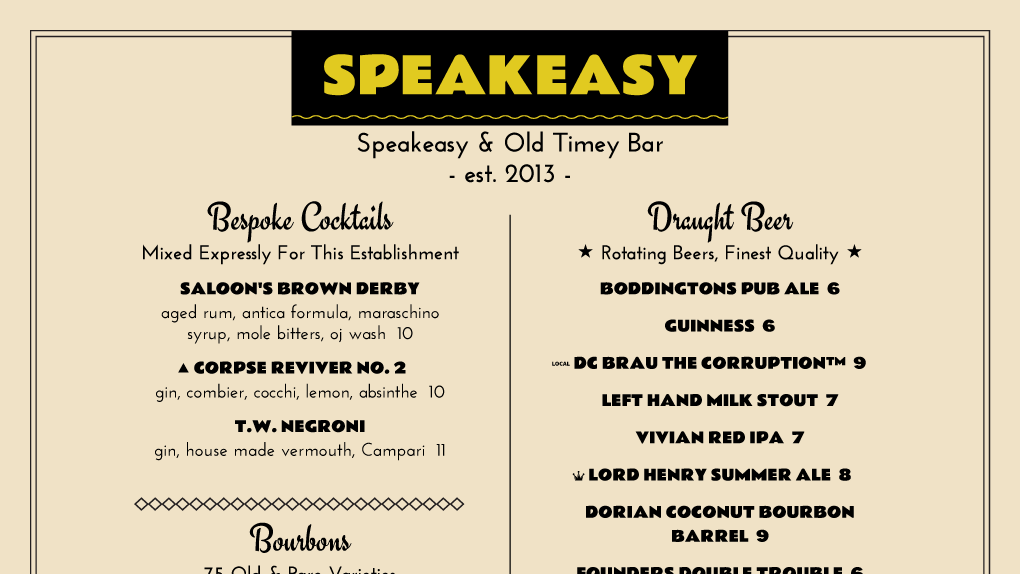
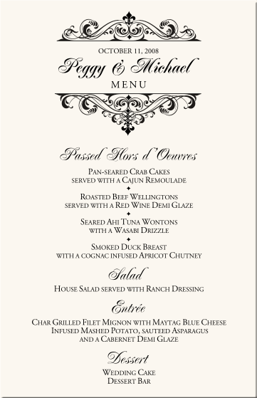
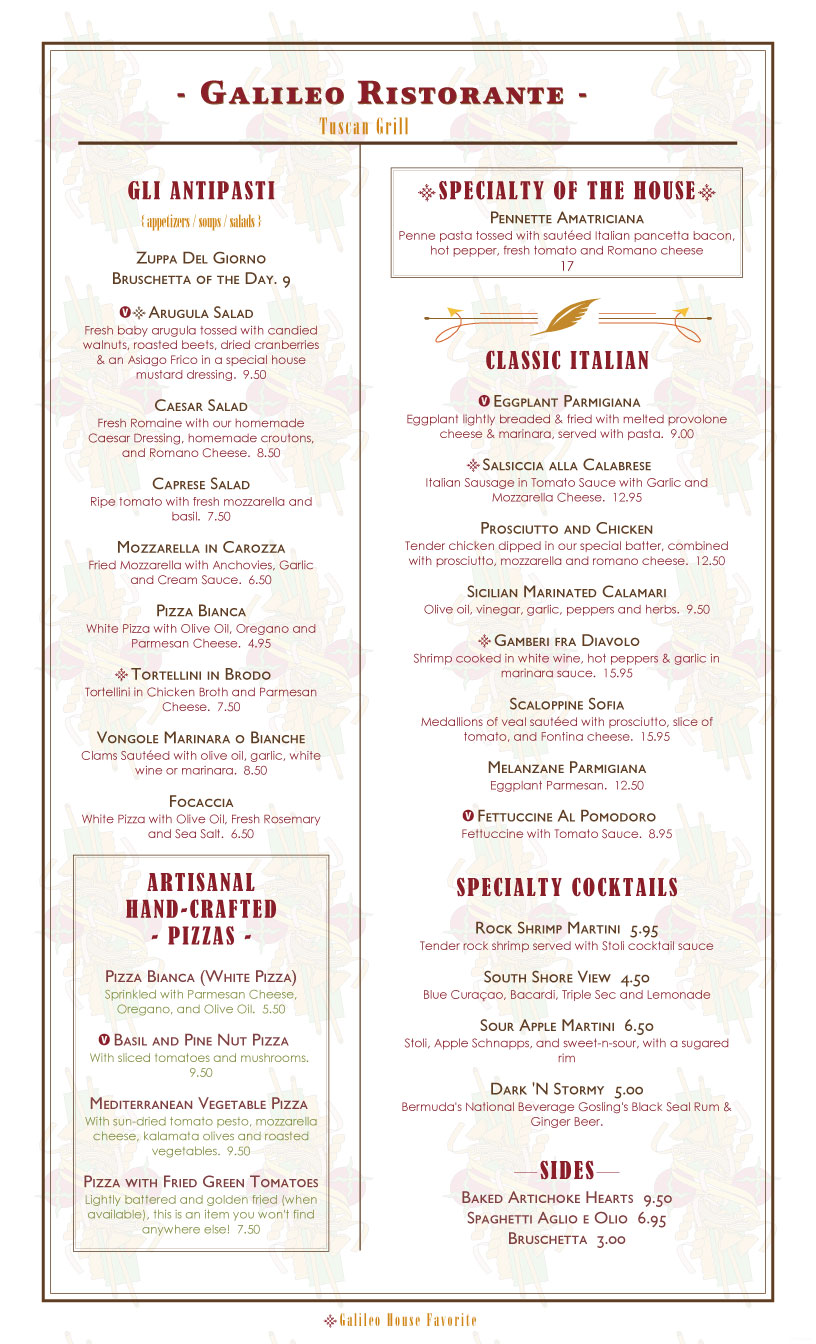
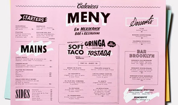
My first idea was to format and layout the publication in the style of a restaurant menu. This was because Lloyds Bar is a wetherspoons, and although the audience of students views it mostly as a venue to buy cheap drinks, the service they provide is all throughout the day and the atmosphere of the bar differs between daytime and nighttime. The menu format/layout vs the content was to represent this difference in atmosphere, with the format/layout reflecting the more sophisticated and gentle daytime atmosphere, and the content reflecting the more chaotic and energetic nighttime atmosphere.

I researched menu layouts and found recurring design features that I could utilise. The page layout was often centered, and the hierarchy of information presented with subheadings and use of individual lines. The typography within the menus utilised calligraphy, with a 'fancy' feel to the lettering. Some menu designs also had subtle illustrations and/or decorations.

Influenced by menu research, I drew some layout ideas. I struggled with integrating images into the layouts as my researched showed that menu designs do not usually include imagery. Having integrated the images, as they were part of the content provided to me, I realised that some of the layout's lost the visual communication of menu designs. Because of this, I decided to experiment with creating some hand-written/calligraphy lettering for the subheadings of the content, in hopes that this would strengthen the communication of the idea.

 |
I explored different styles when hand-writing the titles. Some peer feedback then revealed that the third
design on the left seemed most promising, as the style of the lettering was reminiscent of night clubs and their atmosphere.
|
 |
From the exploration of different handwritten titles, and peer feedback on which was the most effective,
I then continued to write out the rest of the subheadings I will be using.
|
Using the layout idea drawings and hand-written subtitles, I began to work digitally on InDesign.
I experimented with different layouts, and also different type treatments, handwritten as well as some typeface options.
 |
The handwritten title I believe worked well, as it created a more 'night life' atmosphere. The colour for the
title I colour picked from the images, which I believe made the overall design more cohesive.
|
 |
I also looked at using the Edwardian Handwritten typeface, as I thought the design of typeface was fairly
reminiscent of menu typefaces and would help communicate my idea better. However, the typeface and the content
of the design overall looked too disconnected so I decided against this approach.
|
 |
Another typeface option I explored was Helvetica Bold, this was because I thought a more neutral typeface
would allow the content of the publication to stand out more. However, I found that Helvetica also made the design feel disconnected and also too dull.
|


During the initial idea digital design phase, I found that the handwritten custom titles were most effective and appropriate to the designs. Exploring layout, I also found that with the body text on the left page, and imagery on the right, the layout was most reminiscent of menu layout's. However, the layout felt a little boring and didn't communicate the excitement or atmosphere of the night life that the design needed to have. Therefore, I decided on a layout that was a little bit more staggered, and gave the reader something more playful, yet still cohesive, to look at. I went on to design the rest of the pages for the publication.


Although I was happy with the handwritten custom titles, and the layout seemed appropriate in theory, I was not happy with the overall feel of the designs up to this point. The design felt a little bland and lifeless, even with the pink colour of the titles and imagery. Also, the designs had lost the aim of being a nod towards menu's, as the amount of text, it's structure and the layout of the content as a whole had drowned the idea.
In an attempt to salvage the idea, I decided to explore the content within a landscape format instead of portrait. I knew the landscape format would lose the nod towards menu design even more, however, I hoped I could make it work and at the same time bring more life and interest to the designs.


After exploring the landscape format, I still wasn't too happy with the feel of the designs. The menu idea seemed to be even more drowned/lost than previously (with the exception of the drinks page), and the layout of the pages were still too dull and boring. Because of this, I knew that I wanted to scrap the menu inspired layout design, and to continue with a larger focus on how to create a 'story' from the content given to me, and communicate that story through appropriate design decisions.
No comments:
Post a Comment