- The original Ford Model T began production in 1908. The UI model was one of ‘direct control’, where the driver had only one dedicated leaver and gauge, for each function. It was a simple and purposeful design that did not distract the driver from operating the car in a safe way.

- Today's cars are more technologically advanced than the Ford Model T, so obviously need more dials, buttons and gauges. However, over the past 100 years we have become accustomed to accept that all the features of the car are presented at the same time.
- The truth is; many dials, switches and gauges seem to advertise that the car can do more. This was the mentality of the 1930’s, a time in which airplanes were becoming more popular. Many luxury car companies were designing the UI of their cars inspired by these complex airplane cockpit UI designs. This was done not necessarily to increase the usability of the product, but rather boast the technology under the hood.
- Dashboard complexity was driven by style instead of function. In this sense, features became a definition of luxury. This was a time in which designers were imagining the future to be more about technology and less about people. This trend has seemed to continue over the years, and gradually we have lazily come to accept the common dashboard as it is today.
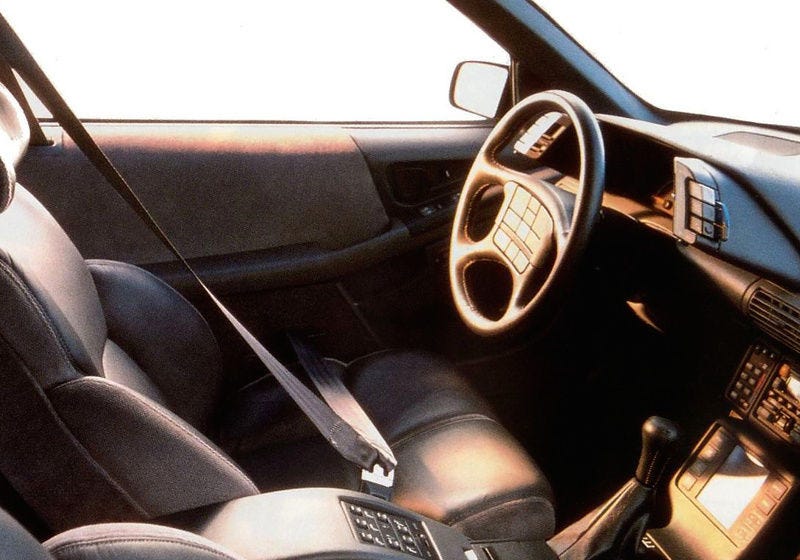
- During the 1990’s car interiors were beginning to gain feature overload. The amount of buttons was becoming increasingly confusing. The Pontiac Grand Prix (5th Generation) for example: Four separate buttons for the lights, four more separate buttons for the wipers, and a steering wheel full of buttons for purposes unclear.
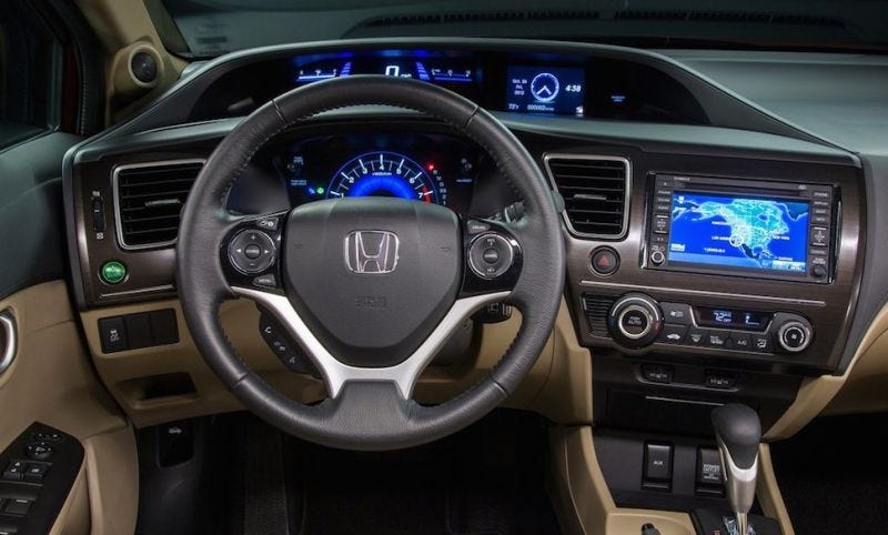
- Another example is the Honda Civic (9th Generation), which bore a wealth of screens: A screen for your infotainment, and two screens for your information right in your line of sight. This is an example of sensory overload.
- Nowadays, there has been an introduction of further elements to car UI, such as: smartphone integration, Bluetooth and Wi-Fi connectivity, autonomous driving and touchscreen displays. Driving is a dangerous activity and all these new features are beginning to become increasingly distracting to the driver.
Matt Krenn's Car UI Design
Matt Krenn’s touchscreen UI design is a touchscreen that isn’t plotted out into arbitrary menus and buttons. You can touch it anywhere and the various controls depend on how you touch it. Dragging upwards with two fingers turns up the volume; dragging up with three changes the audio source, four fingers controls temperature and five for airflow. Each has a unique sensitivity based on its function and can be triggered starting anywhere on the touch surface. Moving up or down with your fingers spread a bit wider offers an additional set of controls. All eight of these can even be remapped to the driver’s preference.
Although touch screens may not be new to car UI, this car UI touchscreen concept embraces the idea of on-demand UI and abandons the direct control touchscreen. This makes for a good example of a simpler, more intuitive on-demand user interface without causing distraction.
How to Improve Car Dashboard UI
Anticipate: Mapping apps have gotten good at anticipating when drivers need to hear the next direction. The rest of the car should operate in the same way. If the user is low on gas, the car could direct them to a nearby gas station instead of just alerting them about running low. If they are entering an area with a reduced speed limit, the car should highlight the speed relative to the limit.
Personalize: Dashboard UI today is largely a one-size-fits-all model. This is good for standardization, but does not reflect the different modes drivers adopt. For example, if the morning commute is all about Zen, the dashboard should be blank. Whereas a Saturday drive is often more about performance, so they may wish to see their speed and RPMs then. Another example is cruise control, people may rarely use it, but the controls are always there. The car should coordinate with the mapping app and identify places where cruise control might be appropriate, and only show the option then.
Examples of Dashboard Design (Bad)
Examples of Dashboard Design (Bad)
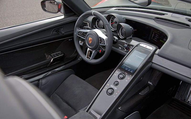 |
| Porsche 918 - The screen is at an awkward angle from the driver, and there is a risk of sunlight/daylight obstructing view/clarity. |
 |
| Audi TT - What is the purpose of the 3D car model and dials around it, this is too complex for the driver to be able to glance at. |
 |
| McLaren - The icons are illegible due to small size and dark background. |
 |
| Tesla - What is the purpose of 3D buttons, and some features being bigger than others. The use of space is confusing. |
 |
| Range Rover - There is too much going on, the driver would be overwhelmed by all the information/features. Legibility is poor. |
 |
| Lexus Concept - It is unclear what the information shown is, nor how to use it. |
 |
| BMW i8 Spyder Concept - It is unclear what the information shown is, nor how to use it. The displays are confusing. |
 |
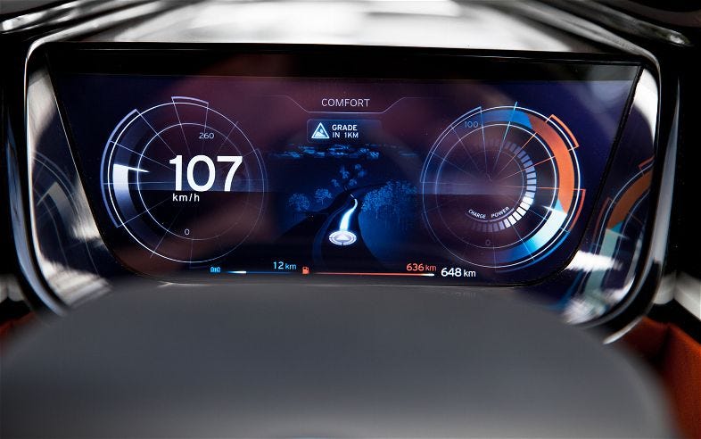
| Porsche 918 - Why are the top selection buttons green and the bottom ones orange? |
 |
| McLaren - The icons are again small and illegible, as well as the columns are unevenly spaced. |
Examples of Dashboard Design (Good)
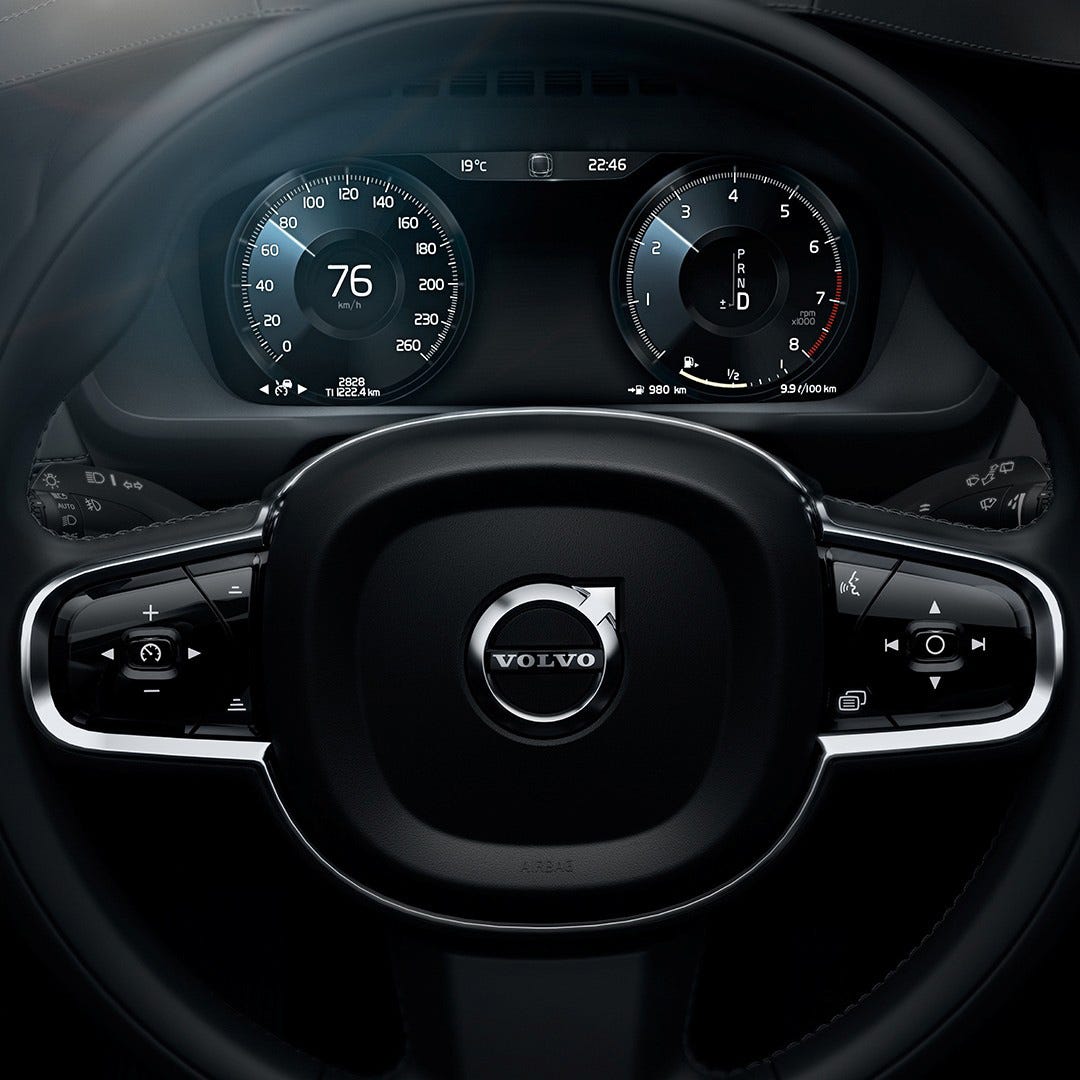 |
| Volvo XC-90 - Clean and clear display of information. Possibly lacking clarity for different functions/controls. |
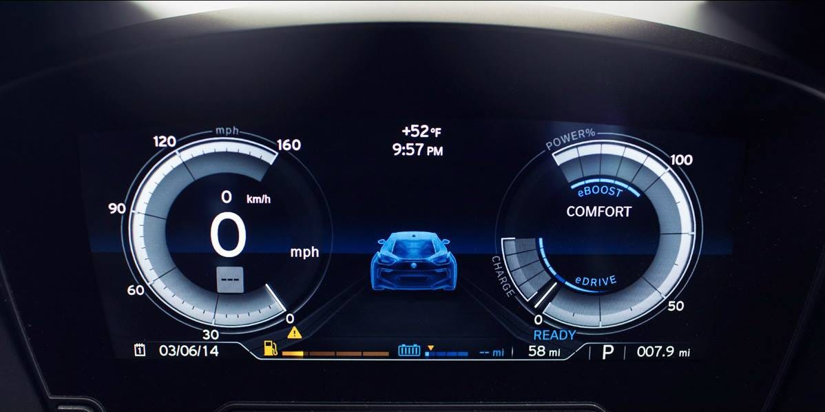 |
| BMW i8 - Clear and not over-crowded display. |
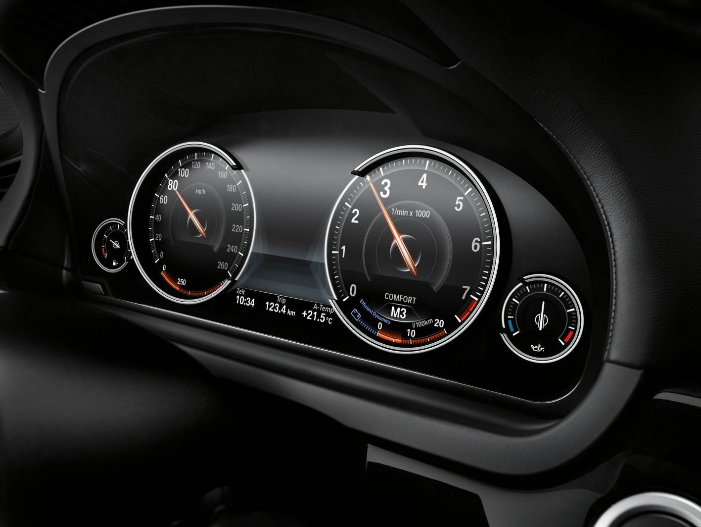 |
| BMW 7 - Neat and clean display of information. Not distracting for the driver. |
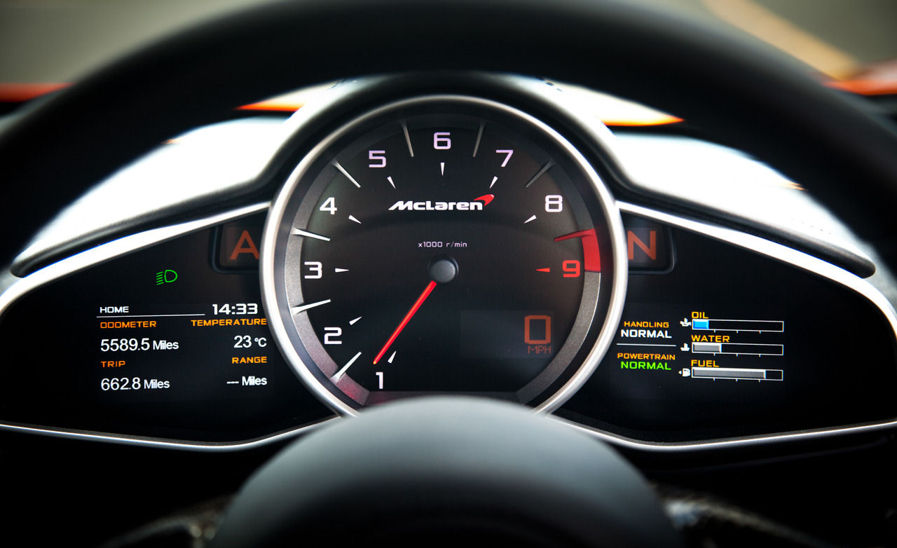 |
| McLaren MP4-12C - Key information provided clearly and accessibly for the driver. |
 |
| Audi TT - A good mixture of display and analogue controls. Neat and clean. |
https://medium.com/sketch-app-sources/the-future-interface-of-the-automobile-ef8a0f07e895
https://techcrunch.com/2015/10/08/why-the-car-industry-needs-to-rethink-the-dashboard-user-interface-design/
https://medium.com/@dnevozhai/car-dashboard-ui-collection-123ce3ab5303
https://medium.com/@dnevozhai/car-dashboard-ui-collection-123ce3ab5303
https://medium.com/habit-of-introspection/the-state-of-in-car-ux-9de33c96403d
No comments:
Post a Comment